Divi Booster is a plugin that enhances Divi by adding 100s of new configurations. It’s a compilation of code that adds features simply by selecting them. Many can be customized, but there’s no coding required. In this review, we’ll take a look at what Divi Booster can do and see how easy it is to use. See All of Divi Booster Features
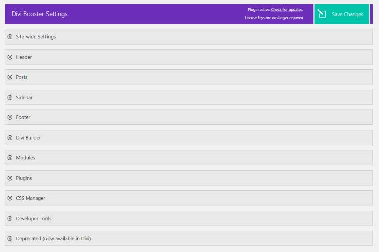
Divi Booster adds a menu item to the Divi dashboard menu. Its settings screen contains 11 accordions with settings where you can make choices and set up features by choosing colors, adding links, etc. Each includes a link to the documentation. The save button floats at the top of the screen, always keeping it within reach.
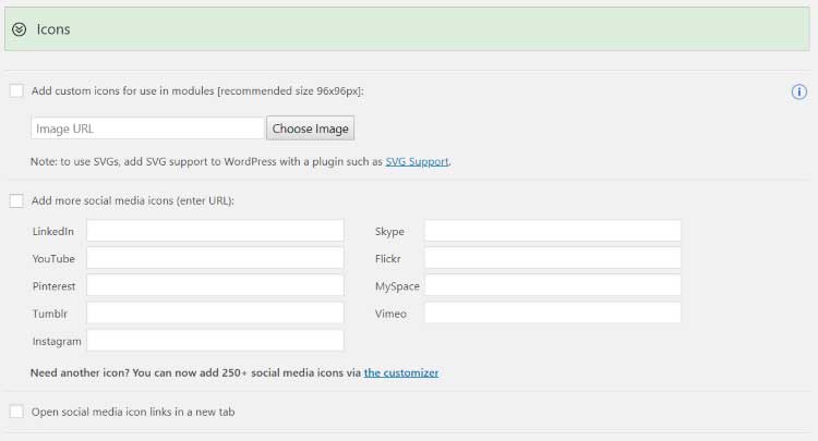
Icons gives you an upload feature to add new icons to be used in modules, add icons of specific social platforms, and an option to open the social media links in a new tab.
Adding multiple icons is simple, but it does take a couple of steps. There isn’t a way to add them in bulk. Add an icon, save the settings, add the next one, etc., until you’ve added all of your icons.
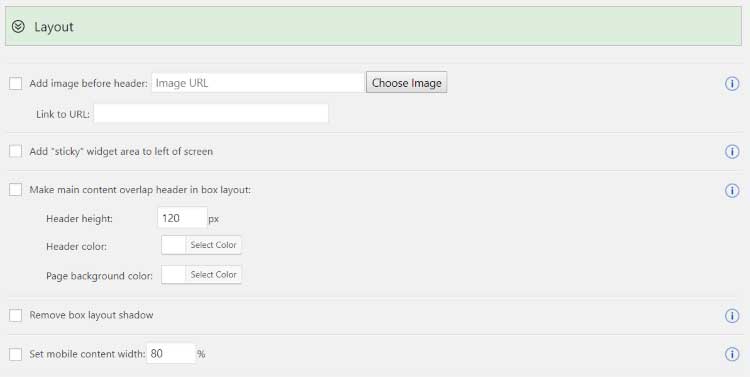
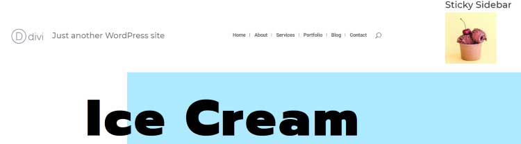
Layout lets you add an image before the header and add a URL to it, add a sticky widget, make the main content overlap in a box layout, remove the shadow, and set the content width for mobile. The image and widget are helpful in creating calls-to-action such as sales, signups, etc. The content overlap is helpful for giving your header a different look.

I’ve added an image as a CTA above the menu and an image as the sticky sidebar.
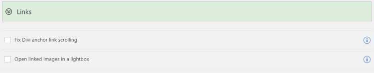
Links can fix the Divi anchor links for scrolling. This ensures that the visitor is taken to the correct location instead of past the anchor link. It also adds an option to open all of the linked images in a lightbox. This is helpful for keeping the visitor on the same page. They can close the image instead of having to click the back button to return to the page they were on.
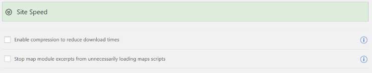
Site Speed includes a compression option and a feature to stop the Divi map module excerpts from loading scripts that are not needed. Both can reduce the load-times even further than the compression that’s already built into Divi.
With Divi booster you will get ton of options for the top, main and mobile header.
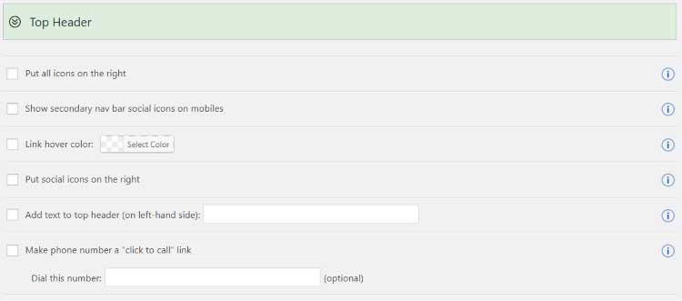
The Top Header lets you place all of the icons on the right, show the secondary menu social icons on mobile devices, change the link hover color, place all social icons on the left, add text, and make the phone number clickable. These give you a lot more control over the fine details.
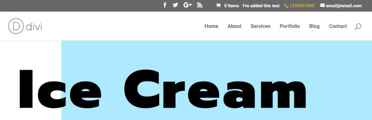
I’ve moved all of the top icons to the right, made the phone number clickable, added my own text, and changed the hover color. I’m hovering over the phone number.
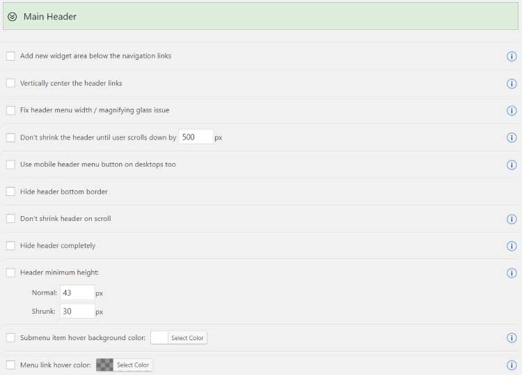
Main Header adds the most options to the header area and a great way to create a custom Divi header. Add a new widget below the links. This is great for CTAs, images, links, testimonials, etc. You can vertically center the header links to get a unique design. It can fix the width/magnifying glass issue. Set the number of pixels the user will scroll before the header shrinks. Add the mobile header to desktop.
Hide the bottom border. Disable the shrink on scroll. Hide the header completely. Set the minimum height. Set the hover colors. Fix sub-link colors on single posts. Specify the space between the menu items. Change the logo link. Change the search icon hover color. Specify where to show the title and tagline and show just one or the other. Add vertical bars between the menu items.
I’ve added the sticky widget, the tagline, the vertical bars between menu items, and increased the space between them. These settings are great for creating headers that can’t normally be made with Divi.
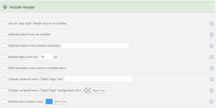
Mobile Header adds several interesting features for mobile devices. Use an app-style header layout. Hide the search icon on mobile. Add text before the menu button. Change the font size. Hide the secondary menu. Change the text. Customize the colors. This is a great way to create a custom menu just for mobile.
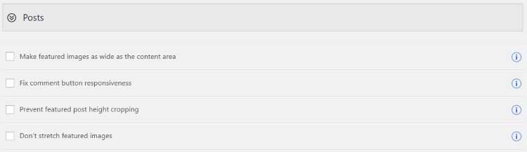
Posts options allow you to make the featured images the same width as the content area, fix the comment button responsiveness, prevent the featured post height from cropping, and to keep from stretching the featured images. These are simple but they can make a difference in the way the content is presented.
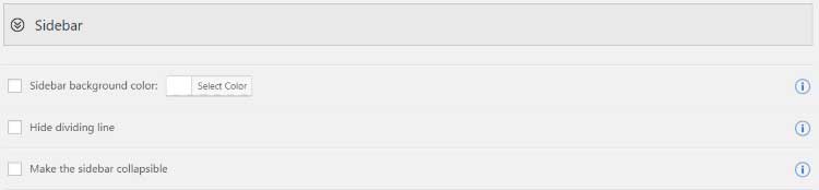
Sidebar settings include a customizer for the background color, hiding the divider line, and making the sidebar collapsible. This means you can have some styling options while using the standard WordPress layout instead of using the Divi Builder to create the layout.
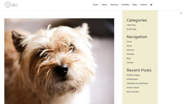
I’ve added color, removed the line, and added the collapsible option, which shows an arrow on the right that hides the sidebar.
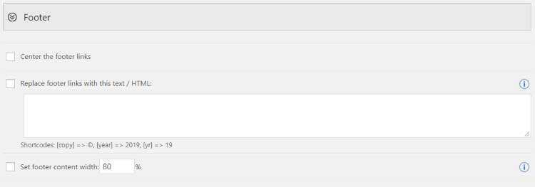
Footer settings give you an easy way to create your own custom Divi footer. You can center the links, replace the links for your own text or HTML, and set the content width percentage.
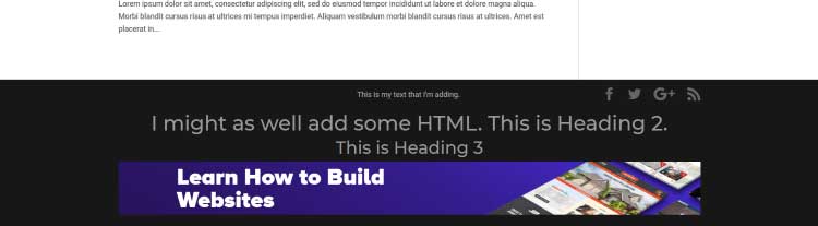
This example uses text and HTML. I’ve set the text styles, added an image, and set the content to 80% of the page width.
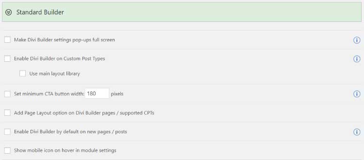
Standard Builder adds lots of helpful settings to make using it easier and use it in more places. Make the module pop-ups full-screen. Enabled on custom post types and use the main library. Set the minimum width of the CTA button. Add a page layout option. Enable the builder by default on pages and posts. Show the mobile icon on hover in the module settings.
I’d like the ability to enable the builder by default to a specific post type. This would allow me to always have the builder enabled on pages but not posts.
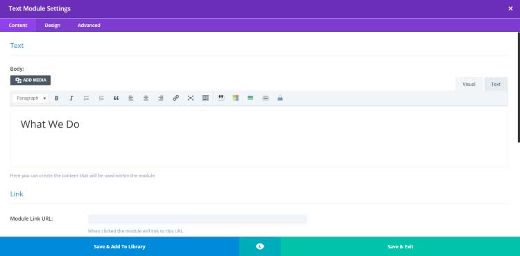
Here’s a Text module opened in full-screen. This is on a WooCommerce product post type using the Classic Divi Builder.
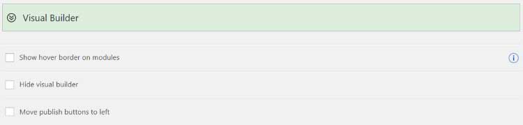
Visual Builder settings let you show the hover border on modules, hide the builder, and move the publish buttons to the left. This helps make building visually a little easier.

For the Accordion module, make them start as closed and make them closable. Make left-placed Blurb icons larger. Hide the leading zero for days on the Countdown.
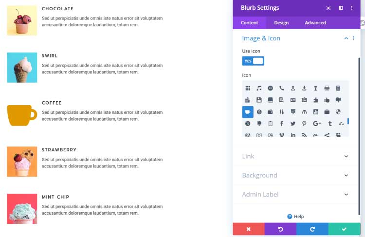
I’ve replaced the coffee image with an icon. Icons are normally about two lines tall.
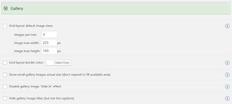
For the Gallery module, set the default images per row and sizes, the border color, show actual size for small images, disable the slide-in effect, and hide the gallery image titles.
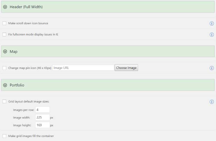
For the Full Width Header, make the scroll down icon bounce and fix an IE issue. Map lets you upload your own map pin icon. Set the Portfolio grid layout’s images per row and sizes, and make the images fill the container.
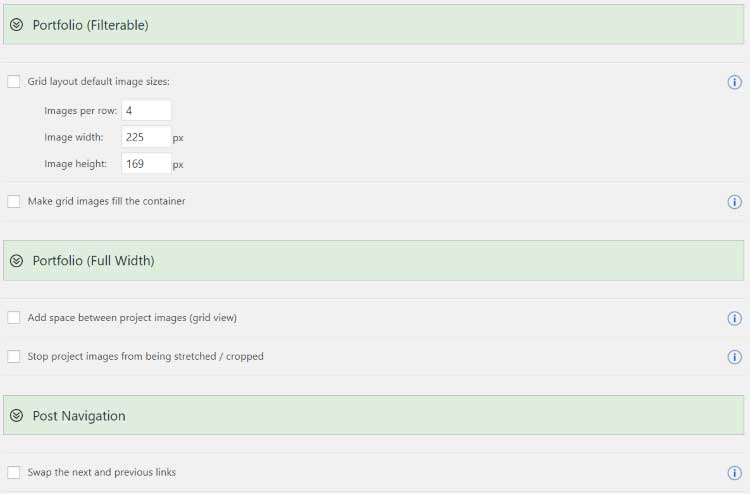
Set the Filterable Portfolio image sizes and to fill the container. For the Full Width Portfolio, add space between the images and stop them from being stretched. For Post Navigation you can swap the links.
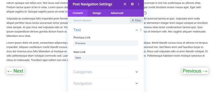
Here’s a look at the post navigation links swapped to the opposite sides.
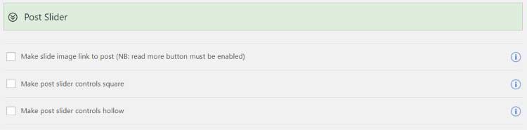
The Post Slider can make the image link to the post, make the controls square, and make them hollow.
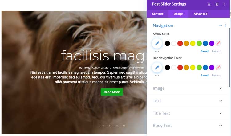
I’ve made them square and hollow.
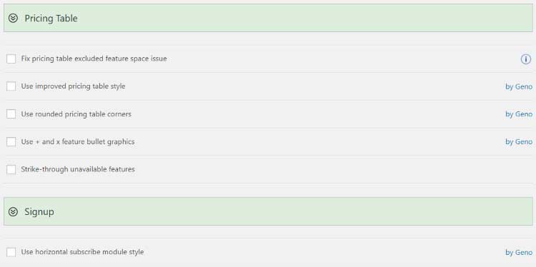
For the Pricing Table, you can fix the excluded feature space problem, use an improved style, use rounded corners, use + and x for bullet graphics, and use strikethrough to show something is unavailable. For the Signup, use a horizontal style. Most of these features are by Geno.
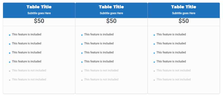
The nice pricing table style basically creates a new look to the table, almost like a different module.
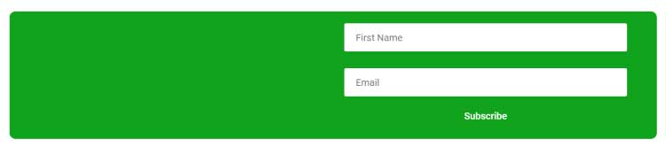
Here’s the new design for the email opt-in (signup) form.
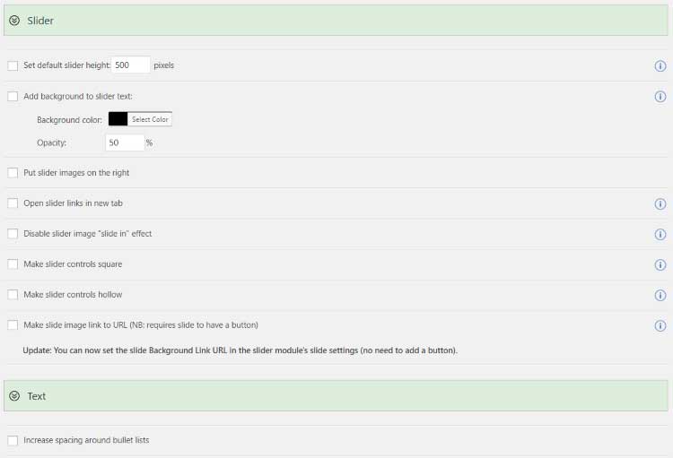
The Slider module lets you set the default height, add a background color, place images on the right, open links in a new tab, disable the slide-in effect, make the controls square, make the controls hollow, and make the image link to a URL. For the Text module, we can increase the spacing around bullet lists.
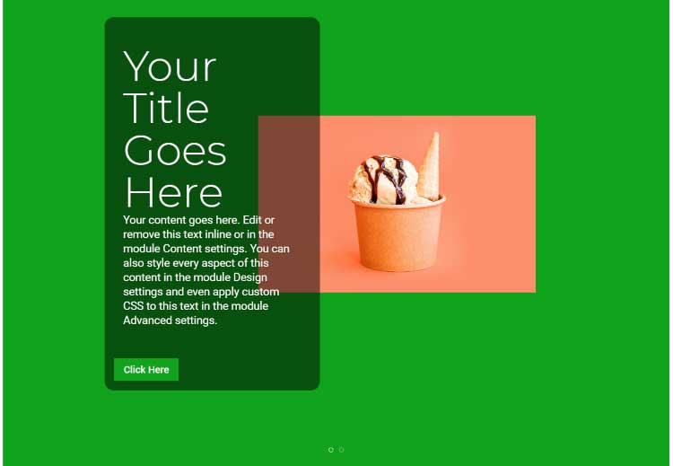
Here’s the new slider design. I’ve added the background behind the text, moved the image to the right, and made the navigation hollow.
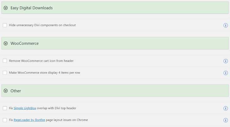
Plugins lets you hide Divi components at checkout for Easy Digital Downloads. For WooCommerce it can remove the cart icon in the header and display 4 items per row. It also fixes issues with Simple Lightbox and PageLoader.
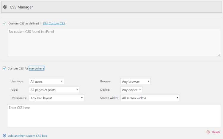
CSS Manager adds a new custom CSS box that connects to the regular WordPress and Divi CSS options. It also adds a feature where you can create any number of custom locations of how and where the CSS will be used. Choose the user type, page, Divi layout, browser, device, and screen width. Add as many custom CSS boxes as you want. This is an excellent way to target CSS.
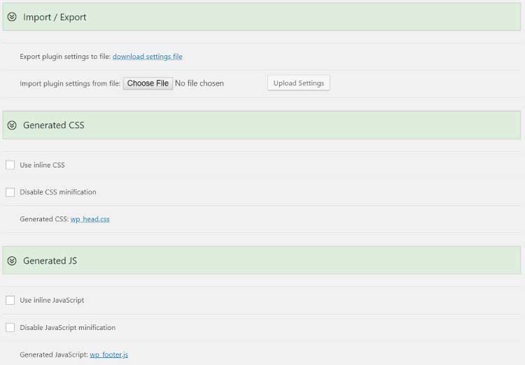
Developer Tools adds a few features that handle code. Import/Export lets you import or export files. Generate CSS lets you generate inline CSS and disable CSS minification. Generate JS lets you use inline JavaScript and disable JS minification. Click the links to see the generated code.
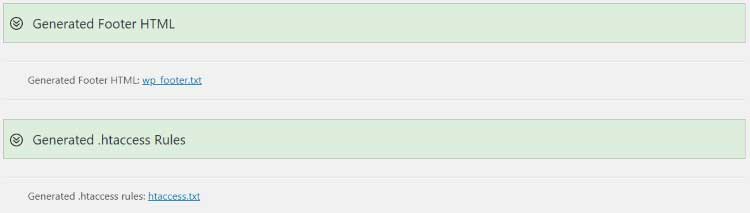
Generated Footer HTML and Generated .htaccess Rules let you see the generated code.
Divi Booster has a lot to offer for its price. It provides useful features for just about every aspect of Divi and it’s easy to use. All of the features are placed within one screen and the controls are intuitive. If you want to add lots of new features to Divi in the easiest way possible, Divi Booster is worth a look.
Have you tried Divi Booster? Let us know what you think about it in the comments.