The web's connective tissue is its links. When properly constructed, they facilitate users' navigation through information, provide assistive technology with predictable navigation, and give search engines clearer signals about page relationships. When they are badly constructed, they can make your site structure less clear and cause friction for consumers. You may make things clickable in Divi 5 in two different ways. The Link Option Group, which can make an entire module or container interactive, is included in the majority of modules. Divi's link settings are also used by the more recent Link Module, albeit it produces an actual <a> element in the HTML. This allows you to provide semantic links more easily without the need to style a full Button module or use a Text module. This article examines the differences between those two strategies, the situations in which each makes sense, and the reasons why combining them is frequently the most useful method.
In Divi 5, "clickable" might refer to two distinct concepts that are not interchangeable. An actual HTML <a> tag is a semantic connection. It is recognized as a link by search engines, keyboard navigation, screen readers, and browsers. A larger clickable surface made with Divi's Link Option Group is called a dynamic click area. Allowing users to click wherever on a card, column, or module enhances usability, but it is not the same as producing a complete semantic anchor for that entire area. This distinction is important since the two methods address distinct issues. For usability, dynamic click areas are excellent. For crawlable markup, accessibility, and organization, semantic linkages are crucial. The ideal option in many real layouts, particularly those using cards and looped designs, is to combine the two.
HTML has included the anchor element, <a>, since its inception. It makes a hyperlink to another site, which is its special function. When a browser comes across an anchor that has a href property, it recognizes that the element points to another location. Links convey more than just click behavior, which is why it counts. Anchors are announced as links by screen readers. They can be tabbed to by keyboard users. They can be followed by search engines to find and comprehend connected pages. Additionally, anchor text aids in communicating the destination of that link. These advantages are less obvious when a clickable area lacks an anchor element. Although a container that reacts to clicks via JavaScript could still feel clickable to a mouse user, it lacks the built-in HTML signal of an actual link. Only the semantic links in the card are actual <a> elements in the example below, but the entire card is clickable.
Take note of the lower-left corner's browser status section. Semantic links are the only ones it recognizes as regular HTML links. Only certain portions of the card are shown in the markup as anchors, even if the entire card is clickable. These anchors in this case are the post title, which is frequently the most descriptive anchor text on the card, and the category link.
Many Divi modules have the Link Option Group on the Content tab, but each module has its own implementation. An actual <a> element is produced by modules like the Button Module and Link Module. The Link Option Group can be used by other modules, such as Groups, Columns, Blurbs, Images, and many more, to generate a clickable surface without making the entire module an anchor in the DOM. Why even use a dynamic click area? because the user experience may be enhanced. Consider a blog card whose primary objective is to direct readers to the complete piece. Making the entire card clickable lowers friction if the image, title, and excerpt all point to the same location. It is not necessary for users to search for the precise connected element. This is made simple on numerous modules and containers by Divi's Link Option Group. Divi may make the entire surface clickable by adding a URL to the Link option of a module or container.
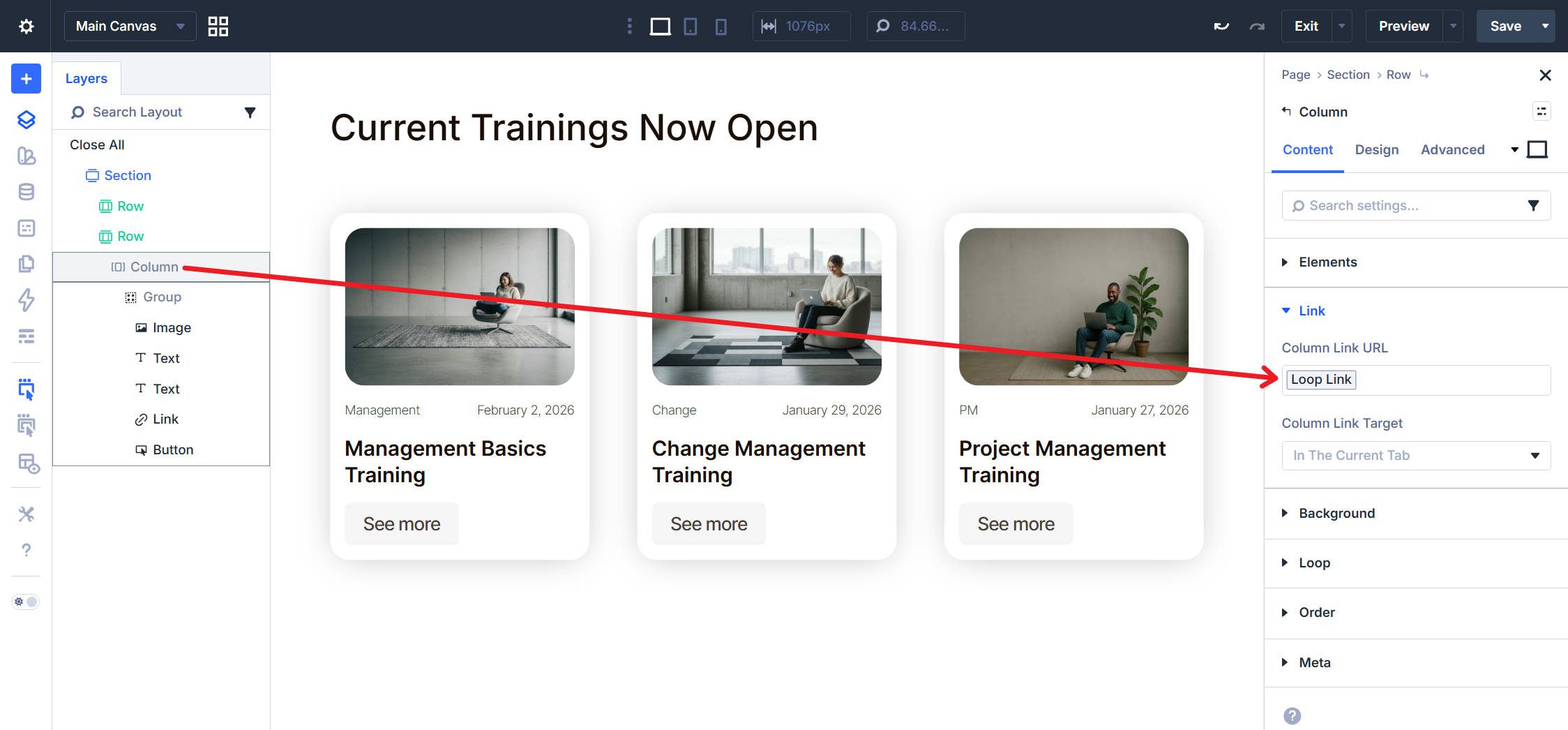
This method works particularly well for looped patterns and cards. For instance, a blog card may contain more specialized semantic links, such a linked headline, category link, or read more link, while using the container-level link as the general click area. Divi manages this hierarchy wisely as well. When clicked, the inner link may continue to be the more precise destination if a module within that clickable container already has its own semantic link, such as a Button Module or Link Module.
Since the Link Module is more recent, it is important to highlight its unique features. An actual <a> element is produced in your page HTML by the Link Module. This provides you with a native semantic link that search engines, screen readers, and browsers can all detect immediately, in contrast to the more general click-area behavior utilized by many other modules. The module all the design settings you would anticipate from a Divi module, like as padding, background, border radius, and hover style, plus it accepts link text and a URL. Because of this, it can be used for purposes beyond than simple inline links. When you require semantic link output without the additional design overhead of the Button Module, you can style it as a lightweight button-like element. When the Button Module is used as a link, it automatically outputs an anchor, making it semantic as well. Intent and weight are the main areas of variation. When you want a simple semantic connection that you may customize as appropriate, the connection Module is easier to use and more adaptable.
Depending on what you are developing and the function that the link must serve, you can choose between the Link Option Group and the Link Module.
When a module or container's whole click behavior is desired. Cards, loop items, and other layouts where the entire surface is intended to travel to the same destination benefit greatly from this. It enlarges and simplifies the click target. Make Use of the Link Module when the website markup requires an actual <a> element. This is important because browsers, assistive technology, and search engines should be able to easily access the link itself. It also functions well when you do not want to use a Button Module and only need a basic, styled link element. Combine the Two When creating clickable user interface cards, you must have both a robust semantic structure and ample click locations. Place a semantic connection using a connection Module, a connected Heading, or a Button Module after setting the Link Option Group on the outer container. This preserves important anchors in the content structure while allowing users to click wherever.
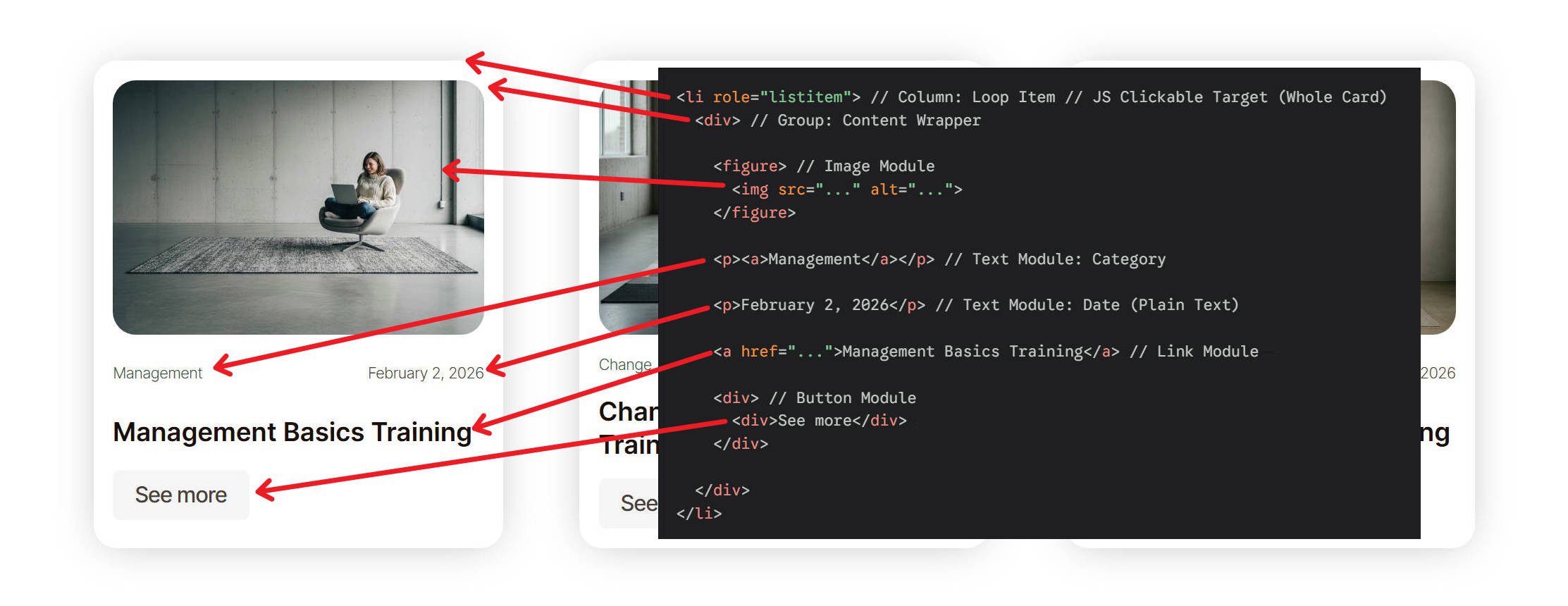
This combined strategy is frequently the most useful. Usability is enhanced by the container-level link. Semantic clarity is maintained via the internal anchor.
In Divi 5, the Link Module and the Link Option Group address distinct issues. For larger click targets and more seamless user interface behavior, the Link Option Group is great. When you want a clear semantic anchor in the markup, the Link Module comes in handy. The optimum strategy in many real layouts, particularly those involving cards and loops, is to not select one over the other. It makes deliberate use of both. Your links will function better for users, assistive technology, and search engines if you match the approach to the task.