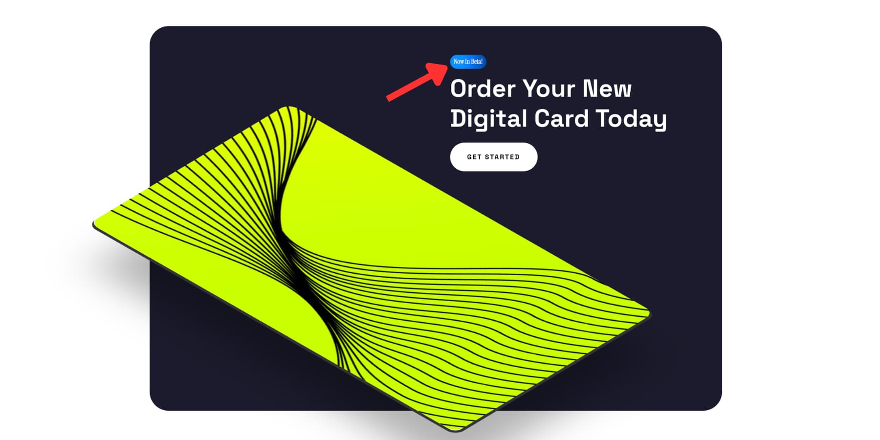
Although they are a minor component of web design, badges effectively address a very particular issue. Without interfering with the remainder of the arrangement, they provide brief context. Because they may convey important information in a small amount of area, you see them on feature lists, pricing tables, product cards, and documentation pages. Simple labels like New, Sale, Beta, or Popular help direct attention and make meaning clear at a glance. That is a badge's true worth. The entire design is not carried by it. It provides a distinct visual cue precisely where it is required. The good news is that Divi 5 makes it simple to create this kind of intricacy. To make a tidy text badge, neither a plugin nor a workaround are required. You can rapidly create one and make it blend in with the rest of your website by using the proper combination of text formatting, spacing, background, and sizing
Short, stylized labels that provide context without taking up much room are called text badges. They may be affixed to headers, slipped into pricing tables, clipped to product cards, or positioned next to menu items. It is not their responsibility to explain. They are responsible for signaling.
Badges are valuable because of this. Compared to a longer block of text, a label like New, Sale, Beta, or Popular can reroute attention more quickly. That type of visual shortcut is important in a thick layout. Additionally, good badges depend on self-control. The color does most of the work, the shape remains compact, and the writing remains brief. A badge can complement the surrounding information without drawing too much attention away from it if those three factors remain balanced.
A text badge could resemble something you would typically create using specialized plugins or custom CSS. The Visual Builder in Divi 5 is already a good fit for this type of component in practice. You can create a neat badge with native controls if you choose the proper text styling, background, spacing, sizing, and border radius. Including a Heading or Text Module For a badge, either the Heading module or the Text module can be used. The circumstance determines the appropriate decision. When the badge is just a visual label, like New or Sale, use the Text module. It is lightweight, easy to apply, and generally effective. When the badge needs to fit more purposefully into the page layout, use the Heading module. Although it will not happen as frequently, it might make sense if the badge is directly related to a title or another structured piece of content. We will be using a Text module for this tour. Type your label after adding it to your column. The sweet spot is often between one and three words. As the lettering lengthens, it begins to resemble a caption rather than a badge.
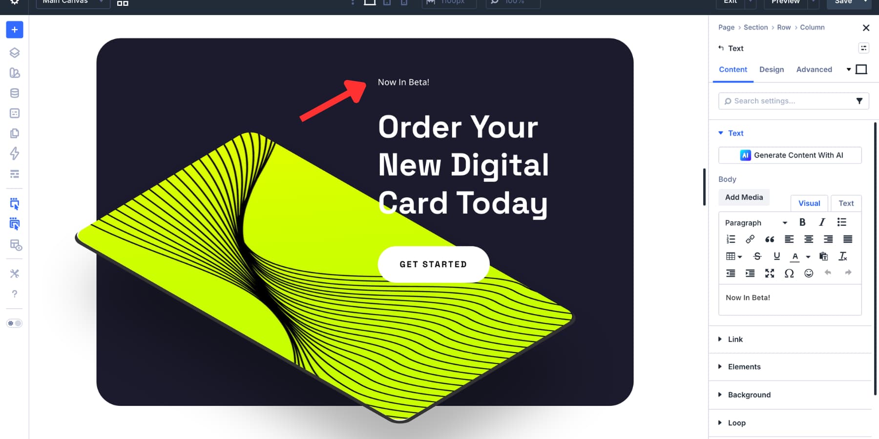
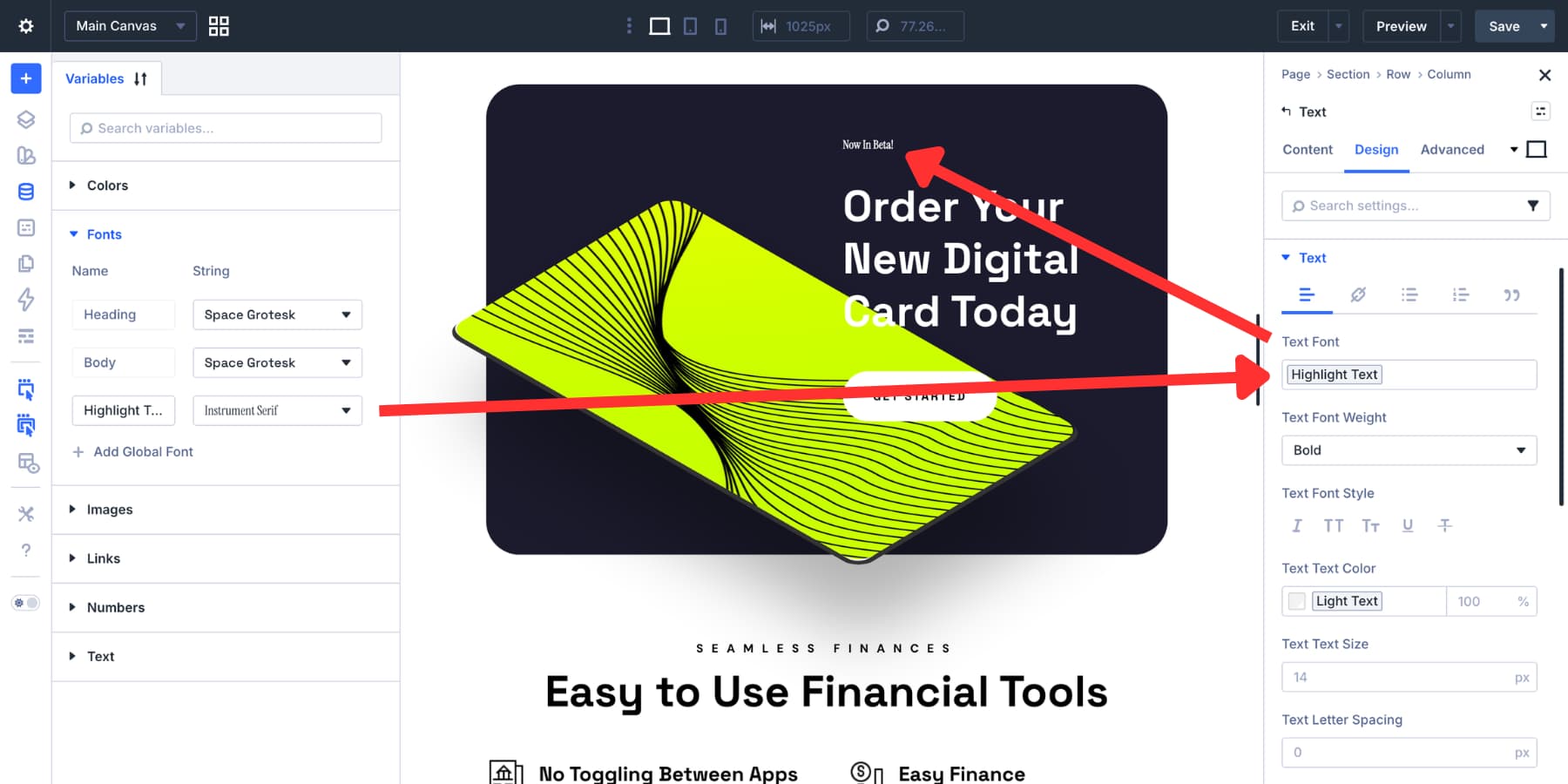
Sans-serif fonts typically work best for typography at small sizes. Bold or medium weight keeps the writing clear. Instead of choosing specific font settings, use the font variables you already have in Divi 5's Variable Manager.
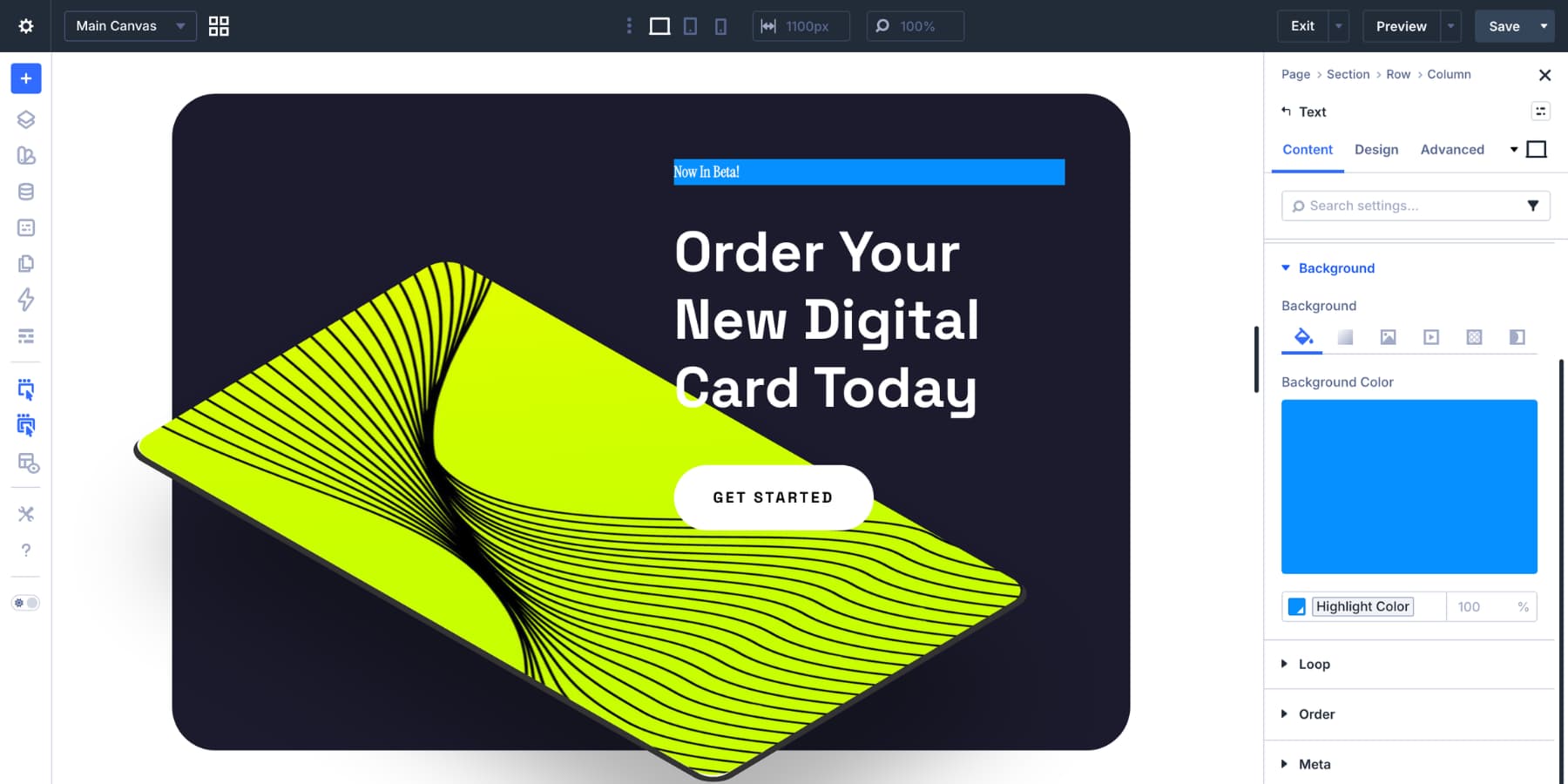
The color of the text is the same. Select a piece that contrasts sharply with the background you intend to utilize. It usually works well to use white on a dark fill or a dark tone on a light fill. For consistency, utilize your brand colors here as well if they are saved as variables. Making It Appear Like a Badge The first item that gives the module a badge-like appearance is the background. Select a fill color that contrasts sharply with the text after opening the Design tab and expanding the Background option group. This is a nice area to use color variables if you already have them in your project.
Another option is to use a faint gradient. Keep it in check if you do. At badge size, closely similar tones of the same color typically work better than anything striking.
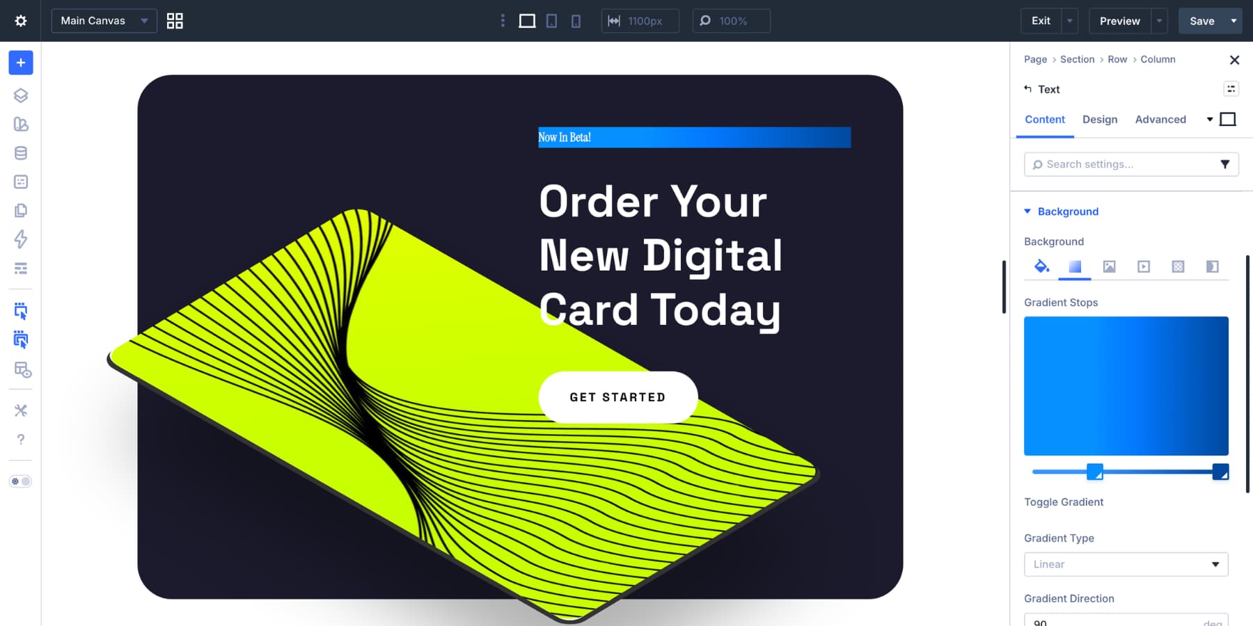
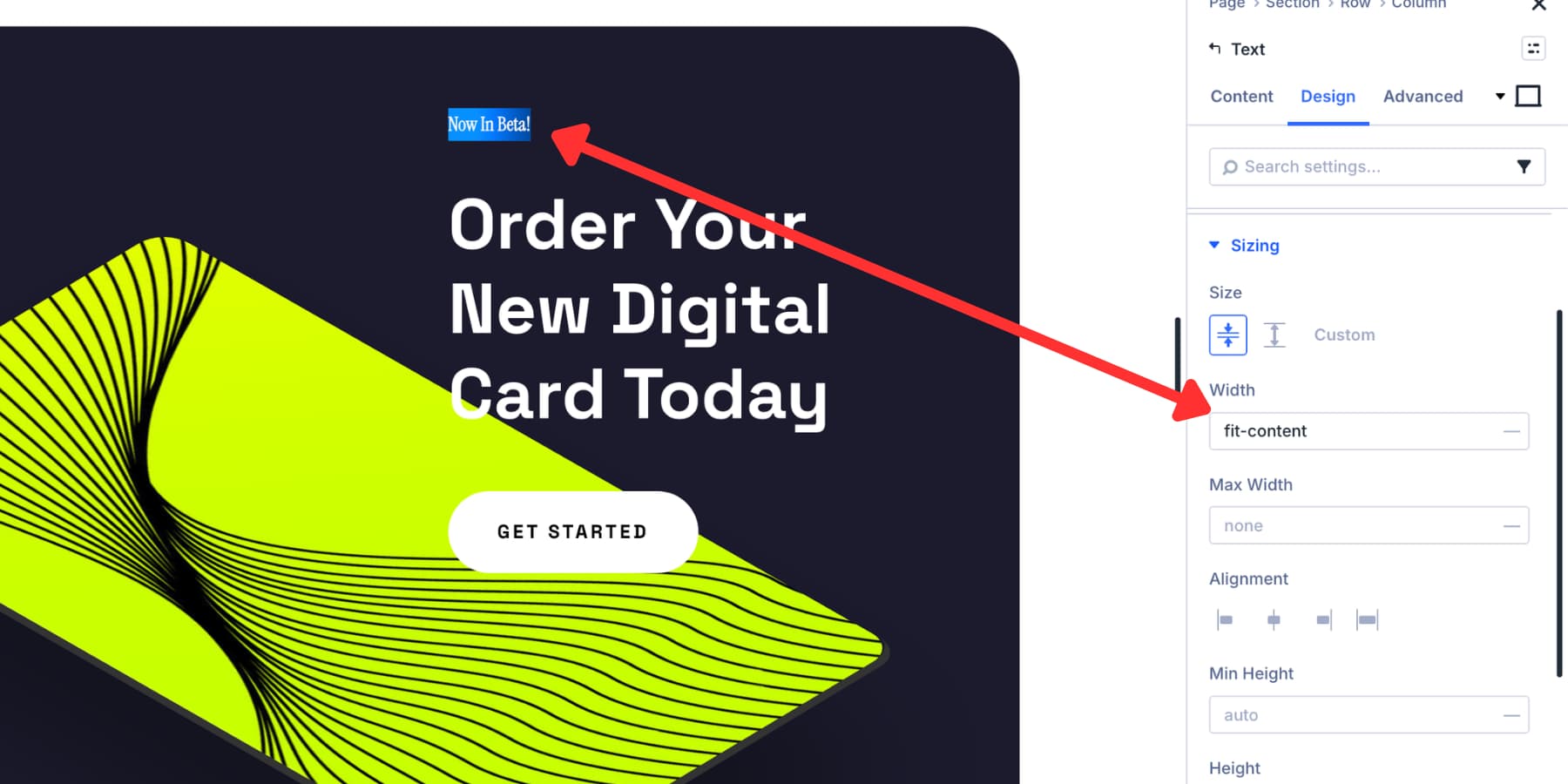
At this point, you might see that the backdrop fills the entire column. This occurs because the Text module is by default block-level. Navigate to Design > Sizing and select fit-content for the width. As a result, the module is reduced to the width of its contents.
Next, use padding to shape the badge. Add padding on all sides and leave the spacing open.
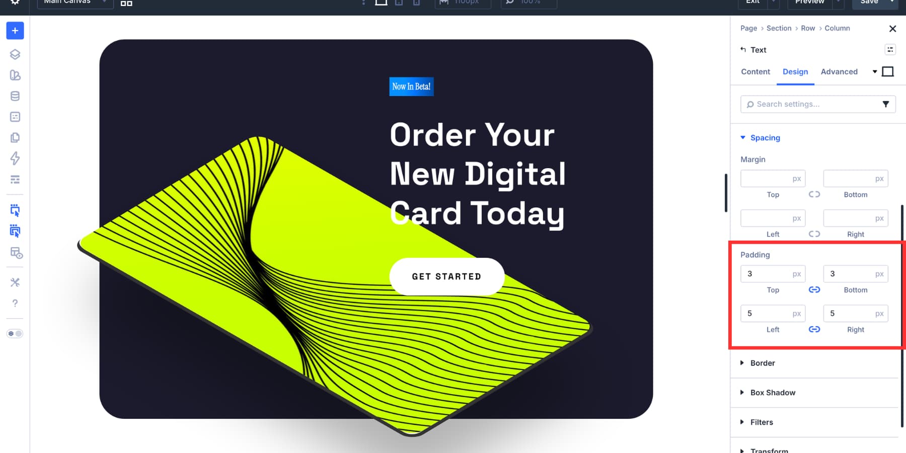
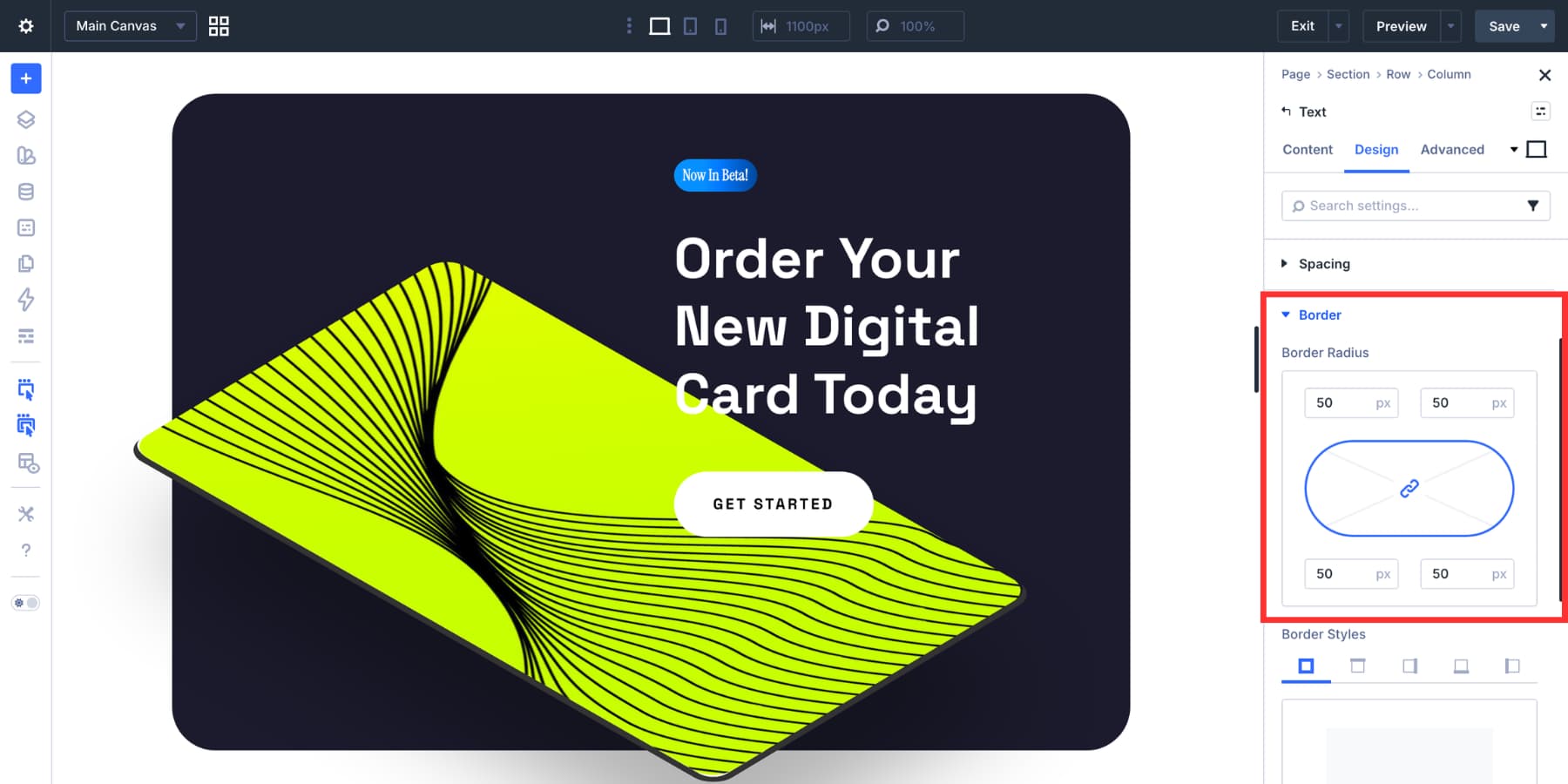
Making the left and right padding around 1.5 times the top and bottom numbers is a nice place to start. For instance, a compact badge form can be created without feeling crowded by using 3px vertically and 5px horizontally. The overall style is determined by the border radius. Keep it lower for a more rectangular label, or raise it to form a pill shape. Depending on the remainder of the design system, both can function effectively.
The insignia can also be distinguished from the background with a faint box shadow. To enhance depth without drawing too much attention to itself, keep the opacity low and the blur gentle. Your text badge is now available.
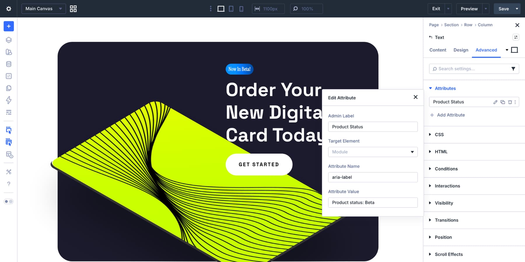
Although badges are frequently physically obvious, context is still important. Since the visible badge content is actual text within the module, assistive technology will frequently already announce it. This implies that you do not always need to add anything more. Whether the badge need further context beyond what is provided by the visible language is what counts. If so, enter the Attributes panel under the Advanced tab and add an aria-label with a more detailed description, like "Product status: Beta."
You can set aria-hidden to true so that screen readers ignore the badge if it is merely cosmetic and the surrounding content already conveys the same information. Setting Up the Text Badge In most cases, a freestanding badge does not require particular placement. It will align itself with the column in which it is positioned. The badge centers along with the column if it is centered. The badge aligns itself with the column if it is left-aligned. When you want the badge to sit next to or partially overlay another element, such a heading or image, things are different. If so, select Position settings under the Advanced tab. You can directly manage placement by using horizontal and vertical offsets when the Position Type is set to Absolute.
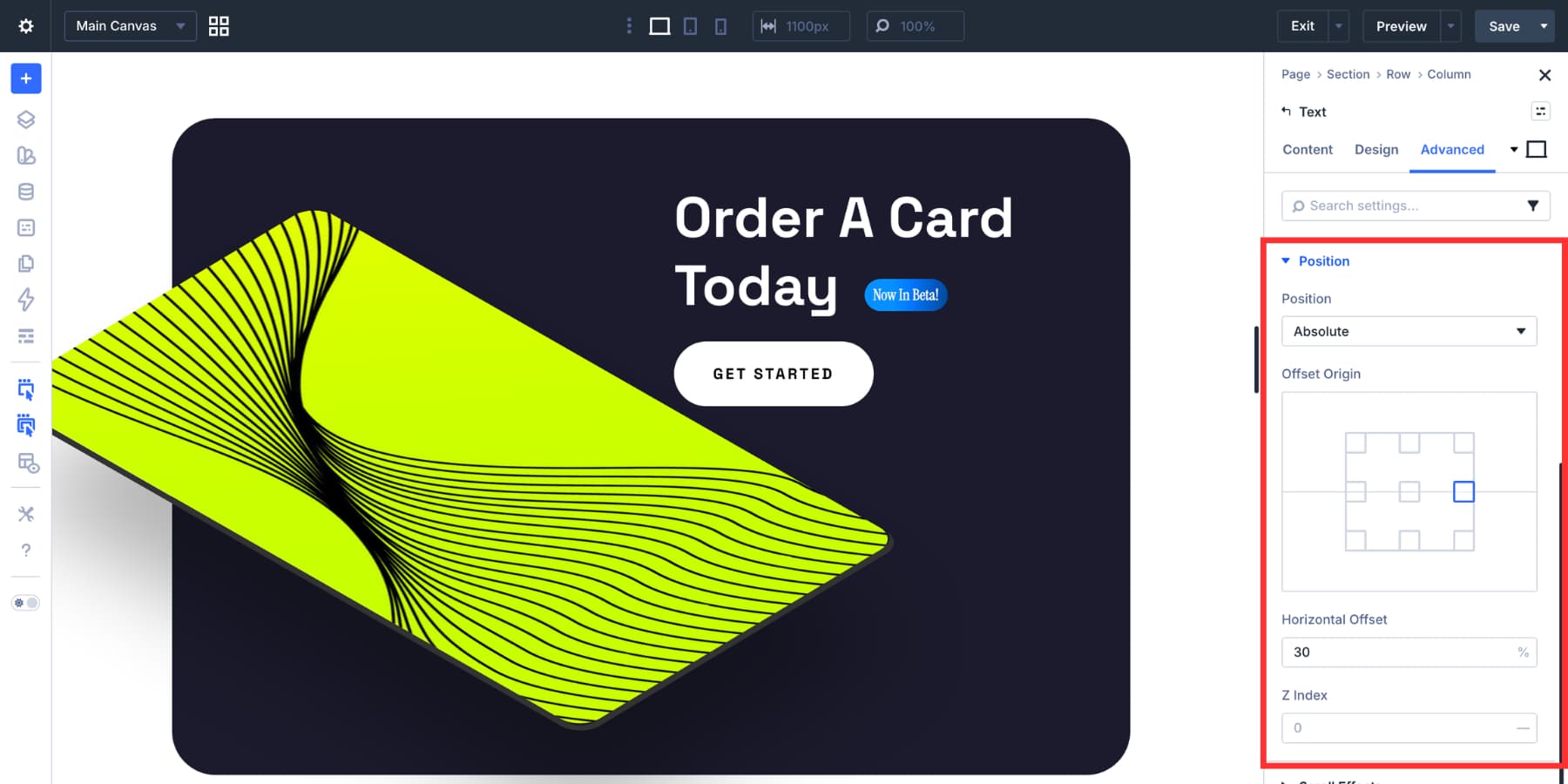
You might need to use Divi 5's Responsive Editor to modify those offsets for tablets and mobile devices. In these situations, relative units like percentages frequently scale more smoothly than fixed pixels.
Divi 5's Canvases are another helpful choice if you intend to utilize the same badge styles in several locations. Instead of rebuilding each time, you can create one or more badge variations on a disconnected canvas and then use the Canvas Portal Module to place them into pages or Theme Builder templates. The Canvas Portal Module is particularly helpful for reusable components that must appear in several locations because it inserts material from a disconnected Canvas straight into your main layout or Theme Builder template. Here's how to set that up practically: Create Your Badge Using a Detached Canvas Create a new canvas by using the Canvas option in the Visual Builder's upper left corner.
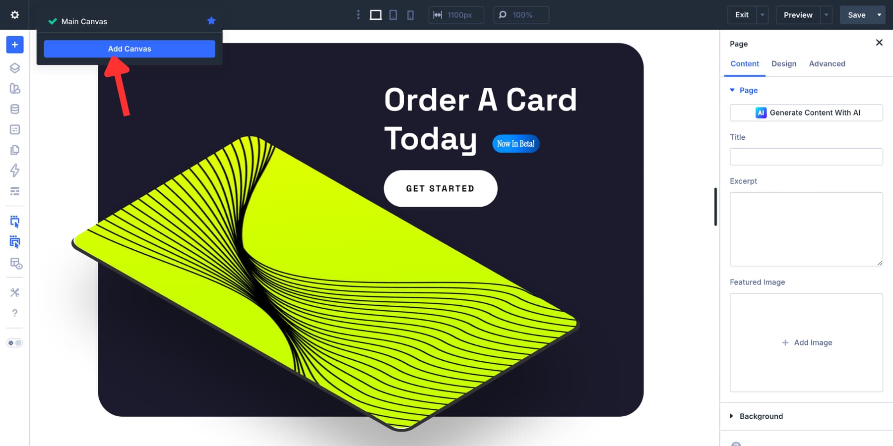
Make the Canvas global if you want the badge to be accessible throughout the entire website. Give it a clear name, such "Sale Badge." Then use the background, padding, border radius, and font options that were previously discussed to create your badge there.
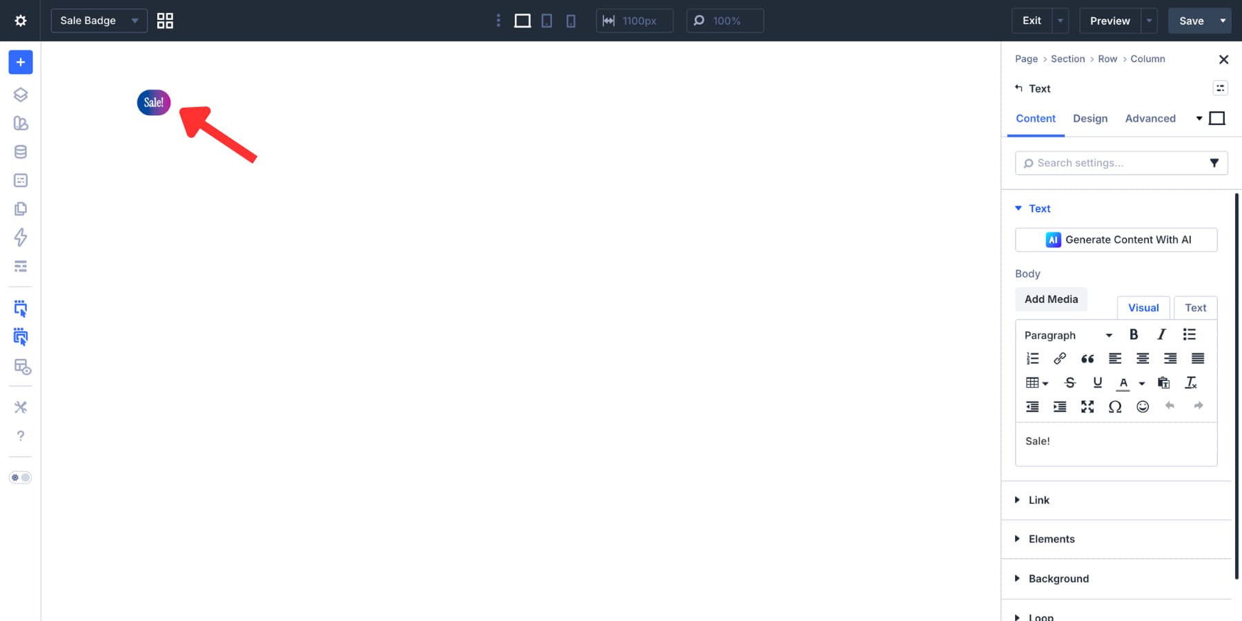
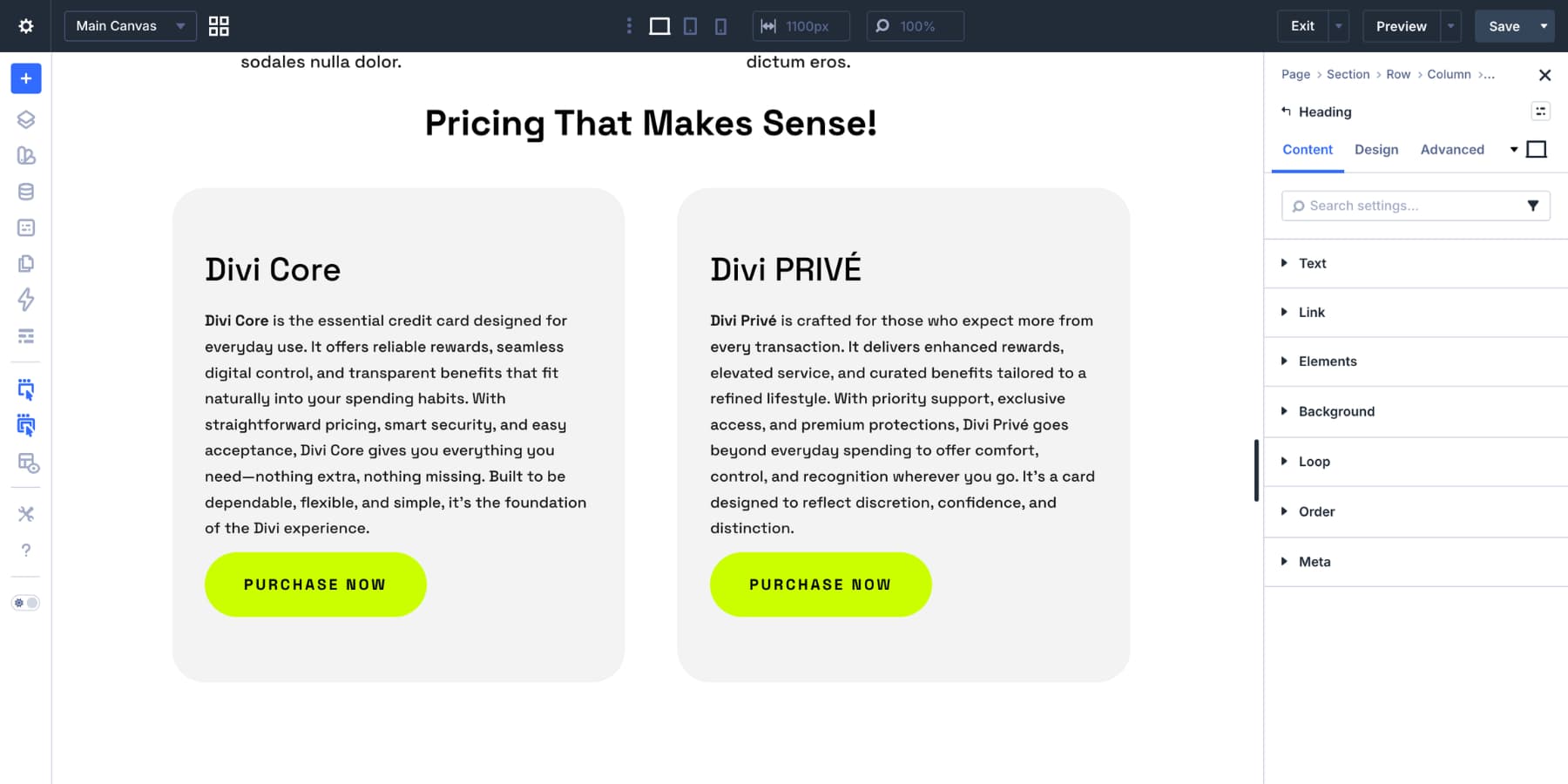
When your badge is ready, adjust the row and section widths so that the badge fits neatly. In addition to preventing the Canvas Portal output from appearing larger than necessary when incorporated into another layout, reducing their default padding also helps. Construct Your Product Loop Return to the main canvas and use Divi 5's Loop Builder to construct your product loop. Create your card style, query your WooCommerce products, and enter dynamic content fields like the product title, image, and price. If you want to learn more about using Loop Builder to construct WooCommerce loops, here is a brief guide.
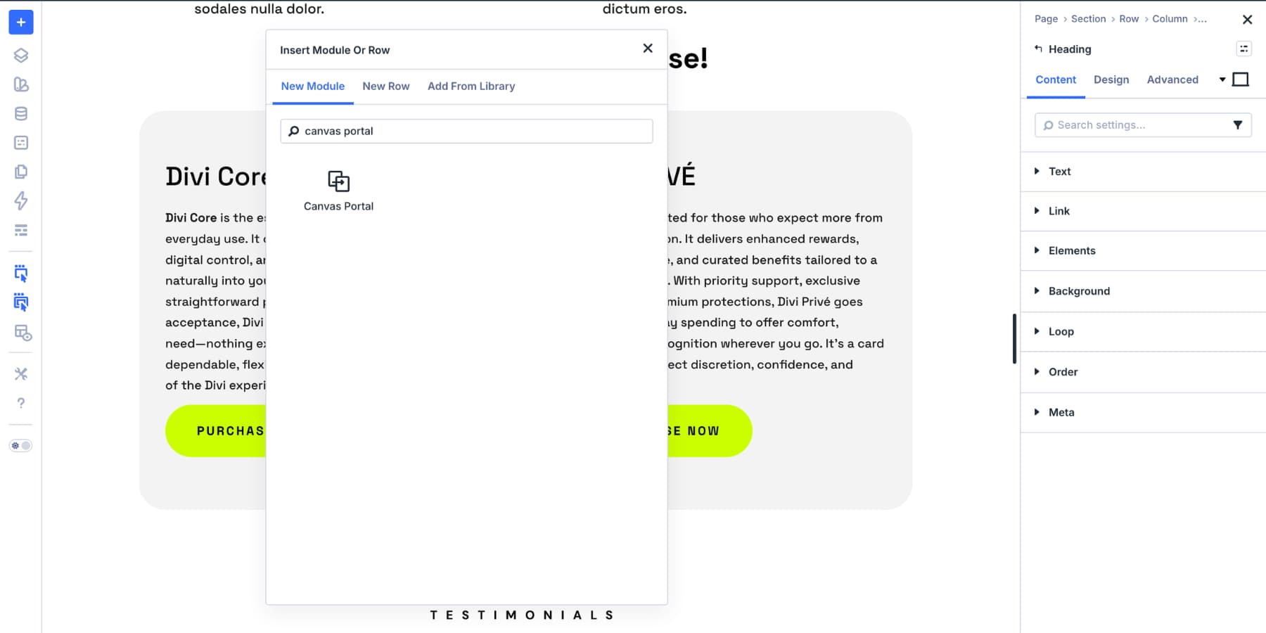
Next, add a Canvas Portal Module in the desired location for the badge.
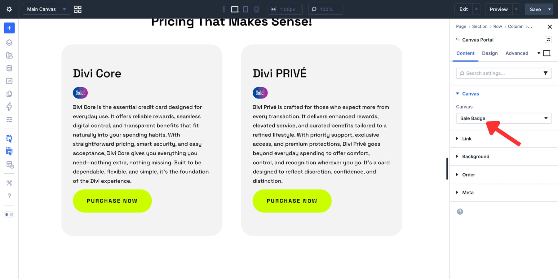
Choose your Sale Badge canvas by opening the Canvas dropdown in the module settings. While changes are still made in the original Canvas, Divi will render the detached Canvas content in that location on the site.
Open that Canvas, edit the wording in the wording module, then save to change the badge from Sale to Popular.
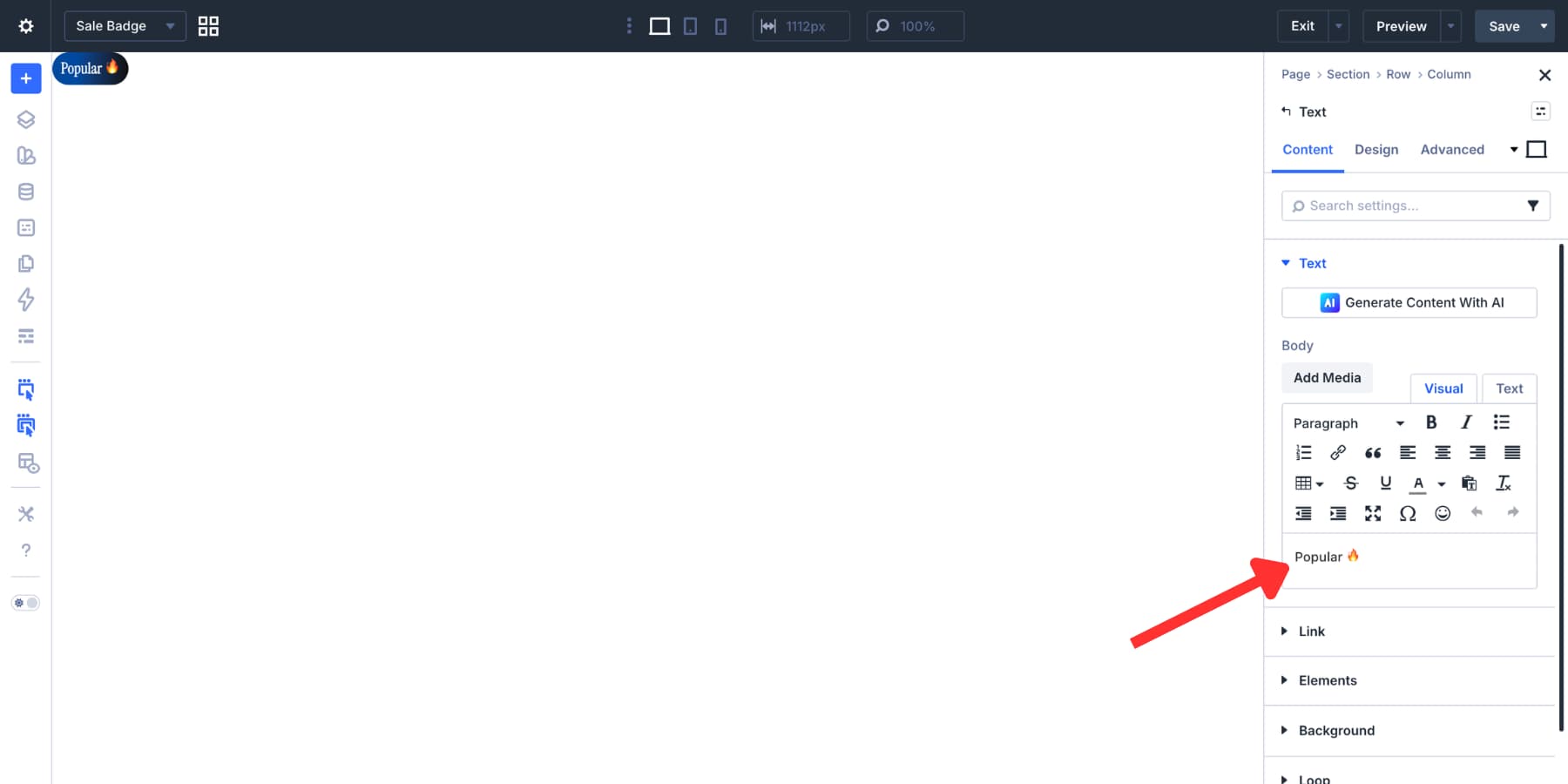
One of the key benefits of the Canvas Portal workflow for reusable material is that every location that uses it changes with it.
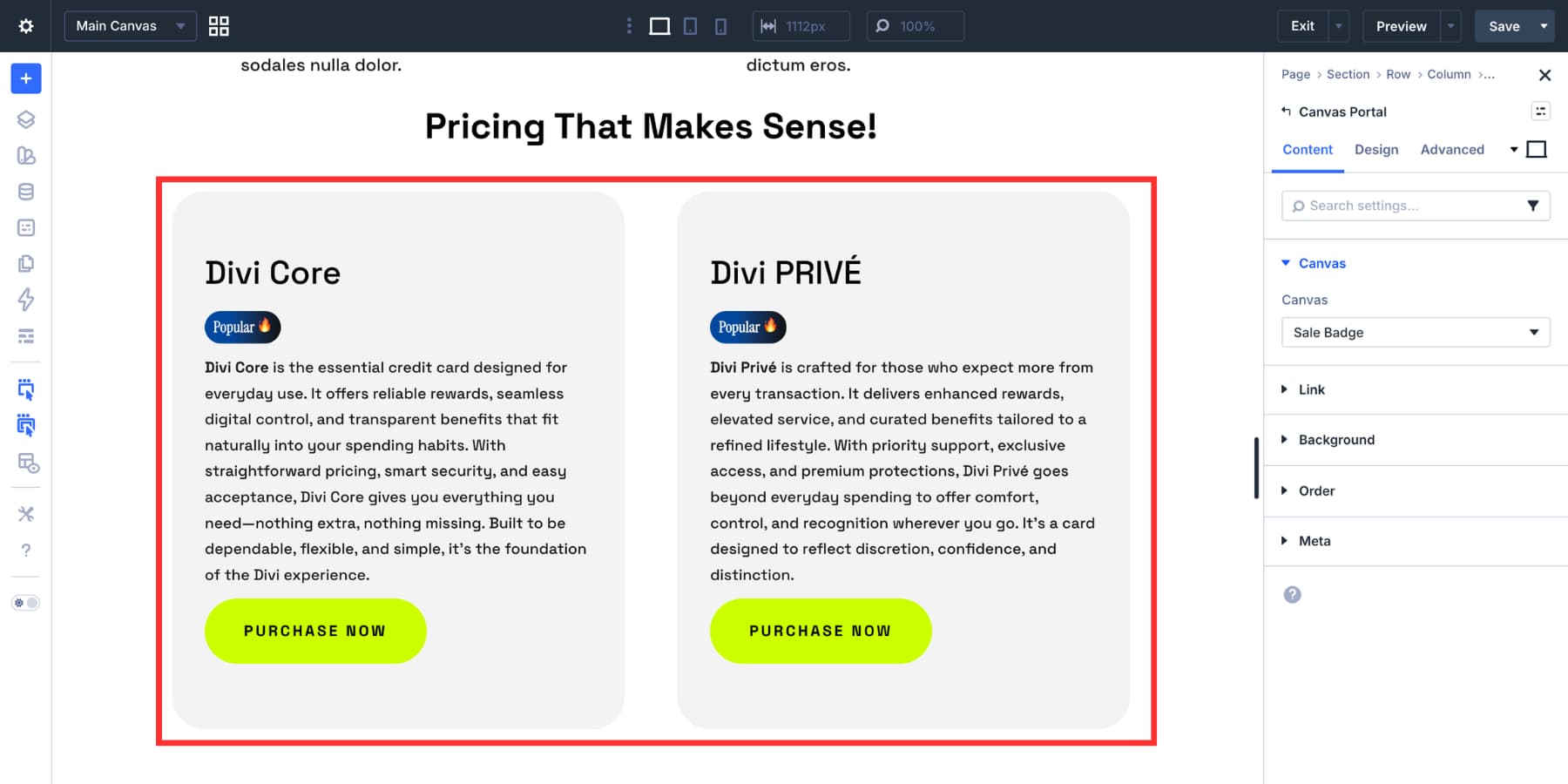
Make a second canvas called Popular Badge and point that loop's Canvas Portal Module to it if you need both labels to run simultaneously on separate loops. This method is particularly effective when your badges are a part of a larger reusable system, such announcement tags that occur in several templates, feature markers, or repeated promo labels. For a straightforward one-time badge, it is not required, but it is a helpful choice when reuse and consistency are important.
A Few Additional Text Badge Types The majority of badge use cases are covered by the above method, however there are a few more ways to apply the same stylistic logic.
Put two modules in a Module Group that is oriented in a row to create paired badges. Style one as a badge and leave the other as a plain-text label. Pairings like Status: Live or Plan: Pro benefit greatly from this.
Although text badges are small, creating them effectively touches on many of the features that make Divi 5 helpful, including custom attributes, reusable content systems, color variables, spacing ratios, border radius, presets, and responsive controls. On their own, none of those components are difficult. When you combine them, you may create a badge system that requires very little upkeep and remains uniform throughout your website.
Build in Divi 5 right now! Strong pages frequently have details that jump out. Before a visitor reads a complete text, a badge in the appropriate location, with the appropriate color and proportion, can enhance clarification. A well-executed small element gives the entire page a more deliberate vibe. You can create those details directly, maintain consistency, and reuse them without the need for workarounds using Divi 5.