Want to elevate your next web design project with some creativity and flair? In this tutorial, we’ll show you how to create floating blurb modules and build a features section that captivates the user’s attention as you scroll. By using Divi’s versatile blurb module and adding scroll effects, you can transform static layouts into dynamic sections that showcase your content.
If you’re interested in exploring the blurb module’s creative possibilities and learning how scroll effects can add some eye-catching movement to your website, this post is an excellent resource for you.
Let’s get started!
Here is how the design will look on mobile. Each blurb will appear with a subtle slide-in scroll effect.
Before we begin, install and activate the Divi Theme and make sure you have the latest version of Divi on your website.
Now, you are ready to start!
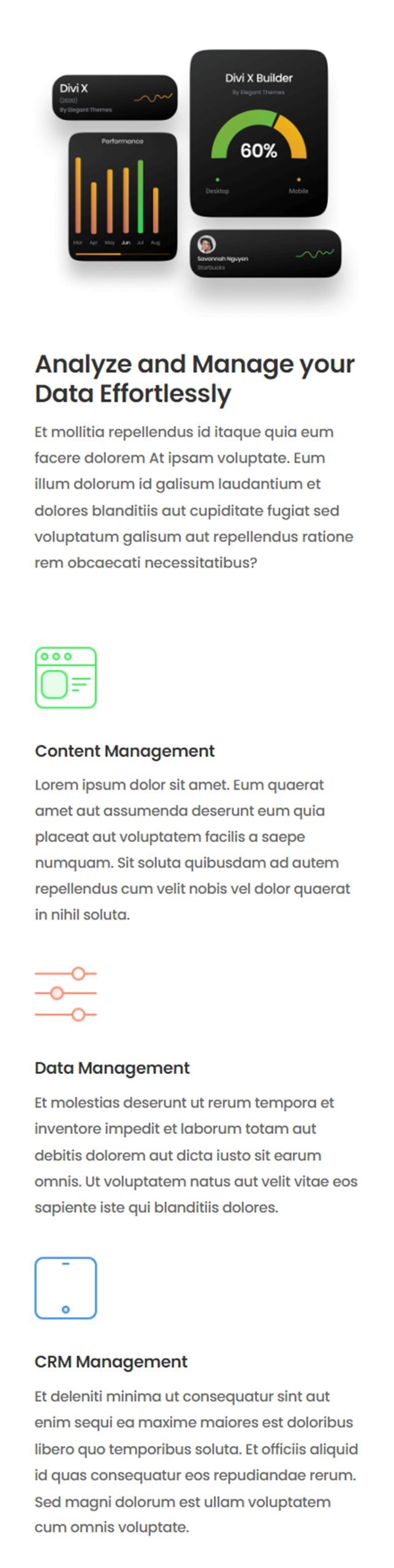
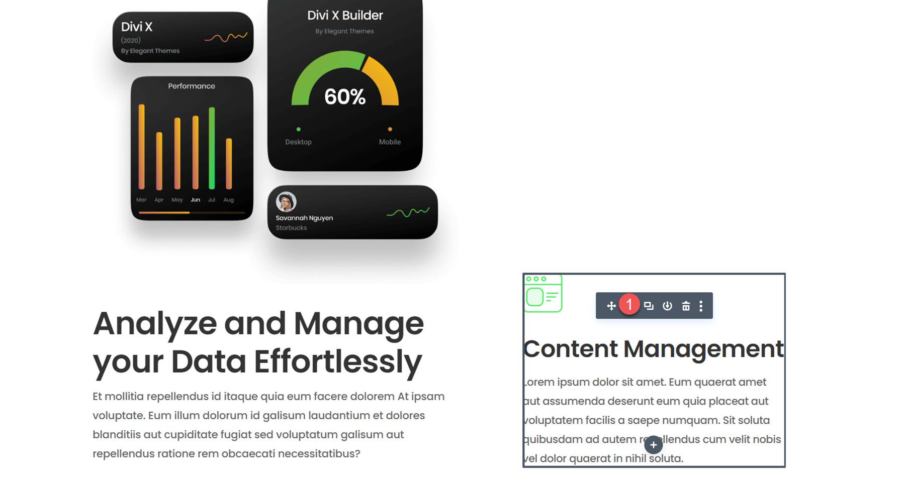
We will create a dynamic features section for this design using four blurb modules. In the left column, we will use sticky effects to make one blurb module float, capturing attention with a large image and heading text that introduces the benefits of the service. Three smaller blurb modules will appear sequentially in the right column, each with an icon and some text. By using Divi’s scroll effects, we can individually reveal the blurbs, creating an immersive user experience that effectively communicates key features.
Let’s start by using a premade layout from the Divi library. We will use the SaaS Product Landing Page from the SaaS Product layout pack for this design.
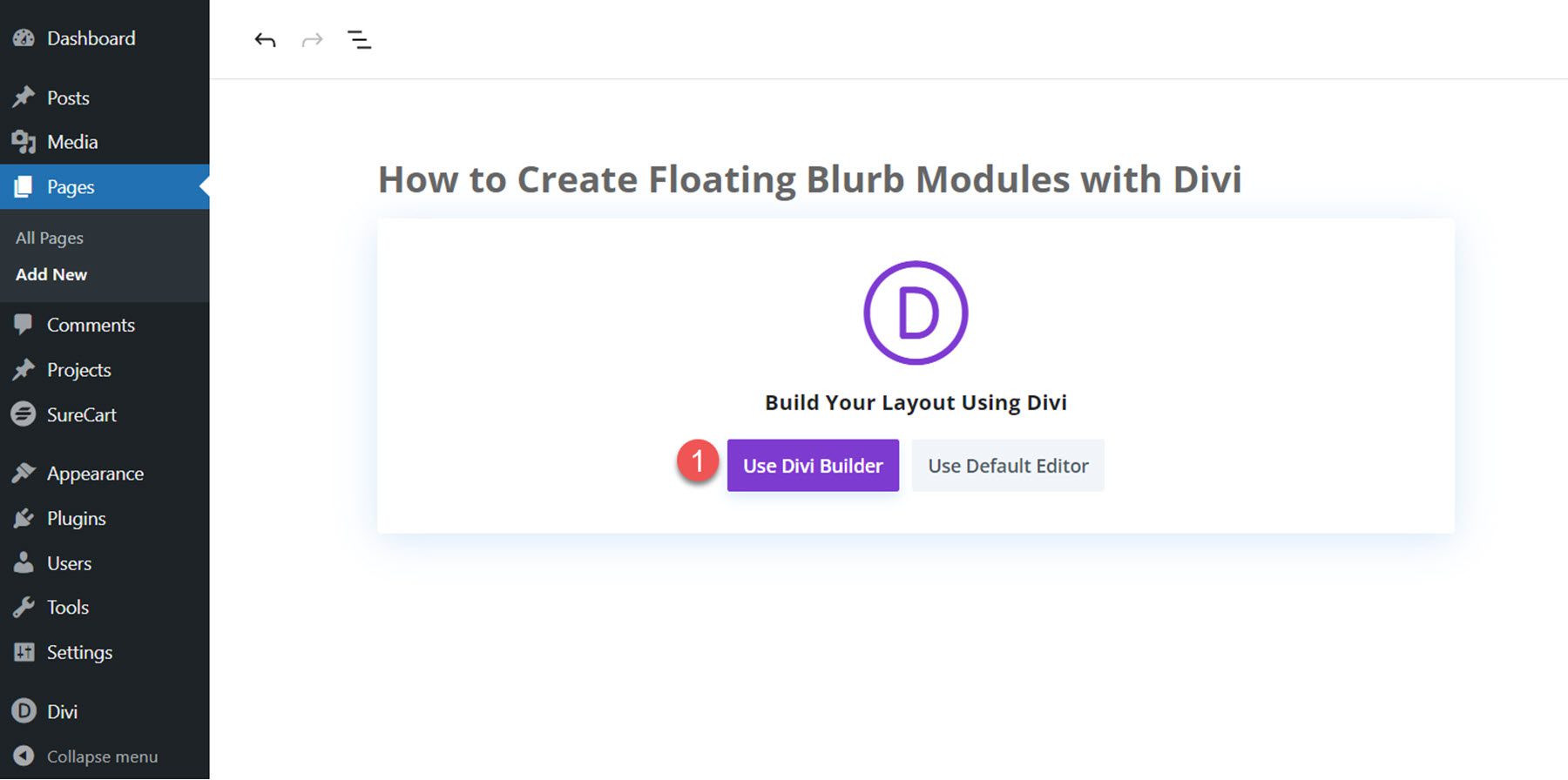
Add a new page to your website and give it a title, then select the option to Use Divi Builder.
Click Browse Layouts to use a premade layout from the Divi library.Search for and select the SaaS Product Landing Page layout.Select Use This Layout to add the layout to your page.Now, we are ready to build our design.
We will create a dynamic features section using the content from the services row and additional images from the layout. To begin, add a new section below the hero section.
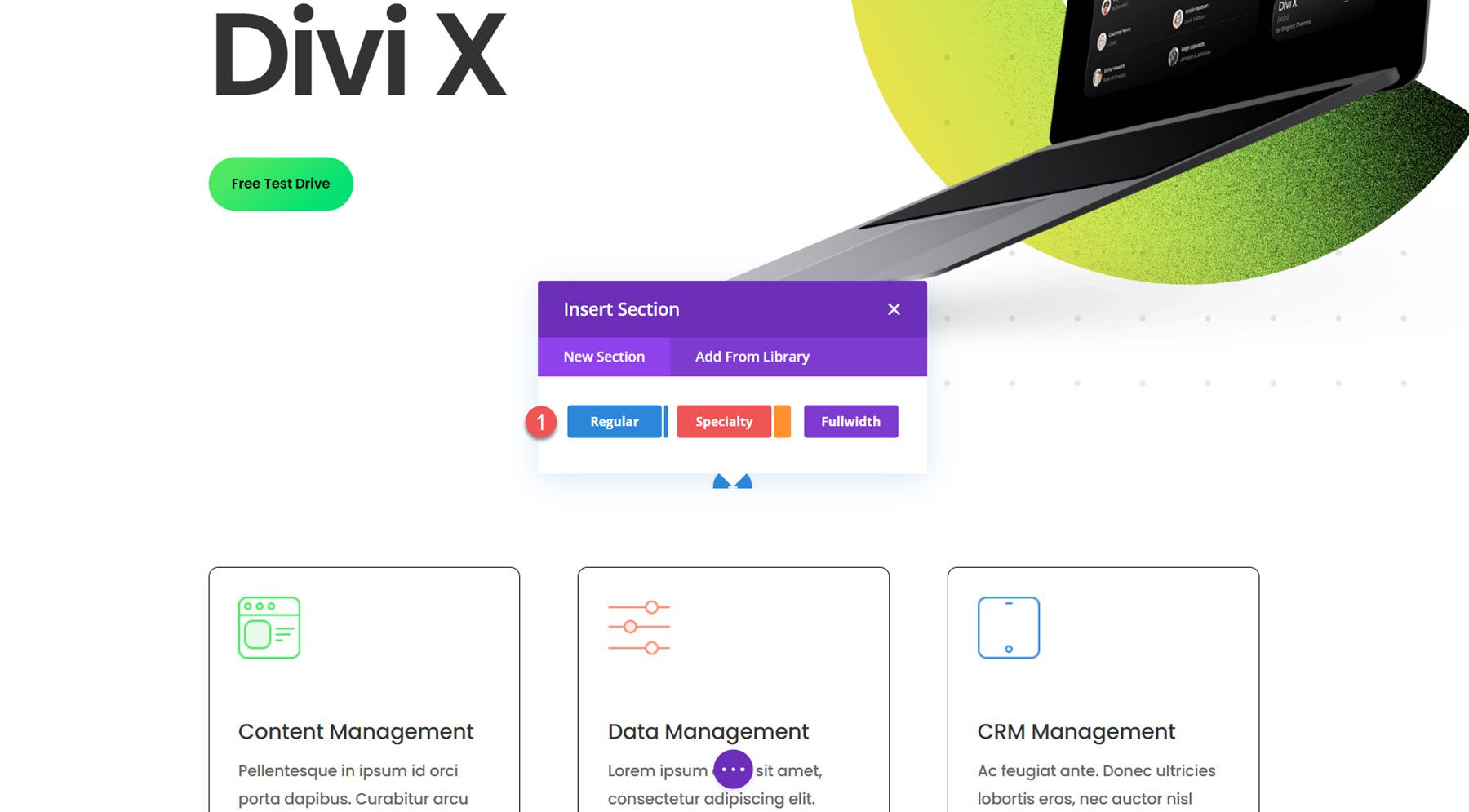
Next, add a row with two columns.You can also delete the section below with the three modules since we will recreate them with the blurb module throughout this tutorial.
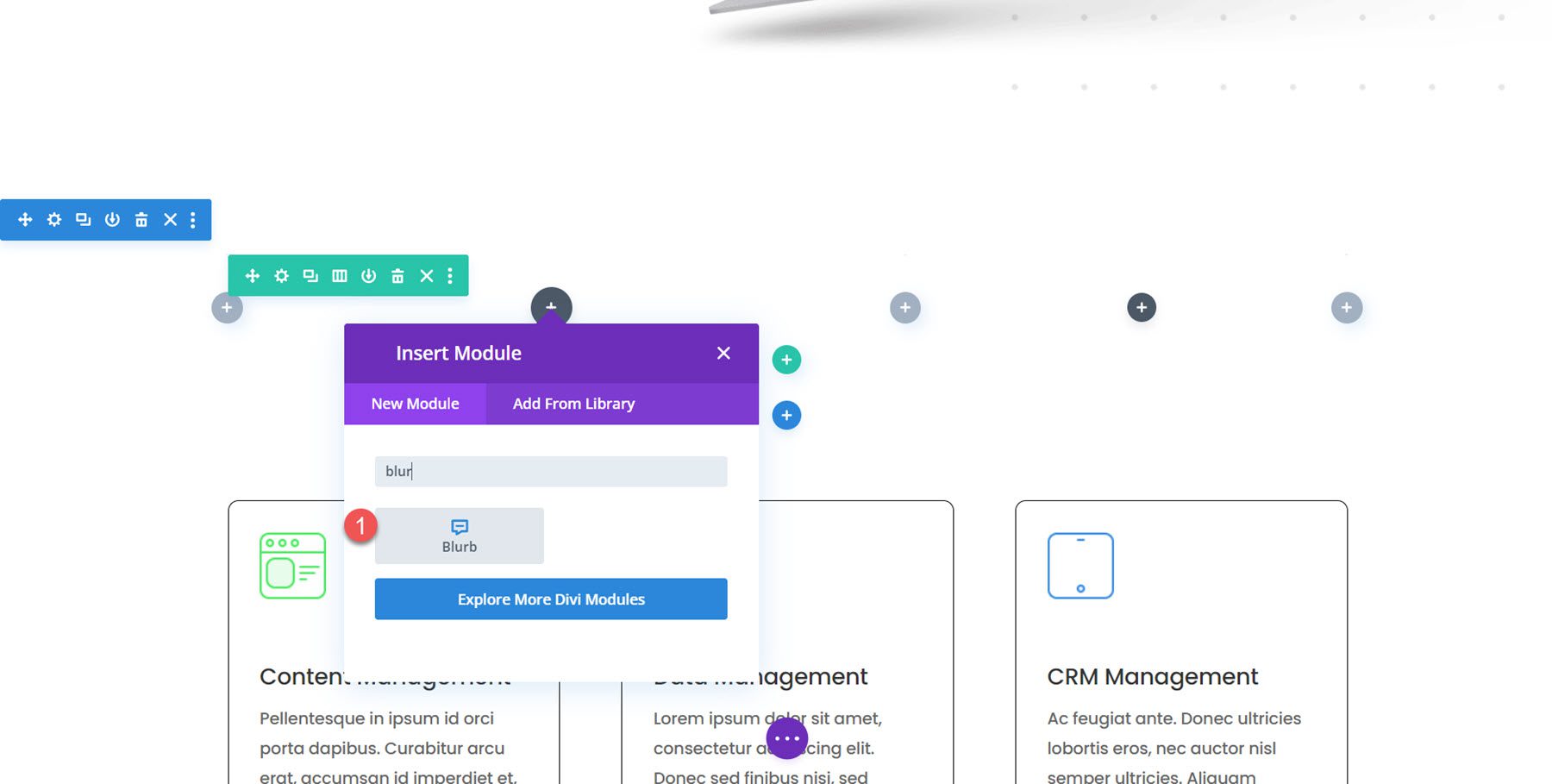
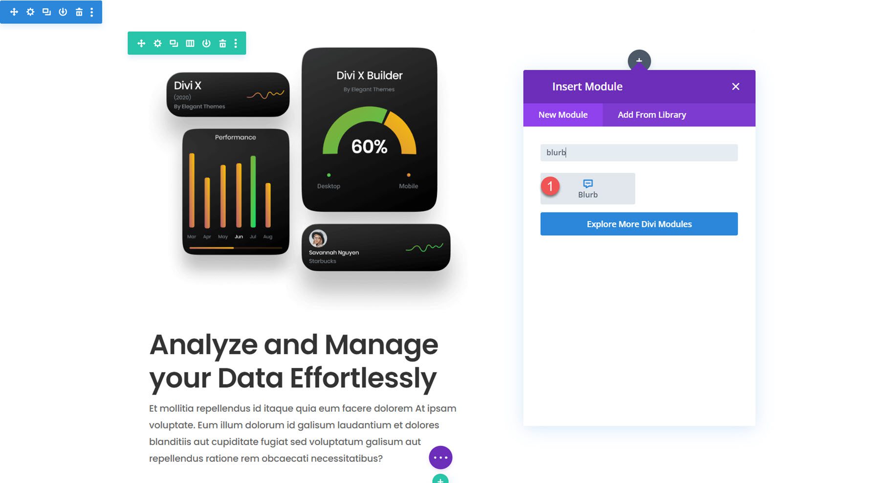
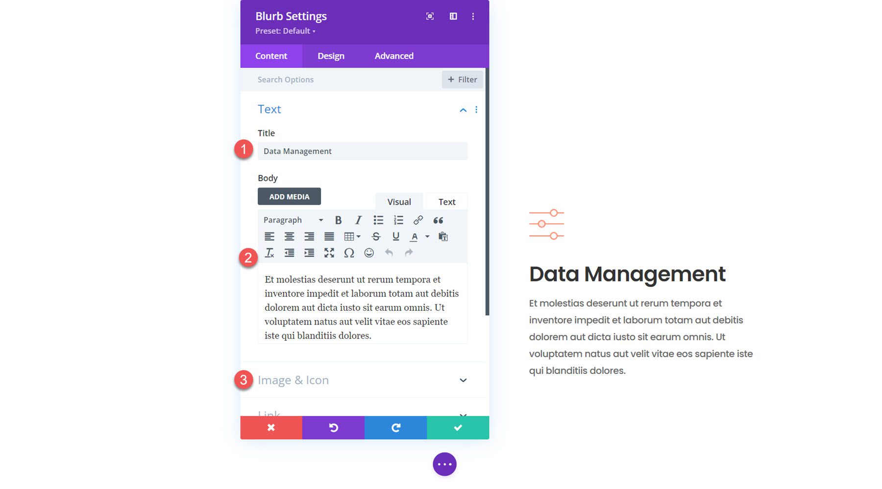
In the left column, add a new blurb module.
Add the following content to the blurb.
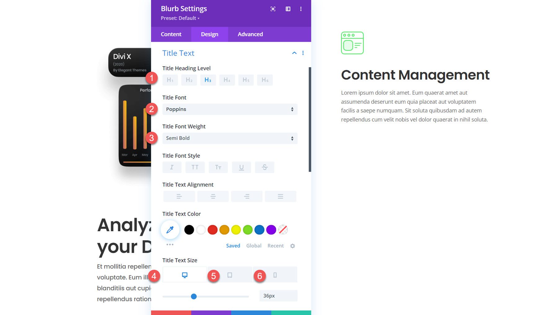
Next, move over to the design tab and modify the title text settings as follows:
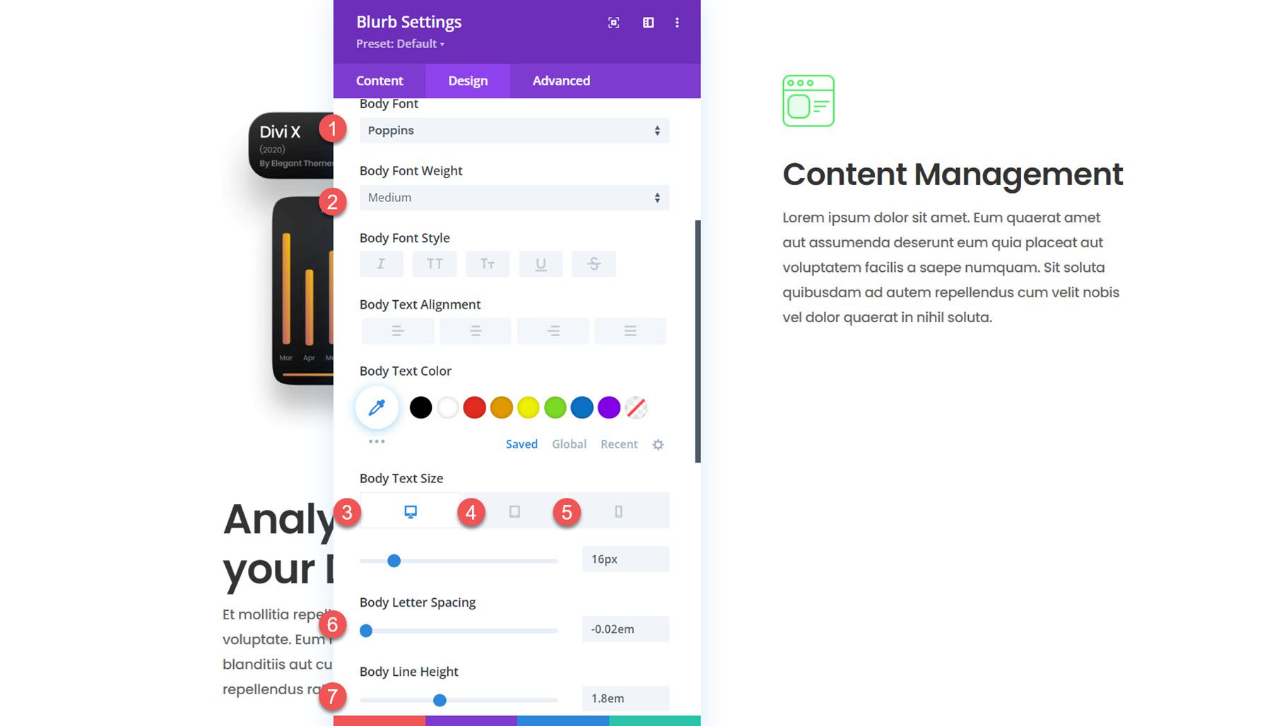
In the body text settings, modify the following:
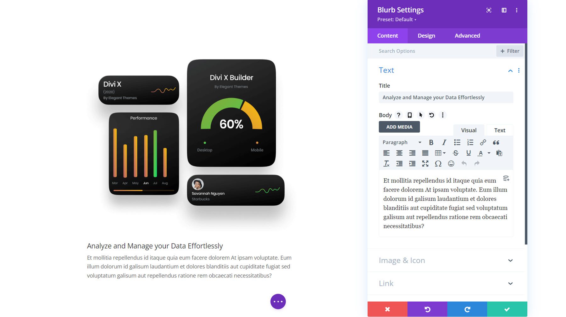
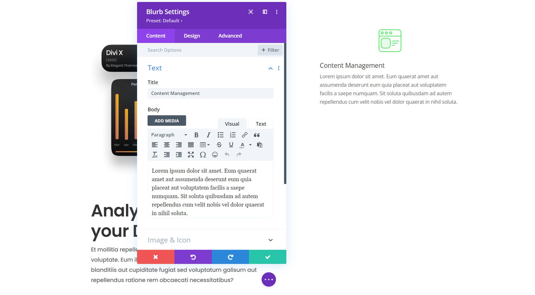
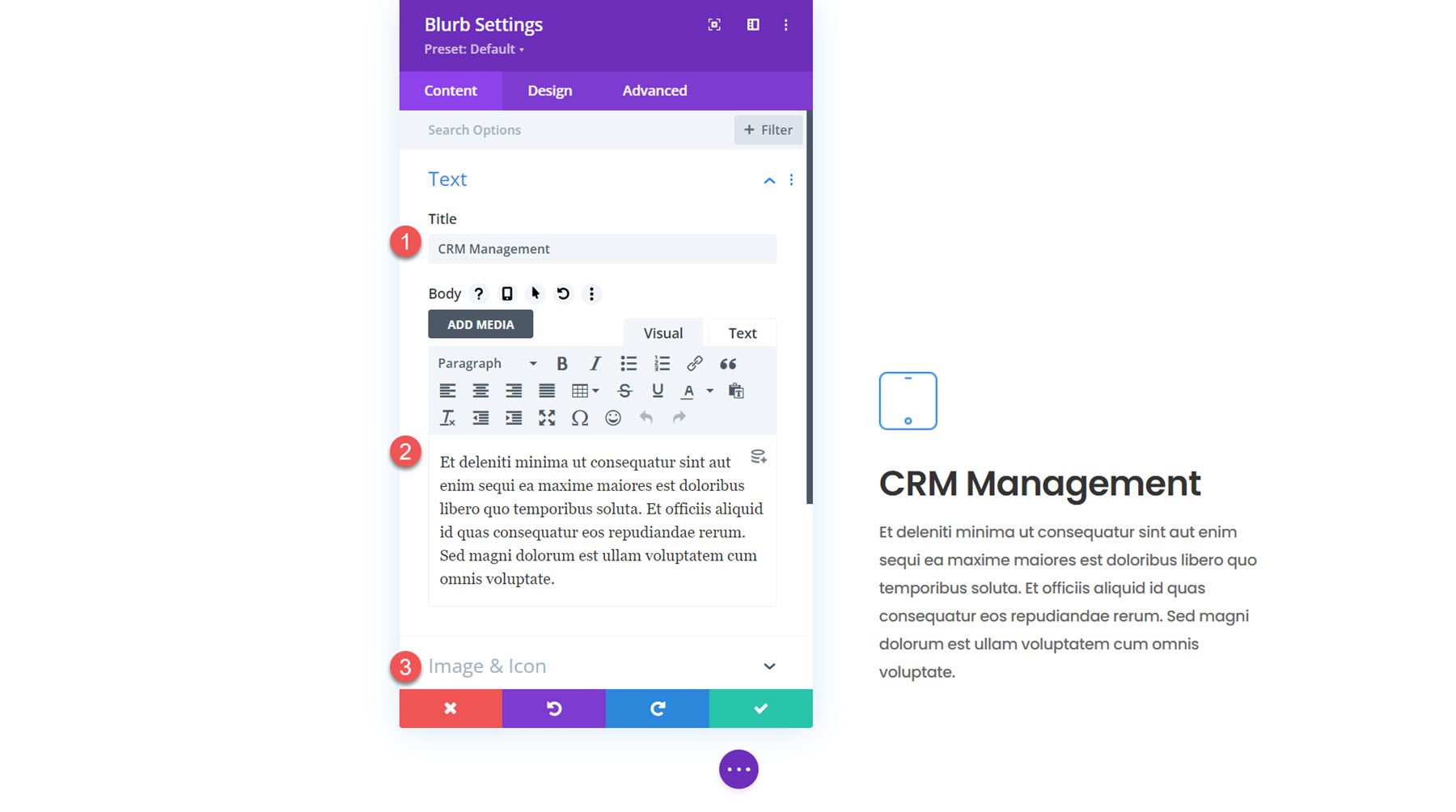
In the right column, add a new blurb module.
Add the following content to the blurb.
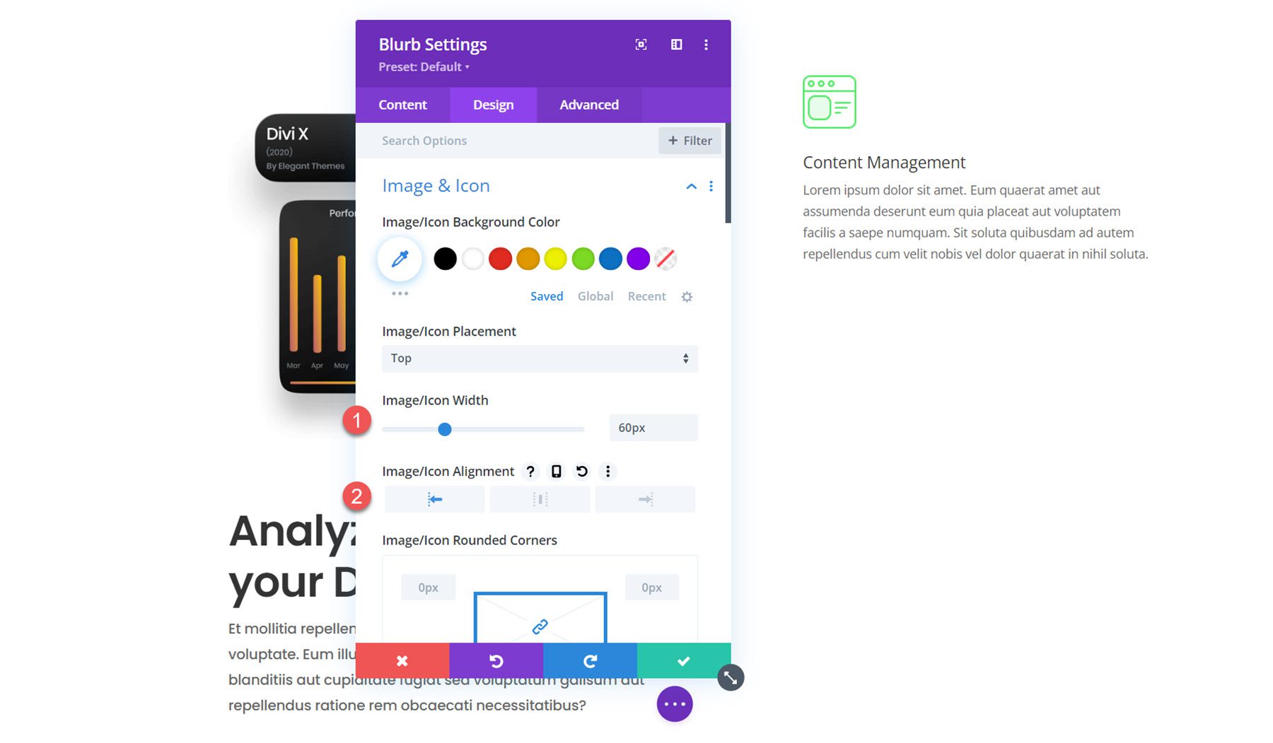
In the design tab, begin by opening the image and icon settings. Set the image width to 60px and set the alignment to the left.
Next, modify the styling for the title text as follows:
In the body text settings, change the following options:
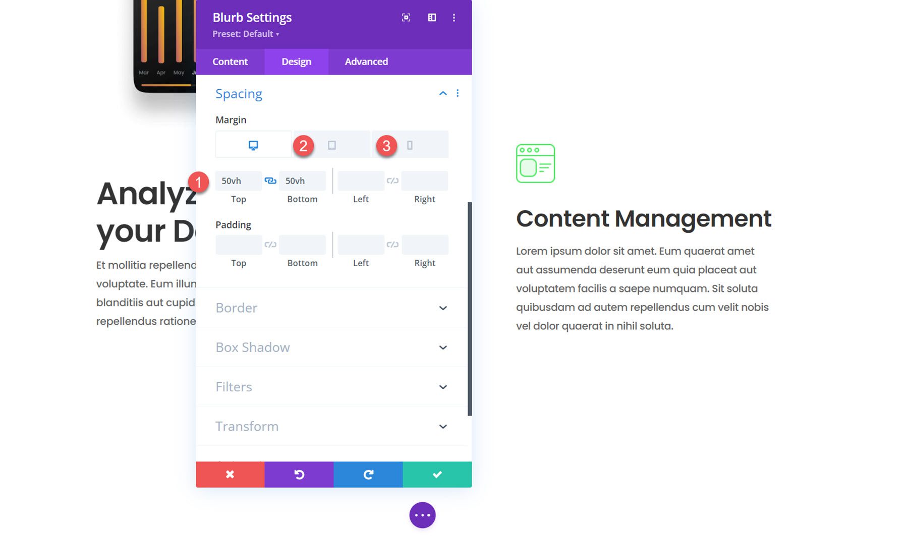
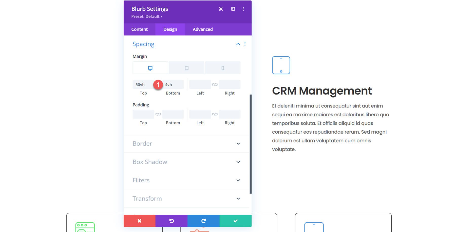
Next, open the spacing settings. We’ll add a top and bottom margin since we want each blurb on the right to appear one at a time. By using vh (viewport height) to set our margin, we can ensure that the blurb module and its margin will take up the entire height of the screen. Later on, we’ll add some scroll effects to enhance the effect. We won’t have a sticky scroll effect on tablet and mobile, so that the margin will be much smaller.
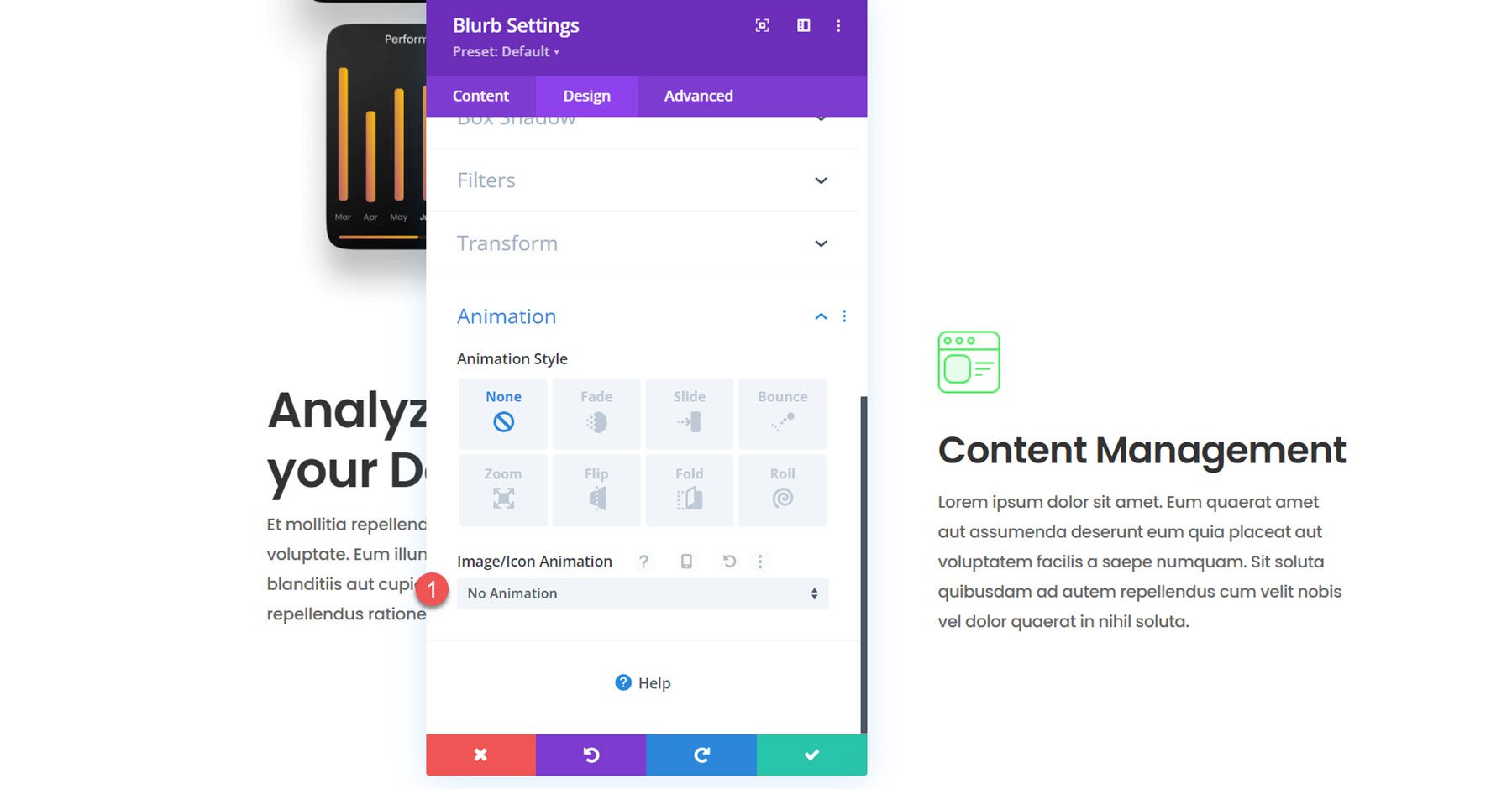
Finally, open the animation settings and set the image/icon animation to no animation.
Now, the first blurb module is created and styled. Duplicate the module twice to create two more blurb modules in the right column.
Open the settings for the second blurb and modify the following:
Next, modify the content for the third blurb.
Since it’s the last blurb, we don’t need a large bottom margin. Modify the spacing settings.
Now, our design is in place, and we can add the scroll effects to create the dynamic layout.
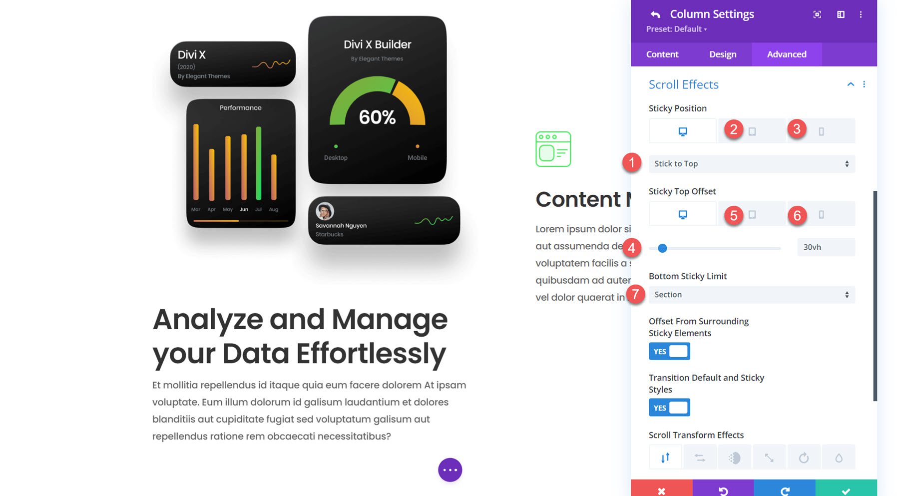
First, open the settings for column 1. Navigate to the Scroll Effects section in the advanced tab and modify the following options to get the column to stick to the top.
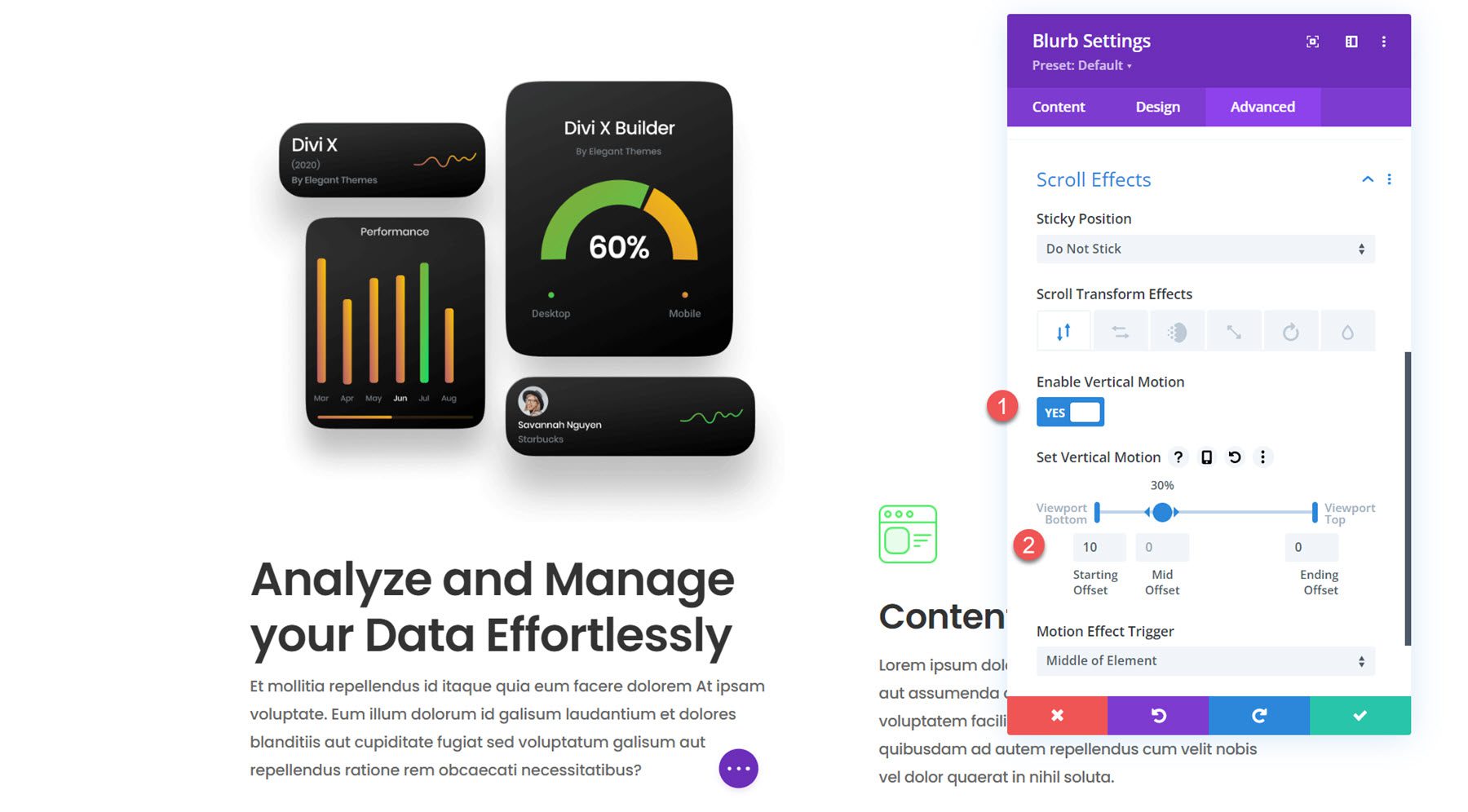
Next, navigate to the settings for the blurb in column 1. We will add a scroll transform effect with some vertical motion to highlight the column when it slides into view.
For the blurbs in column 2, we will use some vertical motion to create a scroll effect that will capture your user’s attention. Drag the arrows to extend the mid offset to 20-70% to keep the blurb in the center longer. The mobile version adds a more subtle slide-in effect. Modify the following scroll effect options for each blurb in column 2.
And that’s it! The floating blurb module layout is now complete.
Let’s take a look at our floating blurb module section in action.
And here’s how it looks on mobile.
Divi’s blurb module makes it easy to display concise information callouts and an eye-catching image or icon. Scroll effects allow you to create creative layouts that guide the user’s attention, like the floating blurb modules we designed in this tutorial.