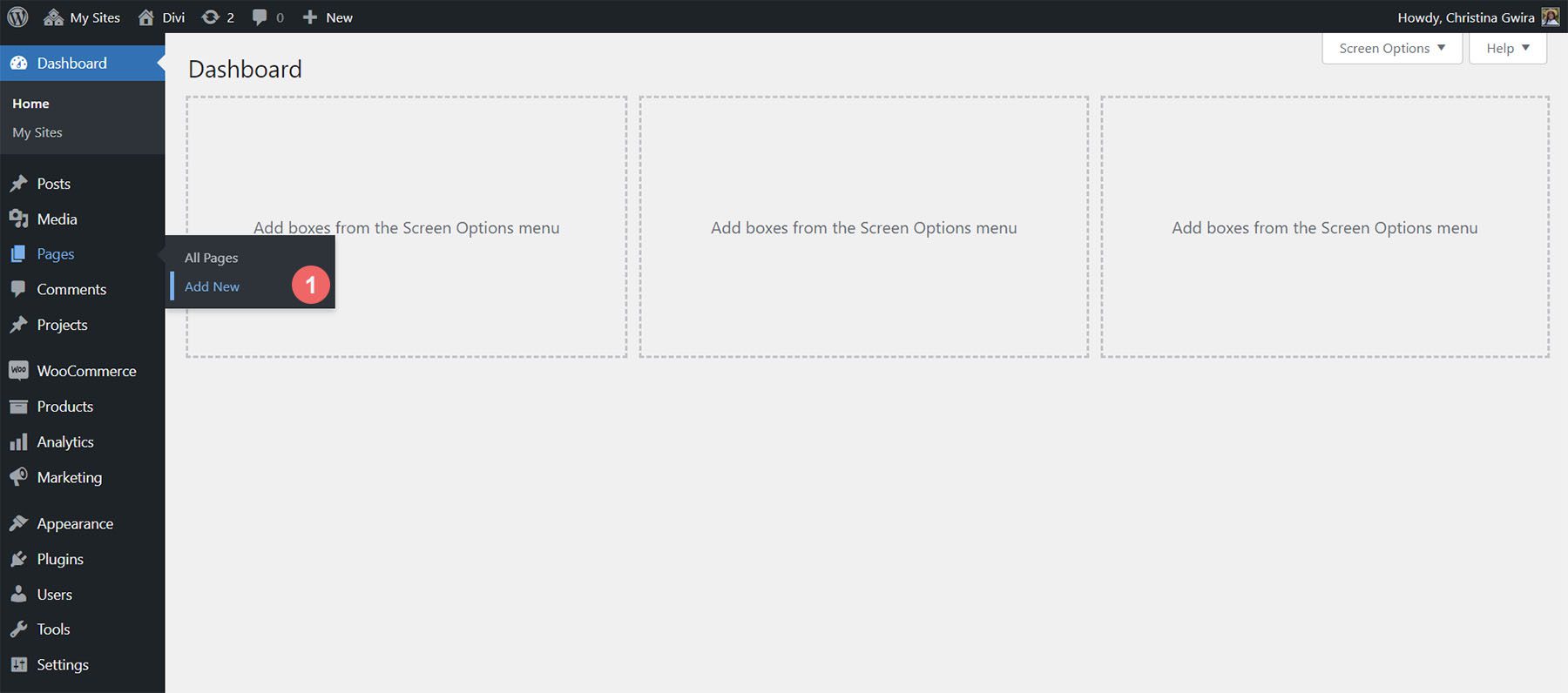
We first need to create a new page in WordPress to install the page layout. We do this by hovering over the Pages menu item from the left-hand menu. Then, we click Add New.
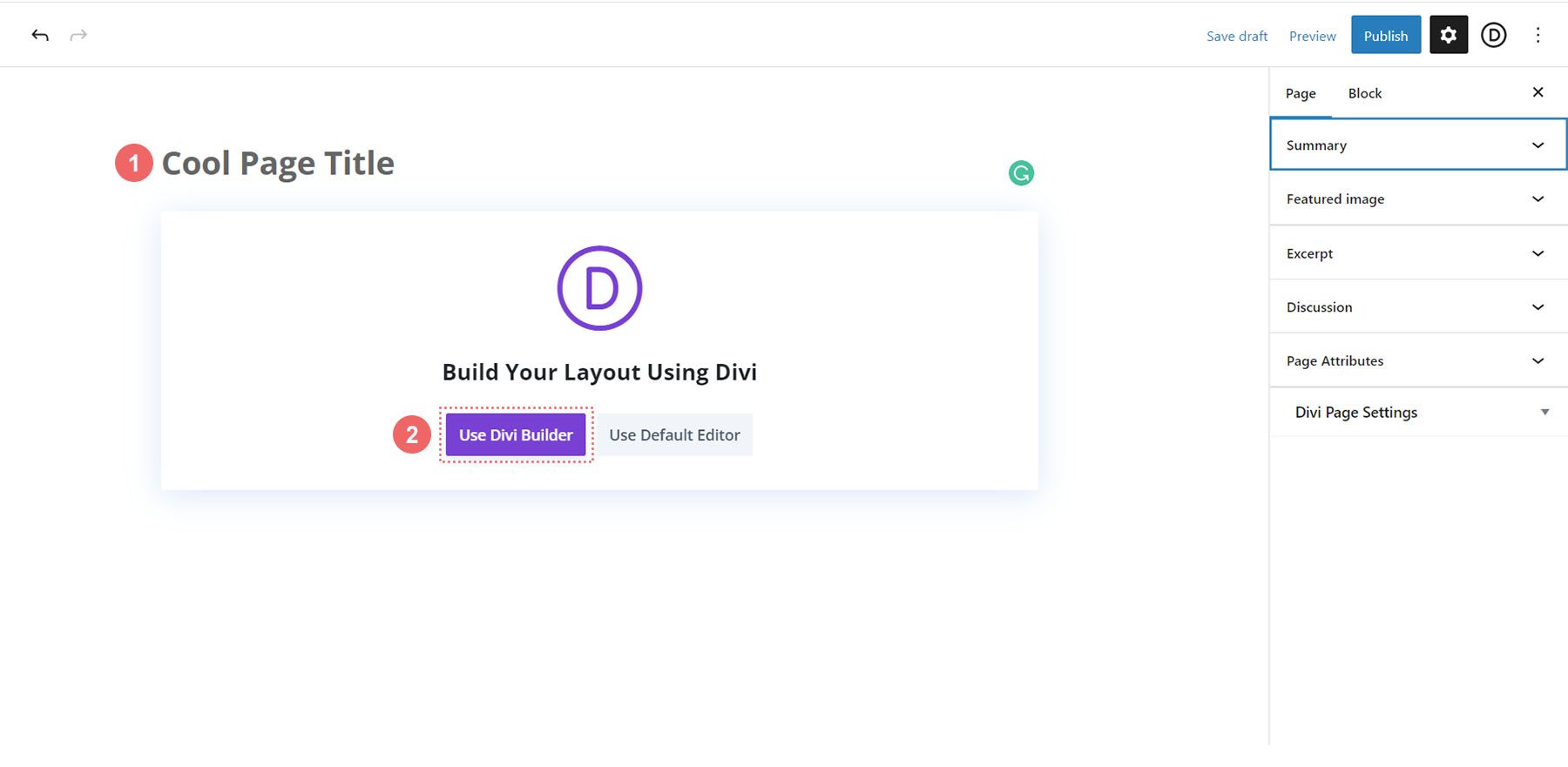
Once inside the default WordPress editor Gutenberg, set a title for your new page. Next, click on the purple Use Divi Builder button.
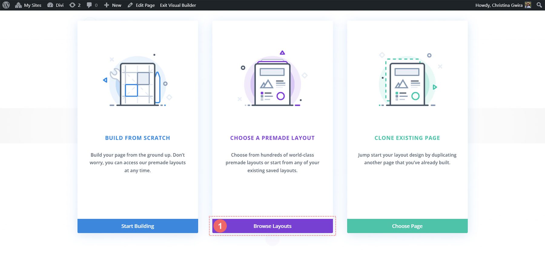
You will then be presented with three options. We will click on the purple middle button, Browse Layouts.
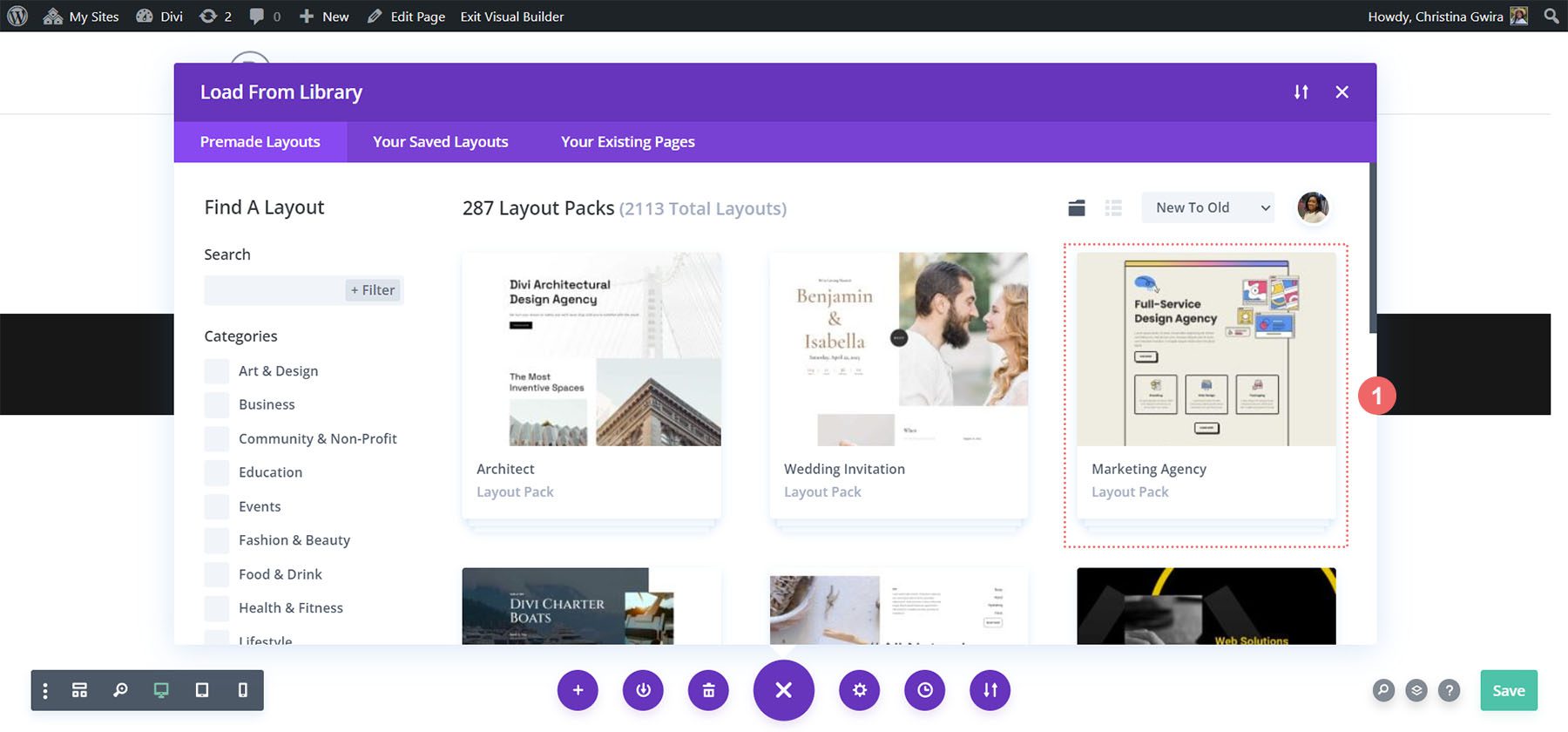
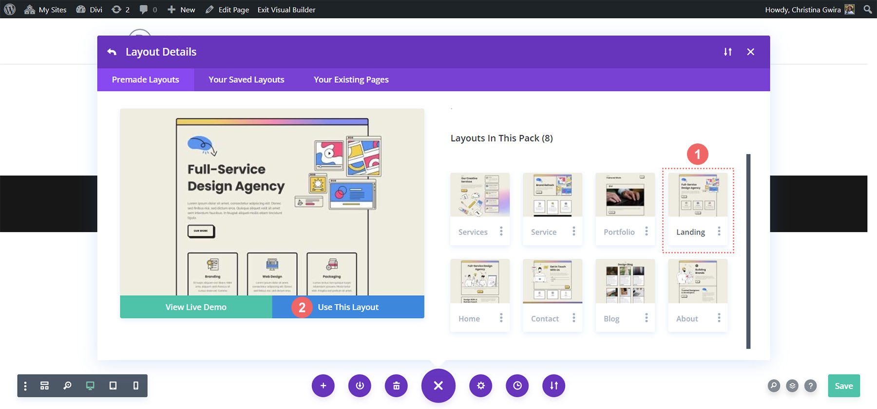
This will open up Divi’s vast layout library, which comes packed with pre-designed pages for you to choose from. We’ll be selecting the Marketing Agency Layout Pack.
From within the layout pack, we’ll be using the Landing Page Layout. Click on the layout, then, click on the blue Use this Layout button to load the layout into your newly created page.
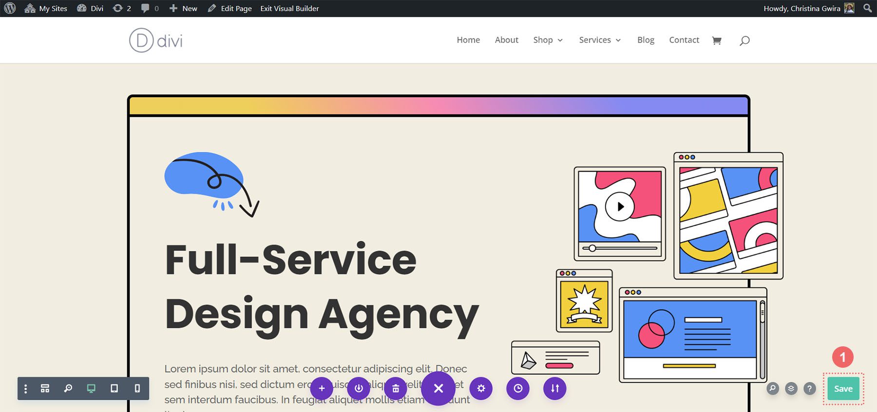
Once the layout has loaded, click the green Save button at the bottom right of the screen.
Now, the real work begins! Let’s create our first call to action!
Throughout this tutorial, we will use a Call to Action module to replace the Text and Button Modules used in this section.
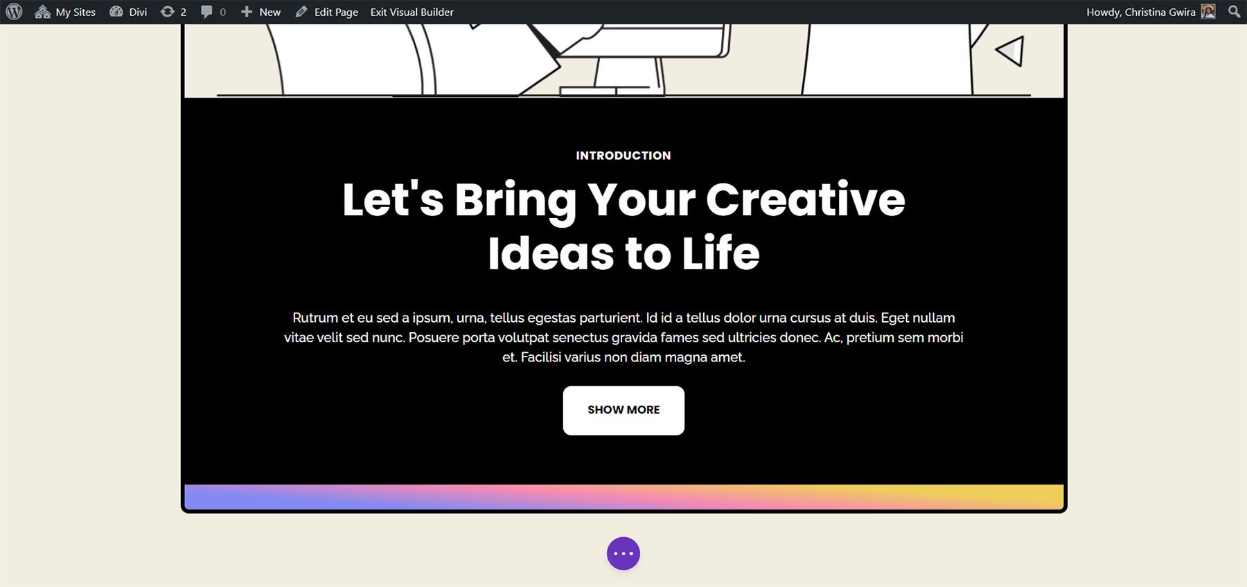
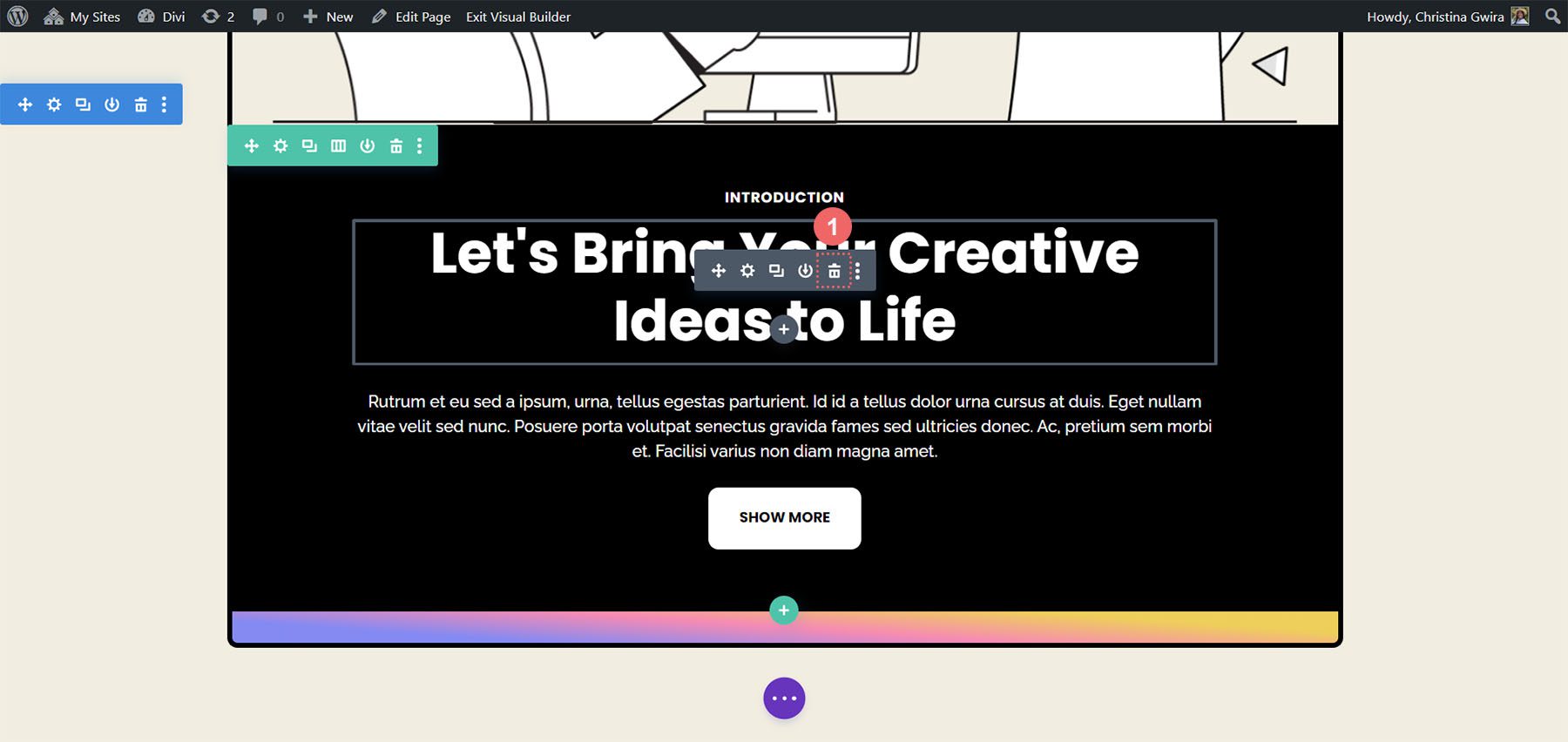
To begin, let’s first delete these modules. Hover over each module, and click the trash can icon when the gray pop-out menu appears. We want to leave the Text Module that says Introduction, but we will use one Call to Action to replace the modules that we have deleted.
Next, we want to add a Call to Action Module to the row. We do this by hovering over the Text Module and clicking the gray plus icon.
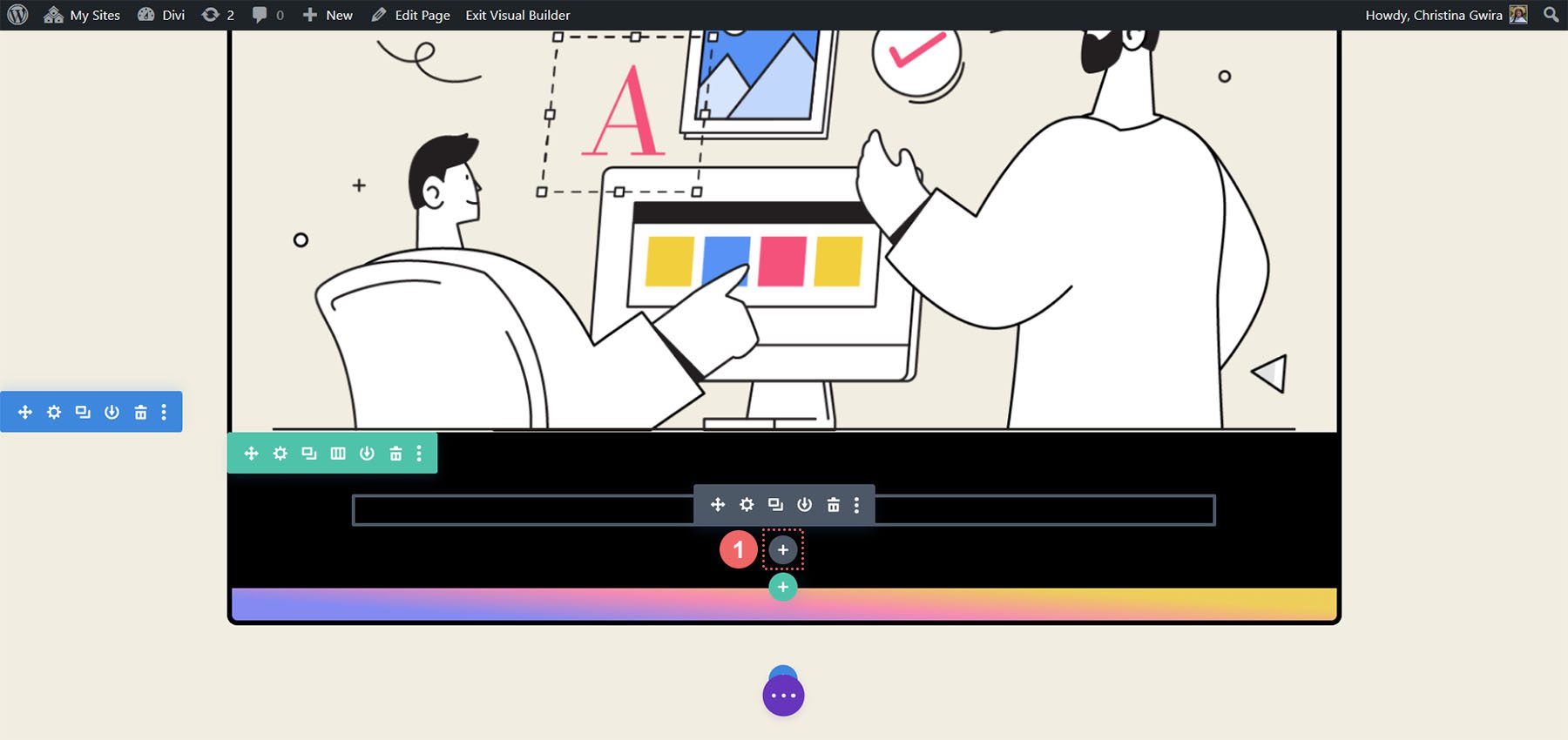
This will then open the modules pop-up. From there, we click on the Call to Action Module icon.
With the module added, we can start to style it for use within our layout.
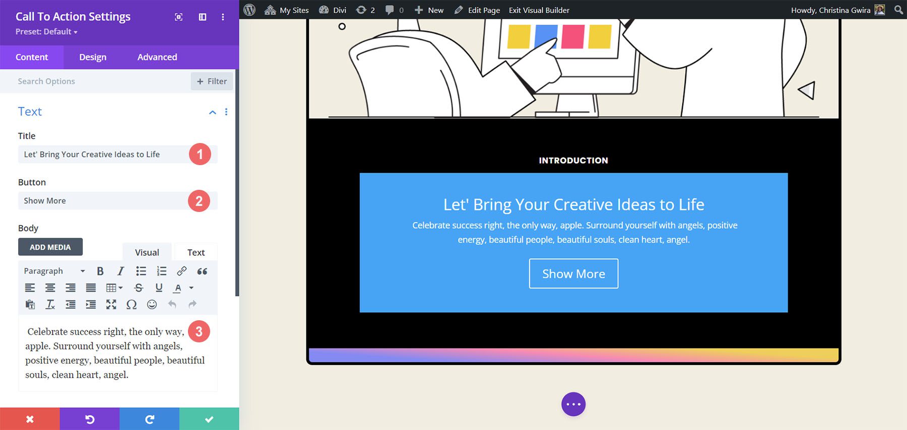
We will use the same copy from the original modules for our newly added Call to Action Module. We can enter this content into the module’s Title, Button, and Body fields.
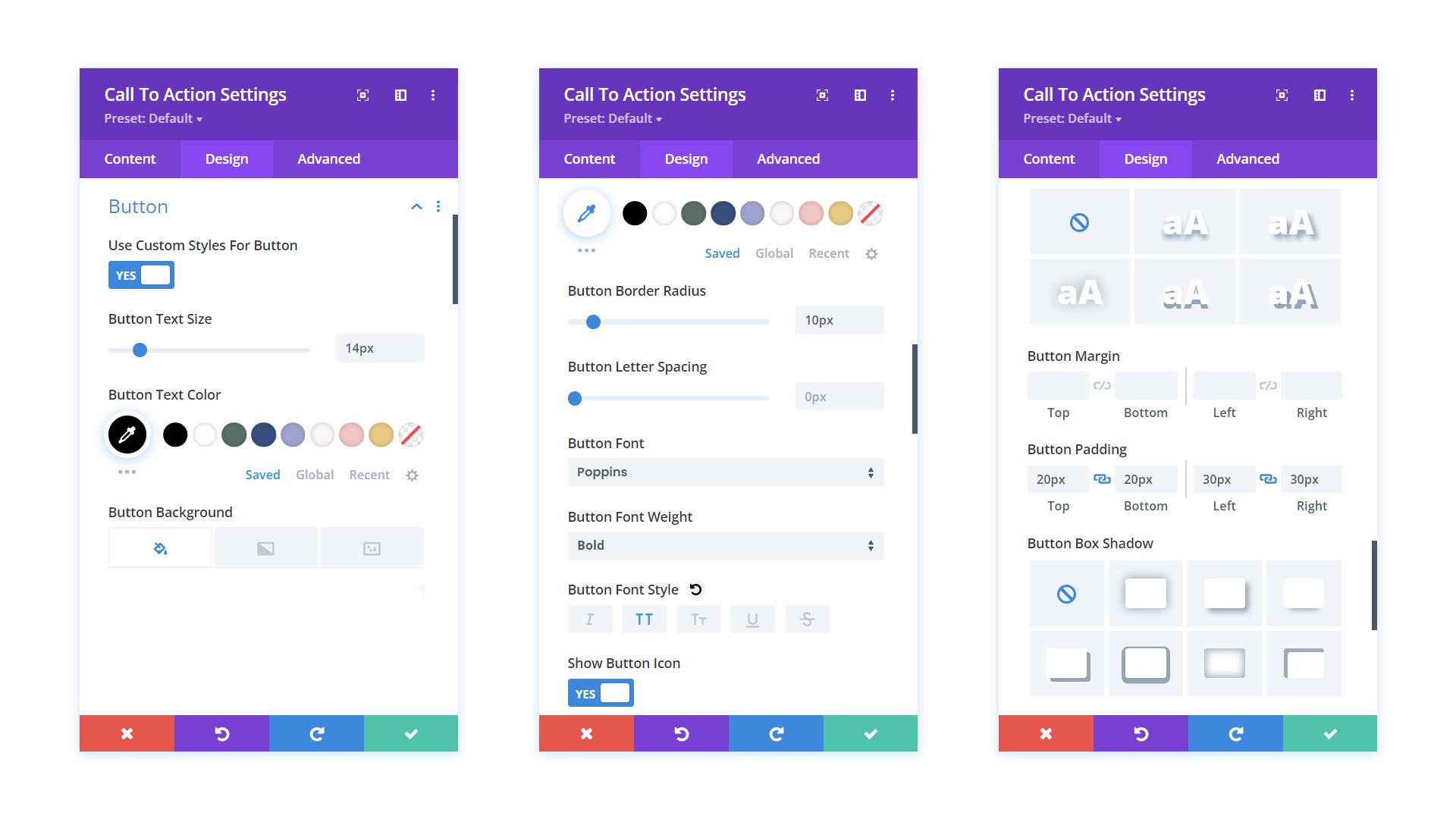
Now, let’s begin to style our module. We start by clicking on the Design tab of the Call to Action Module. First, we want to set the alignment and color of our text. We want to have our text aligned to the Center and color set to Light.
Secondly, we want to start styling our Title Text. Below, find the settings that we’ll be using.
Title Text Settings:
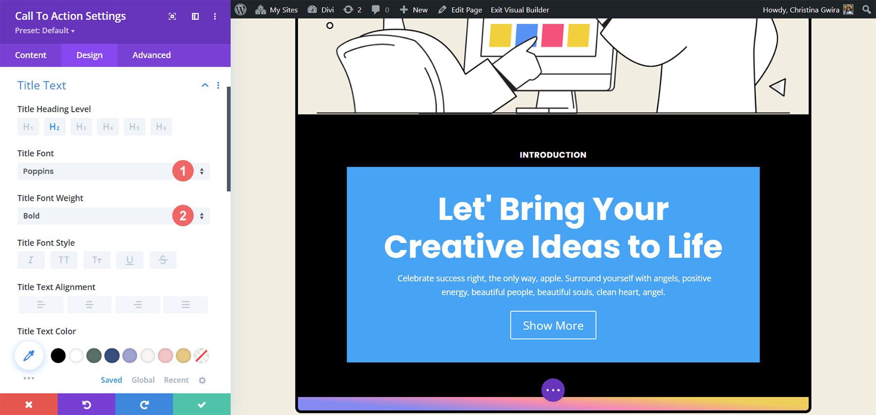
Notice how it looks similar to the text that was previously used. We’ll take our style guidance from our Divi Marketing Agency Layout Pack.
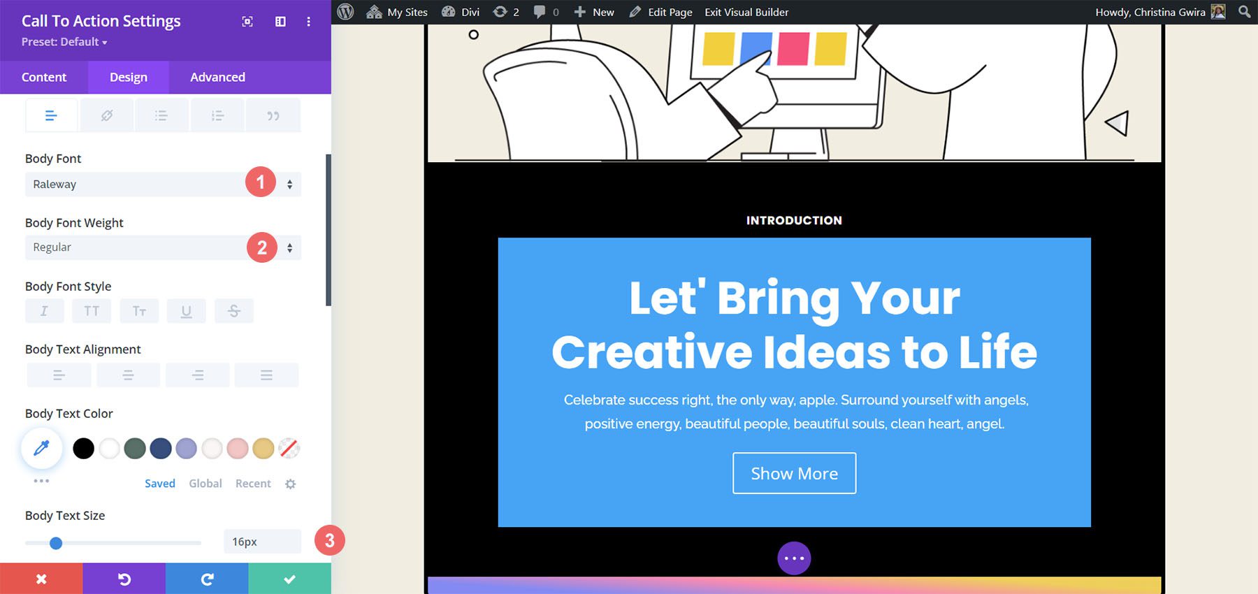
Thirdly, we want to style our Body Text. Let’s use the settings below to get the Body Text of our module.
Body Text Settings:
Finally, we’ll use the following settings to style the button of the Call to Action Module.
Button Settings:
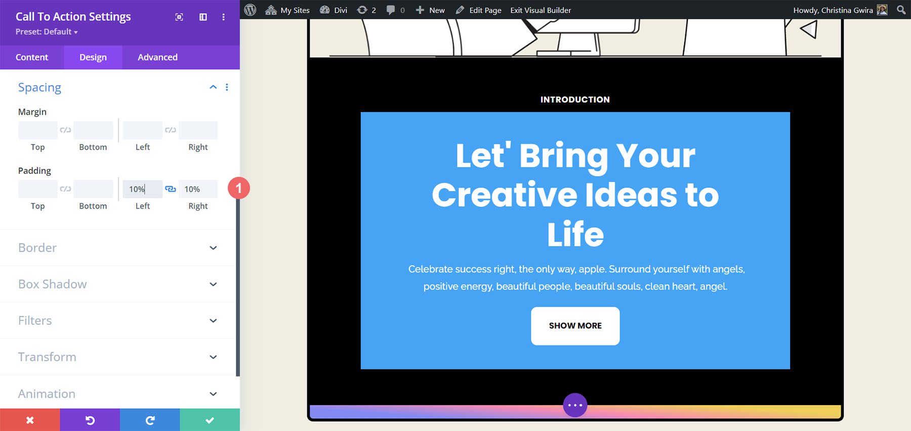
Before we leave the Design tab, let’s add some padding to the contents of our Call to Action Module. To do this, let’s scroll down to the Spacing tab. Then, enter 10% for both the Left and Right Padding.
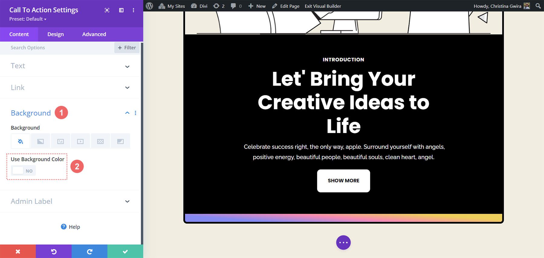
To finish styling our module, we will exit the Design tab and finally end in the Content tab. We click on the Content tab, then scroll down to the Background tab. Then, we uncheck the Use Background Color toggle to remove the default background color of the module.
Once that is done, we then click on the green check mark to save our work and close our Call to Action Module.
We will begin to animate our first Call to Action Module with a subtle Hover animation. You can see the final product of our work below.
To begin, we enter into the Module Settings for our newly styled Call to Action Module.
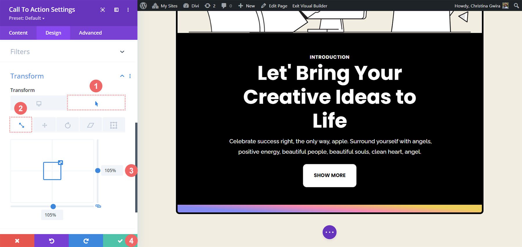
Then, we click on the Design tab. Finally, we scroll down to the Transform tab. This is where we’ll be activating the hover effect for this module. Once we’re in the Transform section, we hover over Transform to reveal a flyout menu. From the menu, we click on the Pointer icon. This icon means we can set alternative settings within the Transform options that will be activated upon hovering.
One of the great things about Divi is that many items and options in Divi can also have the same hover effect activated. In our case, we want the size of the module to increase by 5% when we hover over it.
Firstly, we will click on the hover tab. This will show us the options that we can use to transform our module. Secondly, we will click on the Scale icon. We want to increase the overall size of our module. Next, we enter the amount that we want our module to increase by. We want it to be bigger than it currently is by five percent, so we enter 105% into the size option. To save our changes, we then click on our green check mark button.
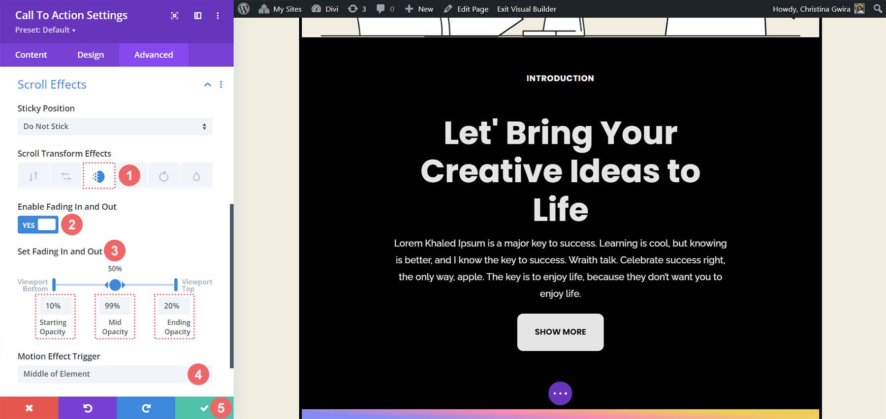
Let’s look at how we can use Scroll Effects to add a subtle animation to our Call to Action Module. Here’s what we’ll be achieving through Divi’s native Scroll Effects:
We’ll be starting from our freshly styled Call to Action Module. Unlike our Transform settings, we’ll activate our Scroll Effects in the Advanced tab of our module. So, we click on the Advanced tab, then we scroll down to the Scroll Effects tab.
Once in the Scroll Effects tab, there are several settings that we need to be aware of to create this subtle effect. First, we will keep the Sticky Position as Do Not Stick for this module. Next, we will be using the Fading In and Out Scroll Effect. We click on its icon to activate it. Thirdly, we want to enable the setting by activating the Enable Fading In and Out toggle.
A major part of this animation style is the figures used for the starting, mid, and ending opacity. These settings are activated when the module comes into the various sections of the screen viewport. For our example, we will be using the following settings:
Fading In and Out Settings:
For the Motion Effect Trigger, we want the Fading In and Out to begin when the Middle of the Element is within focus.
By using these settings, we can create a clean scroll effect within our Call to Action Module. Next, let’s see how we can animate the entrance of another Call to Action Module with the Animation tab.
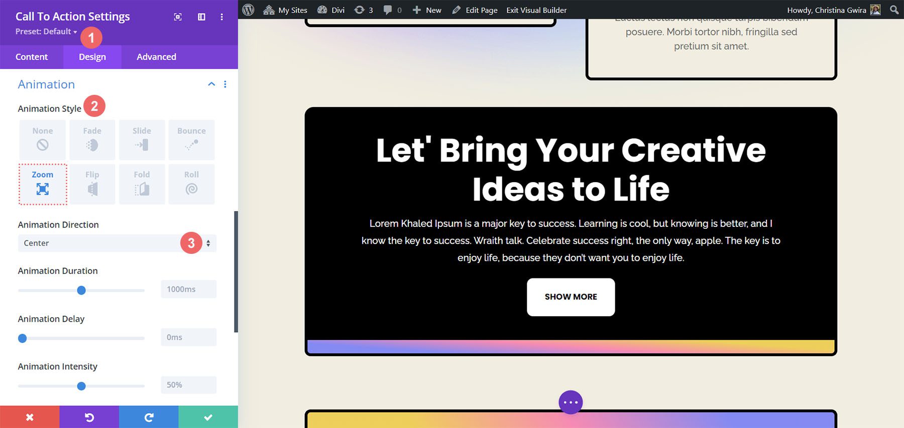
An entrance animation takes place as a module enters your screen viewport. While Scroll Effects allows you to continuously interact with the module each time you scroll through its viewport, an entrance animation is activated once. An entrance animation can be looped, however, whether you scroll by it, hover over it, etc., it won’t become re-animated. Here’s how you create your entrance animation. We would like to use a Zoom animation once the module comes into view:
Within our Call to Action Module settings window, we click on the Design tab and scroll down to Animation. Within, we have several animation options that we can use once this module moves into focus. Click on the Zoom Animation Style. For the Animation Direction, we want to leave it as Center – the default – and leave all the other default settings.
Our final example will show us how to use Divi’s native Sticky Effects. For this, we’ll need to create a new row and section.
Click on the blue plus icon to add a new section.Then, select the one-column row layout.We’ll be using our premade Call to Action Module so we can close the Add New Module window. For the section, we will start by entering the settings and setting a background color. To do this, click the gear icon to reach the section settings.Next, scroll down to the Background tab and set the background color to #f1ede1.
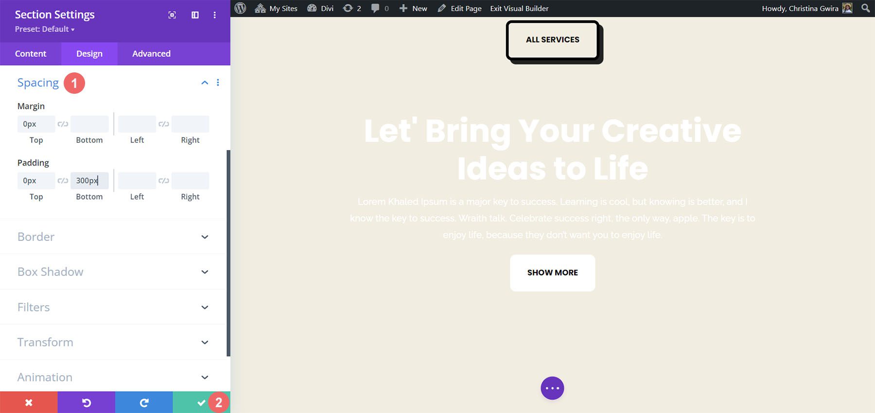
With the background in place, we now need to add spacing settings to ensure that our sticky Call to Action Module works as displayed. So, we click on the Design tab and then scroll to the Spacing section. This part is critical to ensure that we have enough room to see our Sticky animation take effect.
We use the following settings to amend the spacing of our section:
Section Spacing Settings:
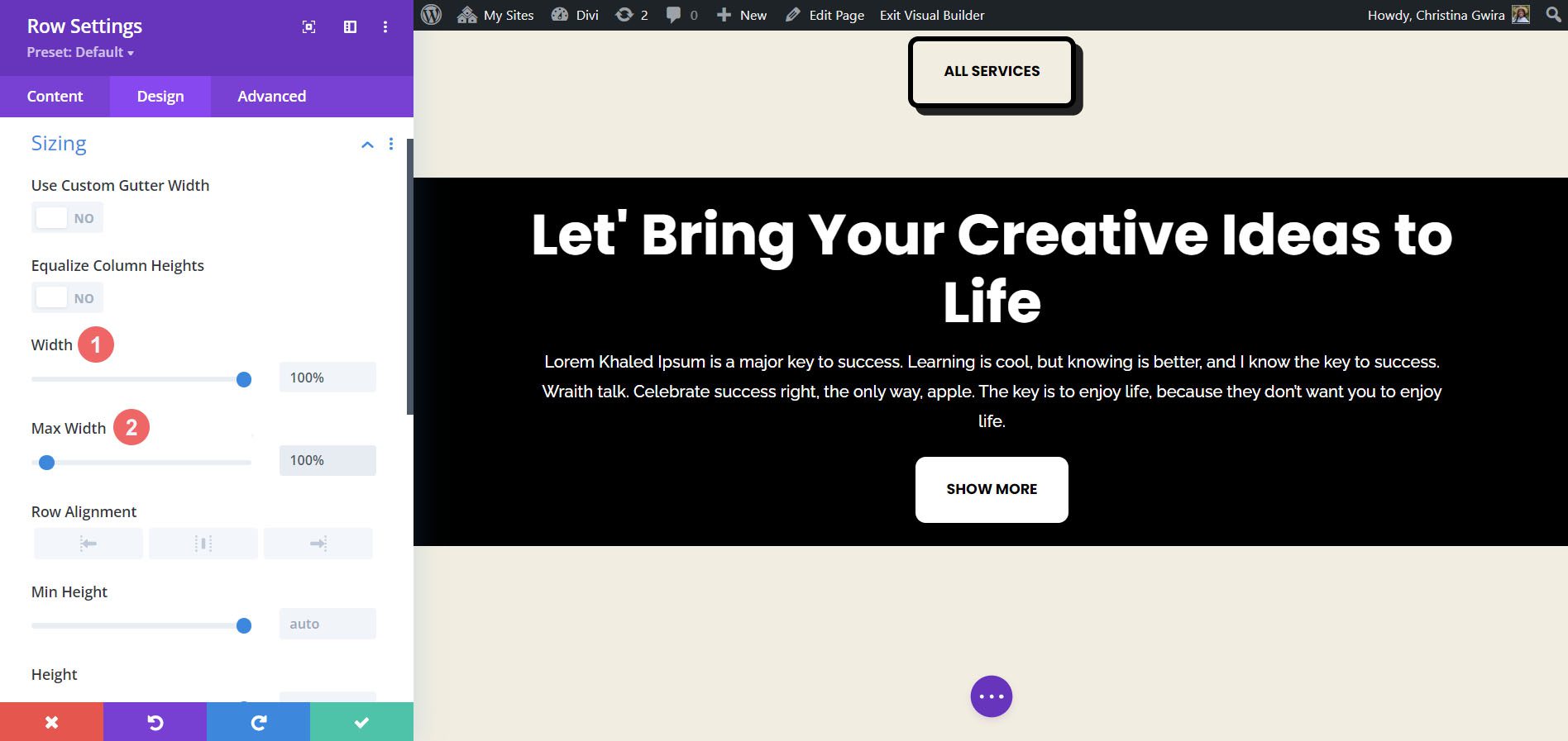
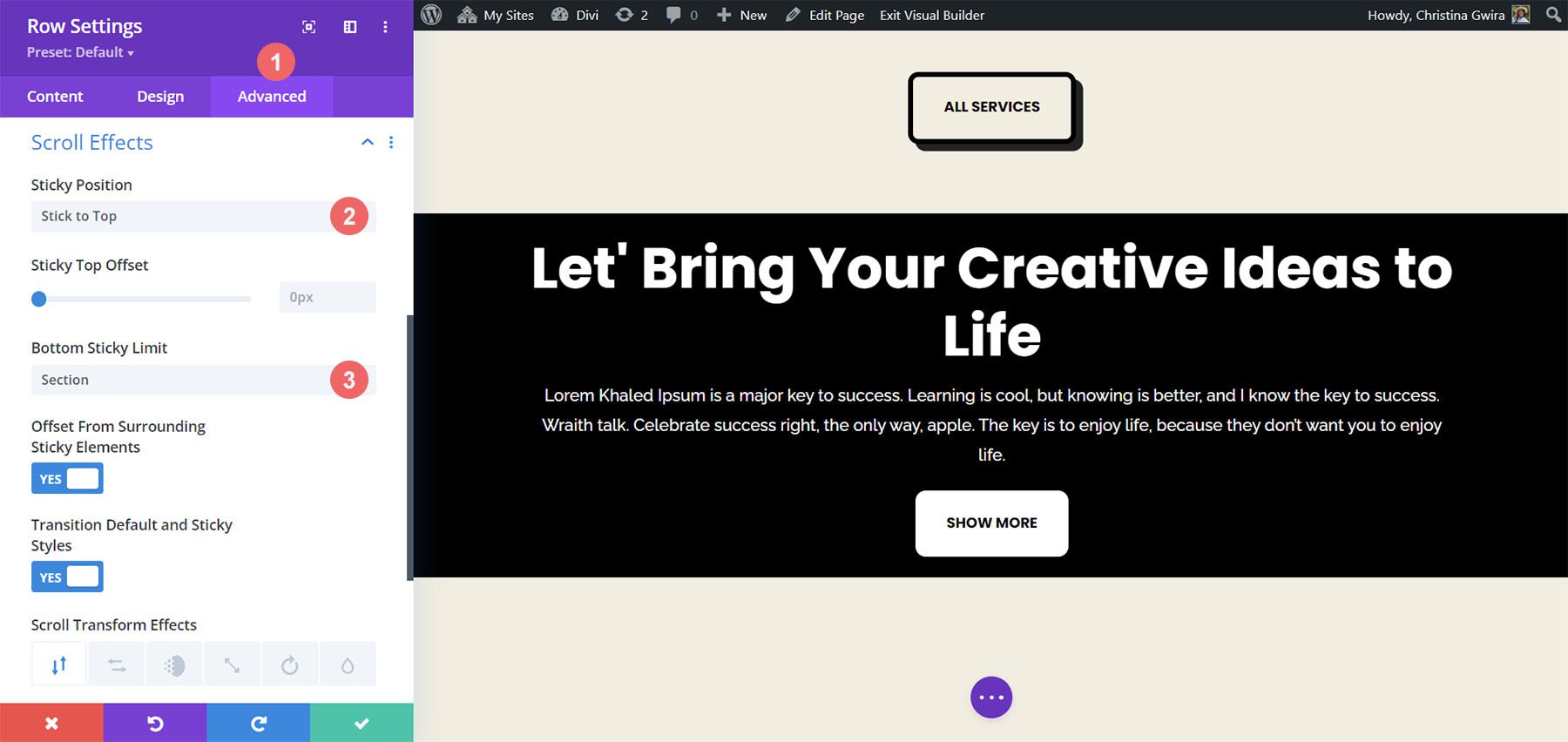
Once we have entered these settings, we can save our work by clicking the green checkmark. Now, we’ll activate the Sticky effect within the row of our section. First, we enter the row settings by clicking the gear icon. Before we navigate to the Advanced tab, let’s set the background color for the row. Similarly to how we did with the section, we scroll down to the Background tab and set the Background Color to #000000.With this, our row almost looks like the Call to Action Module that we created at the start of this tutorial. However, we will use padding and margins to make this row extend from edge to edge. This will make the Sticky effect visually appealing and less intrusive when used for viewers of your website.We now move to the Design tab and click on the Sizing tab. Next, we set the Width and Max Width to 100%.
Moving along, we now scroll down to the Spacing tab and add equal top and bottom padding values of 20px. This helps to create a sleeker look with our call to action.Now that we have the aesthetics covered, we can now move on to applying our Scroll Effect. We move to the Advanced tab, then we click on the Scroll Effects tab. Now, we activate the Sticky Position by selecting Stick to Top. We want our call to action to stick flush to the top of our screen, so we leave the Sticky Top Offset to 0px. The only other setting we’ll change will be the Bottom Sticky Limit, which we will now set to Section.
As you can see, by default, Divi has many features and ways to add animation and movement to your page. Whether you want to add movement to introduce your page or create interest in your content, Divi provides you with the tools to do so. We covered four different ways to animate the Call to Action Module, but you can use these same settings across the library of modules within Divi. You can also apply these settings to sections, columns, and rows to create vibrant and unique page designs for your users.