In the constantly changing world of web design, keeping up with trends and using effective design techniques is key to creating a visually appealing and user-friendly website.
One such technique gaining popularity is website tinting. This article delves into what website tinting is, its benefits, implementation methods, and best practices to help you enhance your website’s design and user experience.
Website tinting refers to the use of color overlays or filters on a website’s elements to create a cohesive and visually appealing look. This technique can involve applying a semi-transparent layer of color over images, sections, or entire pages to achieve a unified aesthetic. Unlike simple color overlays, tinting often involves nuanced adjustments to ensure that the underlying content remains clear and readable.
In the context of iOS 15+ Safari website tinting is a feature that changes the color of the browser’s address bar and other UI elements to match the color scheme of the website being viewed. This is designed to provide a more immersive browsing experience by blending the browser’s interface with the website’s colors.
Enhanced Readability
One of the primary benefits of website tinting is improved readability. By applying a subtle tint, you can create a contrast between the text and background, making it easier for users to read the content without straining their eyes.
Improved Visual Hierarchy
Tinting can help establish a clear visual hierarchy by directing users’ attention to important elements. By using different shades and opacities, you can highlight key sections, call-to-action buttons, or featured content.
Consistent Branding
Maintaining a consistent color scheme across your website is essential for brand recognition. Website tinting allows you to incorporate your brand colors seamlessly, ensuring a uniform look and feel that reinforces your brand identity.
Better User Experience
A well-tinted website can create a more engaging and pleasant user experience. The cohesive color scheme can evoke emotions and set the tone for your website, making it more inviting and enjoyable for visitors.
Immersive Browsing on iOS
For users on iOS 15 Safari, the tinting feature enhances the immersive experience by extending the website’s color scheme to the browser’s interface, making the browsing experience more cohesive and visually appealing.
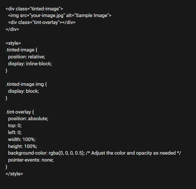
CSS and HTML Implementation
Implementing website tinting can be straightforward with CSS and HTML. Here’s a basic example:
JavaScript and Advanced Techniques
For more dynamic tinting effects, JavaScript can be used. For instance, changing tints based on user interactions or time of day can enhance the user experience:
.style.backgroundColor = 'rgba(255, 0, 0, 0.5)';
Tools and Plugins
Several tools and plugins can assist in website tinting, such as Adobe XD for design and visualization, and CSS frameworks like Bootstrap or Tailwind CSS for implementation.
Color Selection
Choosing the right colors is crucial. Use colors that complement your brand and enhance the overall aesthetic. Tools like Adobe Color can help you find harmonious color schemes.
Accessibility Considerations
Ensure your tinted website is accessible to all users. Use high-contrast colors to cater to those with visual impairments and consider how your tints affect readability and navigation.
Testing Across Devices
Test your tinted designs on various devices and browsers to ensure they look good everywhere. Responsiveness is key to providing a consistent user experience.
Performance Optimization
Tinting should not compromise your website’s performance. Optimize your images and use efficient coding practices to keep your website fast and responsive.
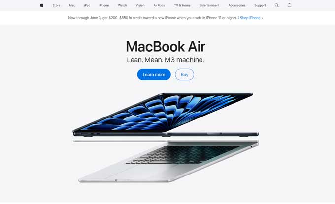
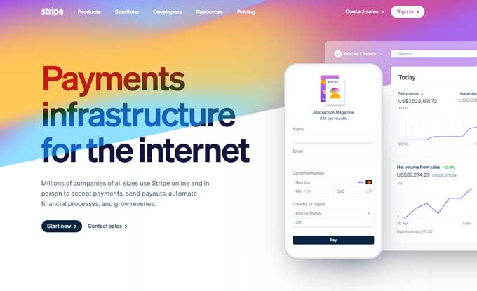
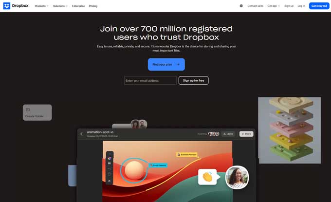
Here are a few websites that use tinting effectively:
Apple uses subtle tints to highlight products and create a clean, modern aesthetic.
Stripe employs soft color overlays to maintain a cohesive look while guiding user focus.
Dropbox uses tints to emphasize key features and improve readability across different sections.
Overuse of Tints
Too much tinting can overwhelm users and make the website look cluttered. Use tints sparingly and strategically.
Poor Color Choices
Avoid colors that clash or reduce readability. Always test your color combinations to ensure they enhance the user experience.
Ignoring Accessibility
Failing to consider accessibility can alienate a significant portion of your audience. Always prioritize accessibility in your design choices.
Website tinting is a powerful technique to enhance your website’s visual appeal and functionality. By understanding its benefits, implementing it correctly, and following best practices, you can create a more engaging and user-friendly website. Experiment with tinting to see how it can transform your web design and contribute to your brand’s success.