A maintenance message is a crucial communication tool for informing users when your website or service is temporarily unavailable due to scheduled or emergency maintenance. A well-crafted maintenance message helps maintain trust and transparency with your users, minimizing frustration and ensuring a positive user experience even during downtime.
In this post, we’ll provide a comprehensive guide for crafting effective maintenance messages that will help you communicate better with your users and maintain a positive reputation for your brand.
Types of Maintenance Messages
When it comes to maintaining a website or online service, there are three main types of maintenance messages you might need to communicate to your users: scheduled maintenance, emergency maintenance, and unplanned outages.
- Scheduled Maintenance:
Planned maintenance activities with prior notice to users, detailing the expected downtime.
- Emergency Maintenance:
Urgent, unplanned maintenance is required to fix critical issues, often with little to no prior notice.
- Unplanned Outages:
Unexpected downtime due to unforeseen circumstances like technical failures or cyberattacks.
Key Elements of an Effective Maintenance Message
Creating an effective maintenance message requires careful consideration of several key elements to ensure clear communication and minimize user frustration.
- Clear and Concise Language:
Avoid technical jargon. Keep the message simple and to the point.
- Explanation of the Reason for Maintenance:
Briefly describe why the maintenance is necessary.
- Estimated Downtime or Maintenance Duration:
Provide a timeframe for how long the maintenance will take.
- Contact Information for Further Assistance:
Include an email or phone number for users to reach out if they have questions.
- Apology and Appreciation for Users’ Patience:
Acknowledge the inconvenience and thank users for their understanding.
Examples of Maintenance Messages
Below you will find some examples of well-crafted maintenance messages for different scenarios:
Scheduled Maintenance:
Emergency Maintenance:
Unplanned Outages:
E-commerce:
SaaS (Software as a Service):
Educational Websites:
Financial Services:
Healthcare Services:
Best Practices for Writing Maintenance Messages
Writing and designing a good maintenance message means being clear, understanding, and professional. It’s important to use best practices to make sure users feel informed and valued, even when there’s a service disruption.
- Tone and Style:
Maintain a friendly and professional tone. Be empathetic to users’ inconvenience.
- Relevant Information:
Include only the necessary details to avoid overwhelming users.
- Keeping Users Informed:
Communicate before, during, and after maintenance to keep users updated.
Designing Maintenance Messages
1. Visual Design Principles:
- Use clear and readable fonts.
- Use a color scheme that aligns with your brand but stands out.
- Include relevant icons or imagery to make the message visually appealing.
2. Mobile-Friendly Design Considerations:
- Ensure the message is responsive and looks good on all devices.
- Test the design on different screen sizes to ensure readability.
Technical Implementation
Display Methods:
- Banners: Display a banner at the top or bottom of your website.
- Pop-Ups: Use pop-up notifications for immediate visibility.
- Landing Pages: Redirect users to a dedicated maintenance page.
User Experience Considerations
1. Communicating Before Maintenance:
- Send emails or notifications to inform users in advance.
- Provide alternative access if possible.
2. Providing Alternatives During Downtime:
- Offer alternative resources or pages that are still accessible.
- Provide updates on social media or via email.
3. Gathering User Feedback Post-Maintenance:
- Ask for feedback on the maintenance process.
- Use feedback to improve future maintenance experiences.
Examples of Maintenance Landing Pages
Making sure users have a smooth experience, even when there are service interruptions, is key to keeping their trust and engagement.
Here are some great examples of maintenance pages that do a really good job of mixing good looks, clear messages, and user-friendly features.
Flickr

This maintenance page design effectively combines visual appeal, clear communication, and user-friendly elements to create a positive experience for users, even during service interruptions.
- Playful Imagery: The use of a whimsical and engaging photograph featuring a child pulling a toy panda creates an emotional connection and makes the downtime message less frustrating for users.
- Warm and Inviting Colors: The image is set during golden hour, providing a warm and inviting color palette that is visually appealing and comforting.
- High-Quality Photography: The image is of high quality, which enhances the overall professionalism and appeal of the maintenance page.
- Clear Message: The text clearly communicates the purpose of the page (planned maintenance) and provides an estimated time when the service will be back online.
- Humorous Tone: The playful tone (“Bad, bad panda!”) lightens the mood and makes the message more engaging and memorable.
- User Guidance: The page provides users with additional resources (Twitter and blog) to follow for updates, ensuring they stay informed.
- Minimalistic Design: The design is simple and uncluttered, focusing on the key message without overwhelming the user with unnecessary details.
- Readable Fonts: The use of a large, easy-to-read font ensures that the message is accessible to all users.
- Branding: The playful tone and creative imagery align well with Flickr’s brand identity, reinforcing brand recognition even during downtime.
Atlassian

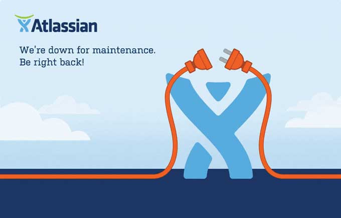
This is the maintenance page from Atlassian, featuring a creative and engaging design. Here are some elements that make it effective:
- Branding: The page prominently displays the Atlassian logo, reinforcing brand identity.
- Clear Message: The text “We’re down for maintenance. Be right back!” clearly communicates the status to users.
- Visual Metaphor: The unplugged cable forms the shape of the Atlassian logo, providing a visual metaphor for being temporarily offline, which adds a touch of creativity and humor.
- Color Scheme: The use of Atlassian’s brand colors (blue and orange) maintains brand consistency and creates a visually appealing contrast.
- Engaging Visuals: The animated elements (if the original was an animated GIF) can capture the user’s attention and make the wait less frustrating.
- Simplicity: The design is simple and uncluttered, making it easy for users to understand the message quickly.
- Positive Tone: The message is friendly and reassuring, which helps maintain a positive user experience despite the inconvenience.
Product Hunt

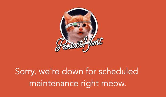
This maintenance page from Product Hunt uses humor and a playful design to communicate its message effectively. Here are some key elements that make it work well:
- Branding: The Product Hunt logo is prominently displayed, ensuring users know which site they are on.
- Humor and Playfulness: The use of a cat with Google Glass and the pun “right meow” adds a humorous and light-hearted touch, making the maintenance notice more engaging.
- Color Scheme: The bright orange background is eye-catching and aligns with Product Hunt’s brand colors, maintaining visual consistency.
- Clear Message: The text “Sorry, we’re down for scheduled maintenance right meow.” clearly informs users of the situation while maintaining a casual and friendly tone.
- Simplicity: The design is straightforward and uncluttered, making the message easy to read and understand quickly.
- Friendly Tone: The informal language and playful imagery help to keep the user experience positive, even during downtime.
There are many different platform tools and plugins that can help you create maintenance messages for your landing pages. Here are some popular options for different website builders:
WordPress
- WP Maintenance Mode: A versatile plugin that allows you to create custom maintenance pages with ease. It includes features like countdown timers, contact forms, and social media icons.
- Coming Soon Page, Maintenance Mode & Landing Pages by SeedProd: This plugin offers a drag-and-drop builder to create maintenance and coming soon pages, with advanced design options and real-time page editing.
- Under Construction: Simple and user-friendly, this plugin offers customizable templates for maintenance and under-construction pages, along with Google Analytics integration.
Shopify
- Shopify’s Built-in Password Protection Page: Use the native feature to display a maintenance message by enabling password protection for your store, and customize the message displayed.
- Plug in SEO: While primarily an SEO tool, it includes features to manage site status and inform users about maintenance.
- Coming Soon Page & Maintenance Mode: An app that lets you create visually appealing maintenance pages, complete with countdown timers and subscription forms.
Wix
- Wix’s Built-in Maintenance Mode: Activate maintenance mode directly from the Wix dashboard and customize the maintenance message displayed to visitors.
- Wix Code (Velo): For more advanced customization, use Velo by Wix to programmatically display maintenance messages and create custom pages.
Squarespace
- Squarespace’s Announcement Bar: Use the built-in announcement bar to display a maintenance message across your site. Customize the message and style through the settings.
- Cover Pages: Create a custom cover page dedicated to maintenance and set it as the home page during downtime.
Webflow
- Webflow’s Designer: Use Webflow’s Designer to create a custom maintenance page from scratch, allowing full control over the design and functionality.
- Webflow’s Site Settings: Enable a custom 404 or redirect page to serve as your maintenance message, ensuring visitors are informed about the downtime.
- Custom Code Embeds: Add custom code snippets or scripts to display a maintenance message or countdown timer.
Divi
- Divi Maintenance Mode: Use Divi’s built-in Maintenance Mode feature to display a customized maintenance page. You can design the page using the Divi Builder for a fully customized look.
- Divi Coming Soon & Maintenance Mode Plugin: This plugin enhances Divi’s capabilities, allowing for more advanced customization options for maintenance and coming soon pages.
- Free maintenance layout pack: I have created a free maintenance layout for Divi.
Elementor
- Elementor Maintenance Mode: Elementor offers a built-in maintenance mode feature, allowing you to create and design a custom maintenance page using Elementor’s drag-and-drop builder.
Conclusion
A well-crafted maintenance message is essential for maintaining user trust and minimizing frustration during downtime. By following the provided templates, tips, and best practices, you can ensure effective communication with your users and maintain a positive user experience.


