Everything you do in Divi revolves on the top navigation bar. Therefore, even minor adjustments to its structure can completely transform the editing process. With the addition of more tools and shortcuts in Divi 5, the top bar began to hold too much information at once. More care was paid than necessary to something as basic as the preview button. To address that, this update rearranges the top bar. We will show you what is changed, where everything is now located, and how it works with your editing process.
Here is the revised top bar next to the old one.
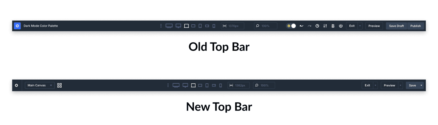
Every action was positioned at the same level in the previous configuration. There is hardly any distinction between the following: save, preview, undo, view switching, and page settings. You had to go through everything to discover a certain tool because nothing pointed your eye in the direction of what was most important. Options you might open once a session are positioned next to controls you reach for fifty times a day. All of those tools are retained in the revised bar. They simply have a new organizational structure. The bar has space, frequently used controls are positioned closer to the surface, and related activities are organized into menus. The concept is straightforward: make routine tasks seem instantaneous while keeping everything else at a click's distance. So that you can see where things landed, let us take a look at each section of the new top bar.
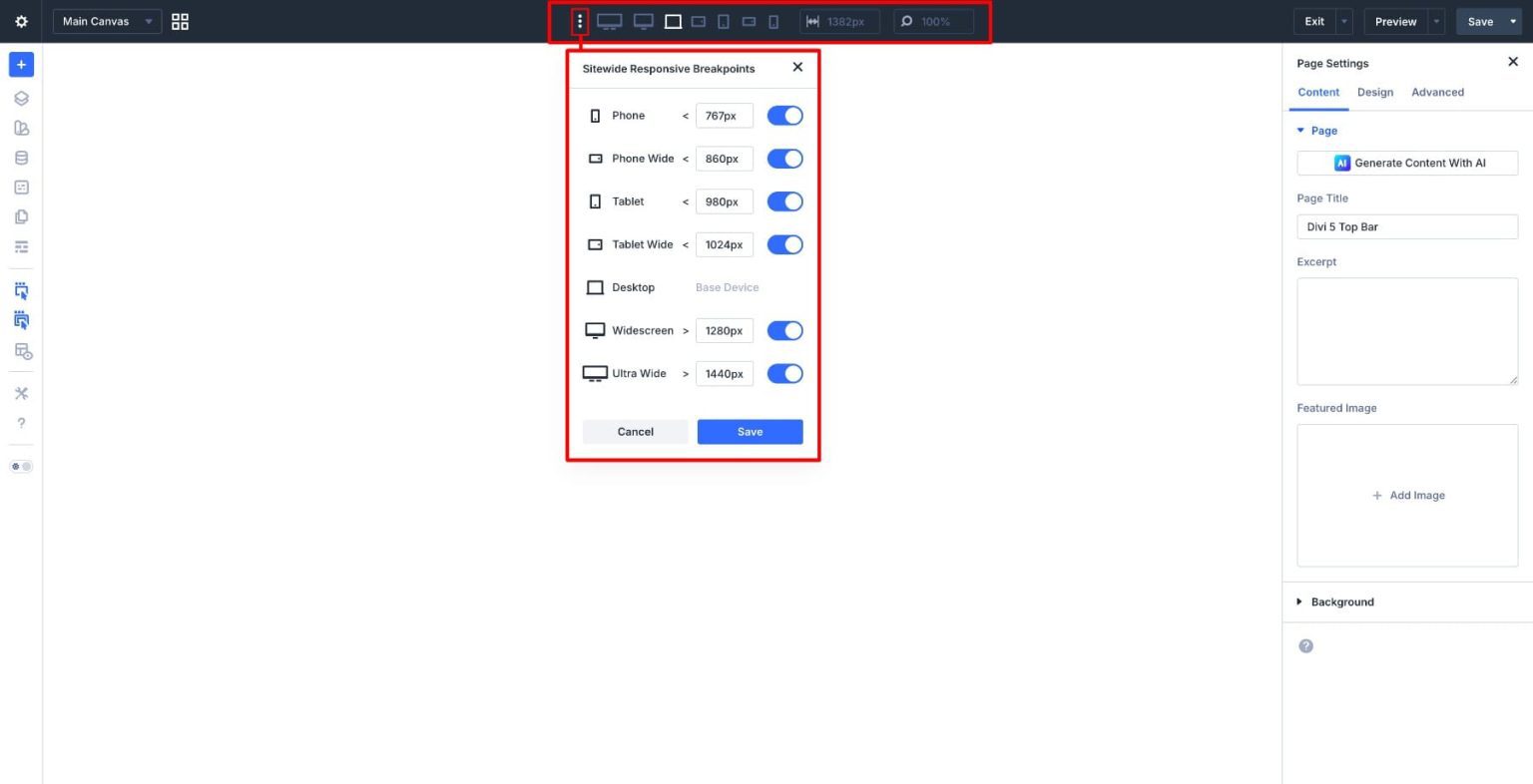
Here are the contents of each region, starting from the left and working your way right.
Everything that has to do with controlling the page itself—not its elements—is grouped together in the Page Menu. It is located on the far left of the top bar, behind the gear icon.
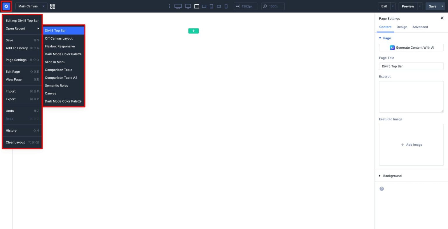
The menu is divided into several distinct sections once it is open:
You can navigate between your Main Canvas and any other canvases (such as off-canvas layouts) from the top bar without ever leaving the builder. You can open and manage all of your available canvases from a single location with the help of the Canvas Grid View.
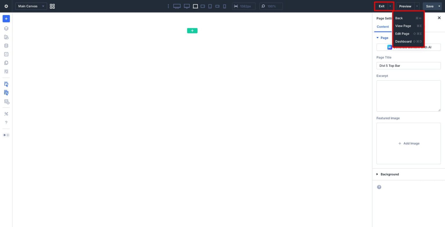
You can exit the constructor using the Exit menu without having to worry about where you are going. You have the option to go directly to the dashboard, start the WordPress editor, view the page on the front end, or go back to the previous screen.
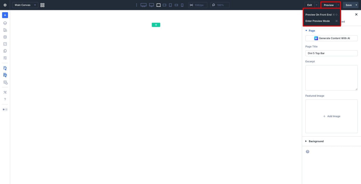
You may check your work in two ways using the Preview menu. You have two options: Enter Preview Mode to examine the page directly within the builder, or open a front-end preview in a separate tab. Because it allows you to examine layout, spacing, and interactions without leaving your workspace, Preview Mode is the quicker choice.
From the Save menu, you can choose which post status to save as: draft, pending review, private, or publish. Each option corresponds to a different stage in your workflow, from early drafts to final publishing. That’s the full tour. The top bar looks different, but nothing is missing. If anything, it should feel like things are exactly where you’d expect them to be.
You Can Restore It If you prefer the previous icon-based top bar, you can switch back at any time. This is worth knowing if you’re already comfortable with the older layout, follow tutorials built around it, or want to keep the interface consistent across a team. All you need to do is enable the Page Bar Icons in the builder’s settings panel. The simplified bar is the default, but the option to restore the icon layout is always there.