The Divi Blog module comes with an option for a Read More link, but there are two shortcomings with this.
We are going to solve both of these issues in this tutorial.
At the end of this tutorial, I will be covering some best practices as well for the Read More text for blog articles.
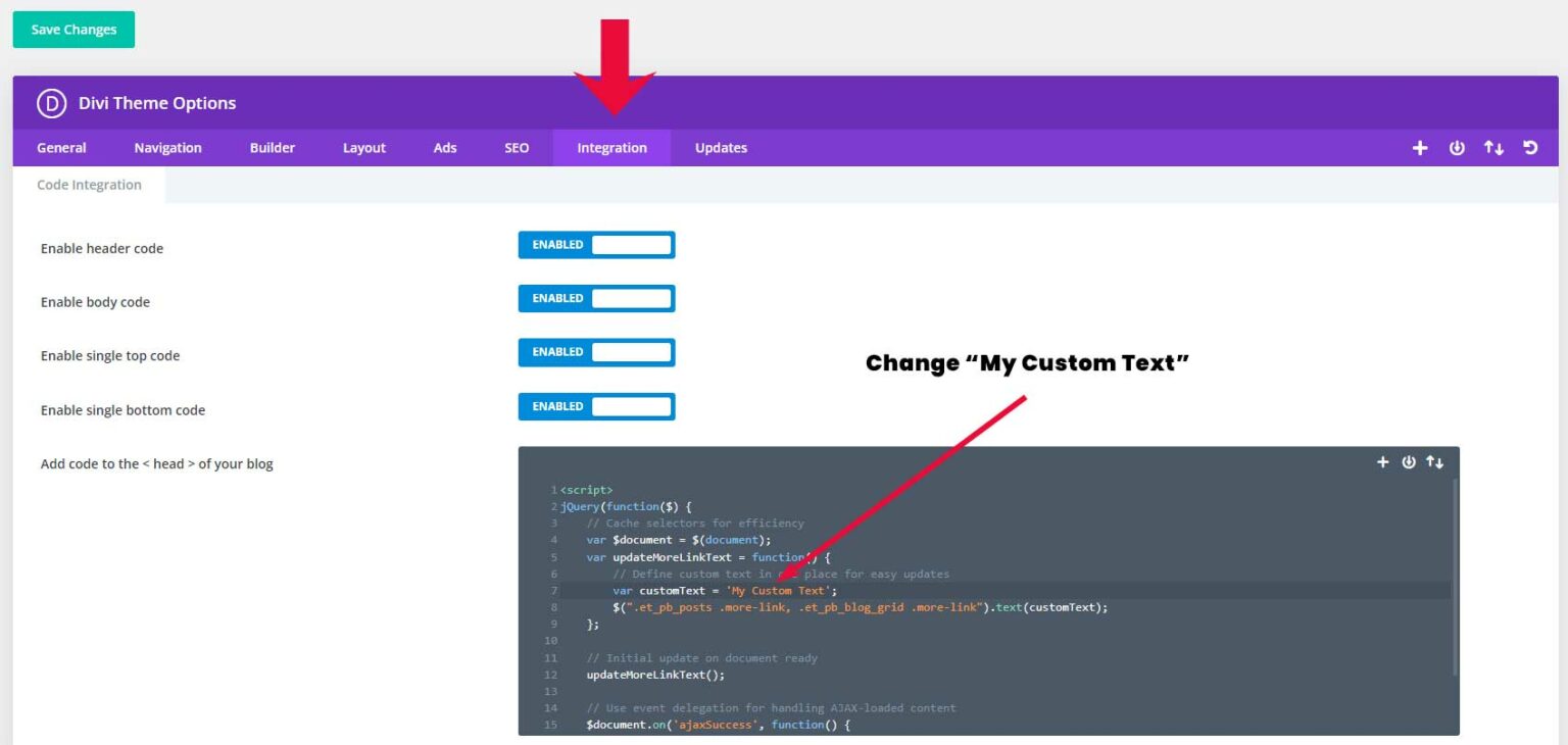
For changing the “Read More” text navigate from your WordPress dashboard to Divi > Theme Options > Integrations > “Add code to the < head > of your blog”.
Then place the following code snippet.
<script>
jQuery(function($) {
    // Cache selectors for efficiency
    var $document = $(document);
    var updateMoreLinkText = function() {
        // Define custom text in one place for easy updates
        var customText = 'My Custom Text';
        $(".et_pb_posts .more-link, .et_pb_blog_grid .more-link").text(customText);
    };

    // Initial update on document ready
    updateMoreLinkText();

    // Use event delegation for handling AJAX-loaded content
    $document.on('ajaxSuccess', function() {
        updateMoreLinkText();
    });

});
</script>
Then change the “My Custom Text” into your text.

Don’t forget to click on Save Changes.
If you’re looking to go beyond the built-in Divi features, CSS is your friend. By creating a custom CSS class and targeting it specifically, we can turn the “Read More” text into a button.
This will work for both full-width and grid blog layouts.
You can just follow the steps below to create a button
Step 1
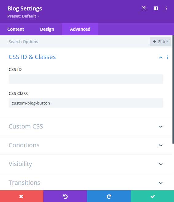
Navigate to the blog module settings and switch to the ‘Advanced’ tab.
In the ‘CSS ID & Classes’ option field, add the following class name ‘custom-blog-button‘.

Step 2
Go to Divi > Theme Options > CSS and add the following CSS code.
.custom-blog-button .more-link {
    background-color: #c60505;
    color: #fff !important;
    padding: 2px 15px 2px 15px;
    font-size: 13px;
    margin-top: 15px;
    display: inline-block;
}Background color:
Under background color, you can change the color of the button.
Color:
Under color, you can change the text color of the button.
Padding:
This is the button space. You can adjust the values to make the button bigger or smaller.
Font-size:
You can change this value to make the font size bigger or smaller for your button.
Margin-top:
This is for the space between the button and the blog content.
Tip: If you want to make the button full-width you can add this to the snippet:
width: 100%;
text-align: center;
For another example of customizing the Read More blog button, Plus the blog pagination buttons you can follow this tutorial: How to create a Divi read more blog button
Selecting the right ‘Read More’ text is crucial. It must be concise, compelling, and consistent with your overall content marketing strategy. Here are some best practices to follow:
Some examples to replace the Read More text are: Continue Reading, Click for Insights, and Keep Learning are common phrases that maintain a natural reading flow.
Making ‘Read More’ Buttons Accessible for Everyone
An important aspect of customization is ensuring that all users, including those with disabilities, can interact with your content. For the ‘Read More’ button, this means using clear, descriptive text that works with screen readers and ensuring sufficient contrast between the button text and its background.
With some simple customizations, we can transform the “Read More” text into a different phrase convert the text link into a button, and make it more appealing.
If this tutorial was helpful or if you have any questions please let me know in the comments below.