Many navigational needs are addressed by Divi's Menu module, but occasionally you want more flexibility and options. You can go beyond what the Menu Module provides with custom header designs, distinctive hover effects, or particular semantic HTML needs. With the use of HTML wrappers and semantic components in Divi 5, you can create navigation from scratch using simple modules and produce correct, accessible HTML. Using an Image Module for the logo, Text Modules for the text-based navigation links, and a Button Module for a call to action, this lesson shows how to create a navigation menu. The end effect is a semantic <nav> structure with appropriate <ul> and <li> elements that search engines, browsers, and screen readers can all understand.
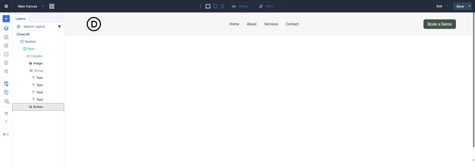
While custom-built navigation has advantages in certain situations, the Menu Module is effective for out-of-the-box navigation. You can access each module's complete styling choices by using it separately. Instead of using the Menu Module's preset layout, you can customize the navigation using CSS Grid or Flexbox. Instead of floating outside the <nav> element, you can include a styled button as part of the navigation itself, semantically inside it where it belongs. This is a practical and valid method thanks to Divi 5's semantic element settings. You have complete control over the HTML tags that each module generates, guaranteeing that your unique navigation is always completely accessible and semantically sound.
there are legitimate methods for implementing semantic structure. Invalid implementations of context and semantic elements are frequently worse than not trying them at all. Therefore, it is useful to comprehend the HTML structure and guidelines you are attempting to imitate before developing this in Divi. This is a condensed example:
<header> <nav> <ul> <li> <a><img></a> </li> <li> <ul> <li><a>Home</a></li> <li><a>About</a></li> <li><a>Services</a></li> <li><a>Contact</a></li> </ul> </li> <li> <a>CTA Button</a> </li> </ul> </nav> </header>
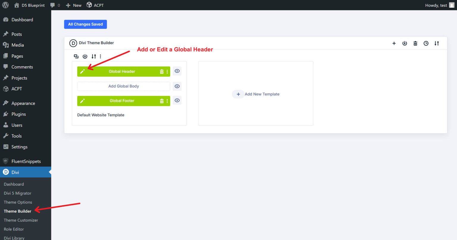
Using a Global Header, we will construct this in Divi's Theme Builder. By doing this, the <header> tag is automatically assigned to you. Every navigation element then enters a <nav> landmark. If an element has a link, you know it must be inside the Navigation tag (in this case, that includes the button and logo). Three list items (<li>) are contained in the outer <ul>: the CTA button, a nested list of navigation links, and the logo. The list semantics convey the relationship between menu items, and screen readers identify this as a navigation area. Each text link in our sub-list is encapsulated in a <li>, and we use another <ul> for them. Divi modules now have more than one layer. Sometimes we will modify a Module's HTML element directly, but other times we will additionally use the Before and After HTML choices because we need to create a semantic layer on top of it. All we need to do to give this straightforward menu and navigation the right semantic structure is to use both of those Advanced > HTML options.
Edit your Global Header template by opening the Theme Builder. Once more, you do not have to bother about header templates because the Theme Builder automatically wraps them in a <header> element.
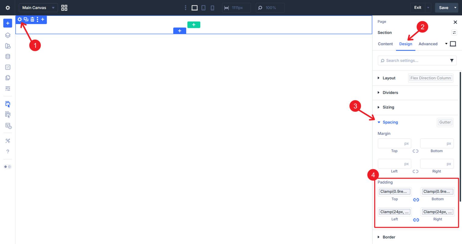
The editor should already have an empty section. Only the most basic styles will be used in this lesson. Choose the desired amount for the top and bottom padding of the Section; in this case, clamp(0.9rem, 0.8rem + 0.2vw, 1.1rem). Use a clamp to set the site gutter's left and right padding (24px, 6vw, 90px). For each of them, design variables are being used.
I will add a background color as well.
Insert the Row Insert a row within the section. This Row will later become the <nav> element. Choose the Flex Row with a single column.
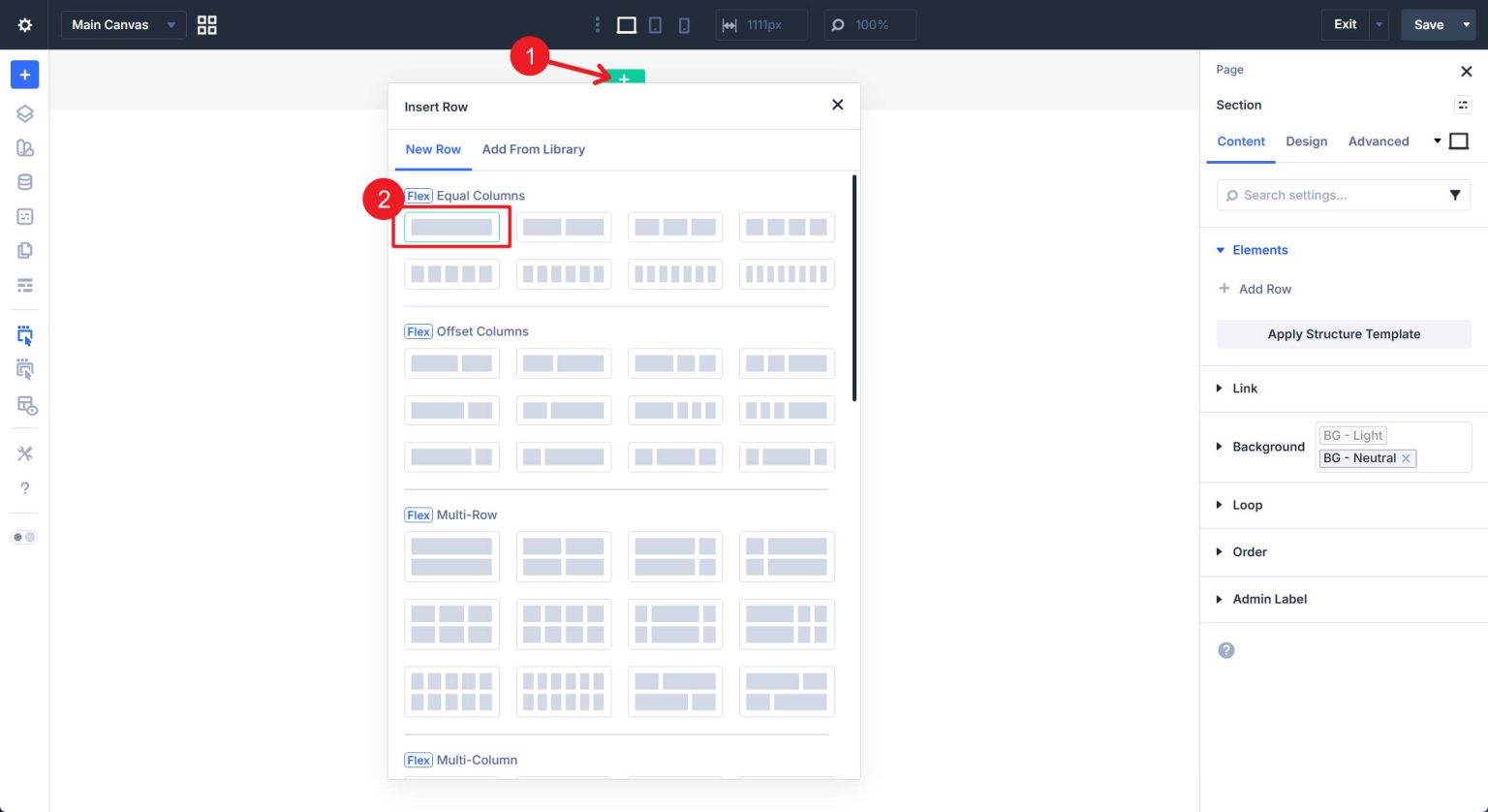
The first column will always be filled in when a row is added. This is the only column we require because we used a single-column layout option.
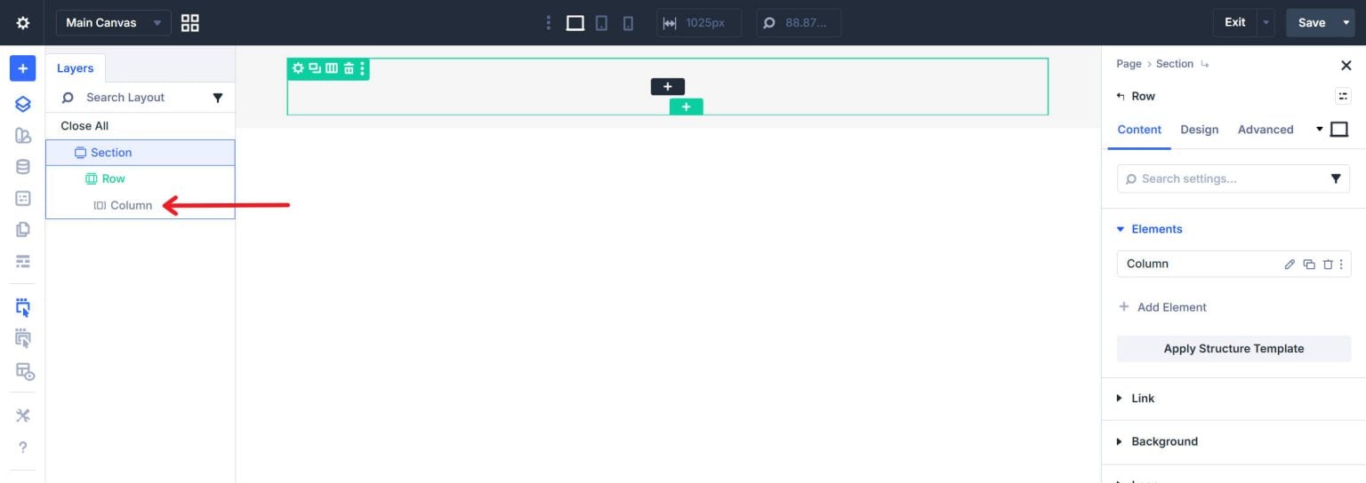
The outer <ul> that contains all of the navigation elements will be the column.
The modules that will make up the navigation elements are now added after the core containers are in place. Include the Logo (Image Module) The first element in the column should be an Image Module.
Upload or pick your logo image. Put your homepage as the link URL for the image. This link is vital - without it, the logo won’t effectively operate as a menu item.
After the image inside the column, add a group module. In addition to visually grouping the navigation links, the Group will also produce the nested <ul> structure. Add four Text Modules to the Group, one for each text navigation link. Add the link text and set the hyperlink in the Rich Text editor (Ctrl + K) in the content field of each Text Module. For correct semantic output, the anchor must be inside the text content; do not utilize the module's Link option group.
Give each a unique text and link as you see fit.
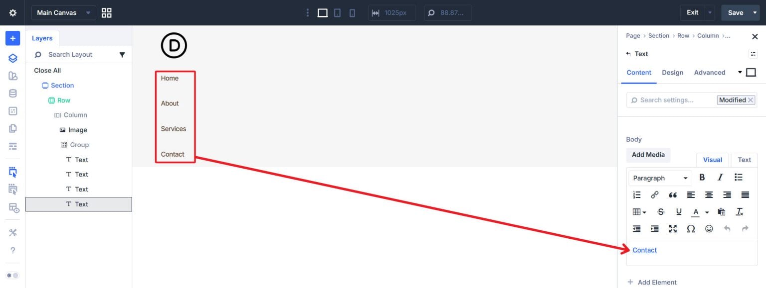
The last thing to add is a Button module inside the Column after the Group.
Set the Button Text and Button Link URL. You can also add any button styles you like.
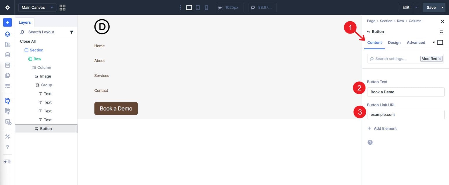
We need to change a few Flexbox settings so that our internal modules and structure are arranged horizontally now that they are all in place.
Click on the Design tab after selecting the Column. For logo-left, nav-center, and button-right distribution, select Layout Direction (horizontal) to Row and Justify Content to Space Between under Layout. Align Items to Center as well.
Open the Design tab > Layout after selecting the Group Module. Select Row as the Layout Direction. For uniform navigation link spacing, use an optional custom gap value and set Justify Content to Space Around.
You have complete control over the layout and design. Moving on to semantic structure, however, we will convert generic <div> elements into legitimate HTML for navigation. The precise procedures listed below may need to be adjusted if you add any or rearrange the components. However, the steps below will provide you with a totally legitimate implementation if you are quite near to the above-described structure.
Choose the Row. Select the Advanced tab. Locate the Element Type dropdown and the HTML option group. Change it to <nav> instead of the default. Instead of <div class="…">, the row now outputs as <nav class="…">.
Choose the Column. Set Element Type to <ul> under the Advanced tab > HTML option group. All of the navigation elements are contained in the outer unordered list that is created by the column.
If you would want, you may also utilize the <menu> Element type in this situation. In this context, it is uncommon for these two items to be semantically interchangeable.
Select the Image Module by setting it to li. Select <li> as the Element Type under the Advanced tab. In the navigation list, the logo is turned into a list item. Keep in mind that this logo or image must have a connection.
There are two semantic changes needed for the Group Module. First, locate HTML Before in the Advanced tab and type <li>. Enter </li> after finding HTML After. This creates a list item element that encloses the entire Group. This guarantees that all of the direct descendants of the parent <ul> (the Column) (which should be <li>) maintain a correct HTML structure.
Next, set the Element Type to <ul>, which will result in a nested, unordered list for the Group output. When we get to the Group's Text Modules, this is crucial.
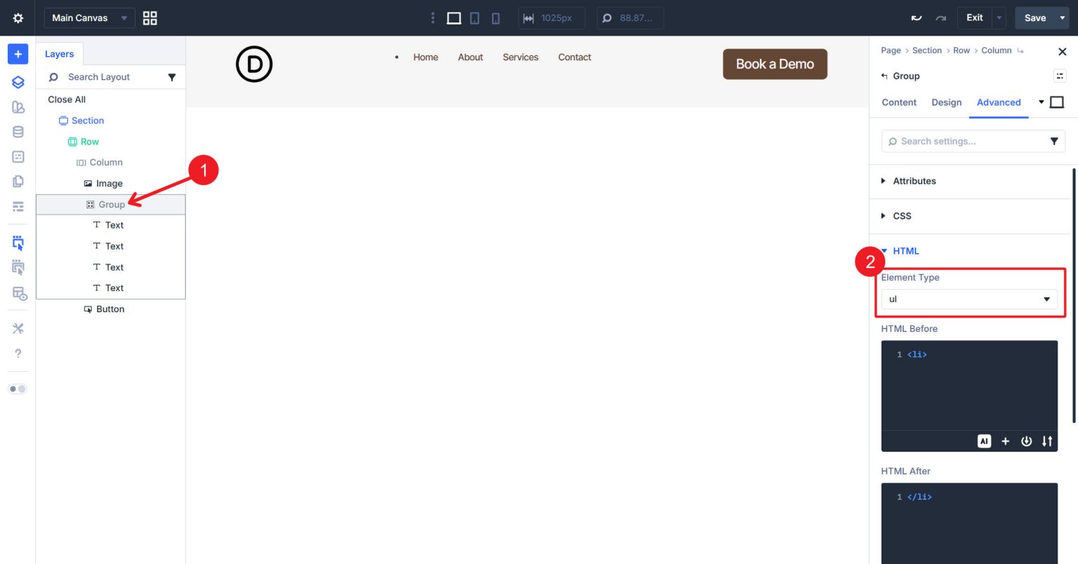
Crucial Note: As we previously stated, <menu> and <ul> are interchangeable. This actually applies to the top-most <ul> or <menu>. However, we must use <ul> instead of <menu> because the Group Module is already nested inside a <ul>/<menu>.
Inside the Group, choose each Text module. For each of the four, set Element Type to <li>. Within the nested list, every navigation link becomes a list item.
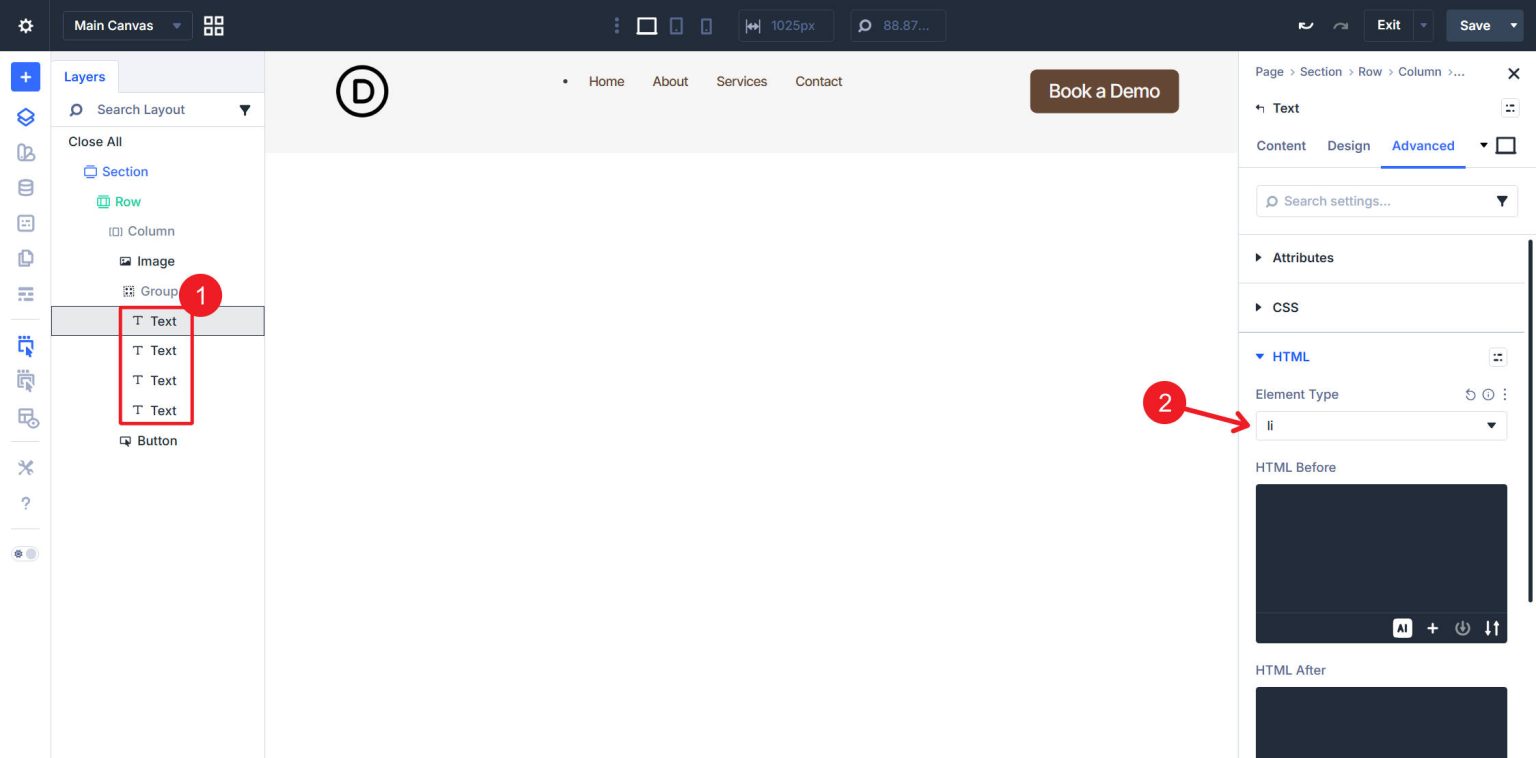
Additionally, they have the required <a> tags since we included links to each text in the Rich Text editor of the module.
Next, pick the Button Module. We wish to retain the Element Type of <a> that Divi automatically assigned to the button. Nevertheless, <li> must be added to HTML Before, and </li> to HTML After.
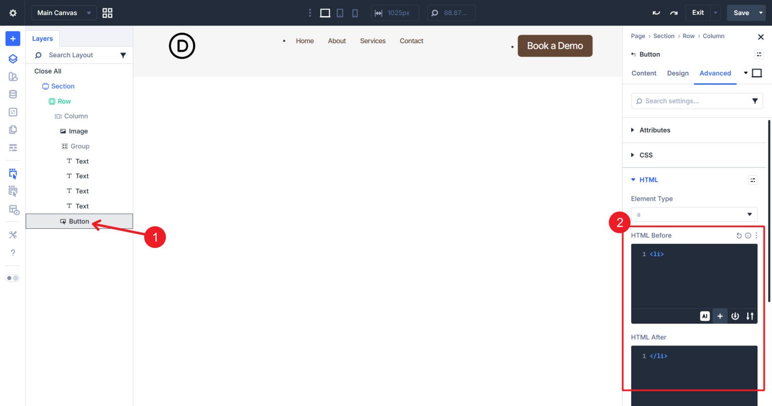
In order to match the structure of other navigation components, the button is transformed into a list item with an anchor tag.
Most likely, you notice some off-center spacing and list dots. This is because we may have introduced unwanted spacing into the layout when we introduced some of those HTML components. Specifically, lists frequently use default styling, which we will now reverse.

To see some of the additional spacing, you can use X-Ray Mode.
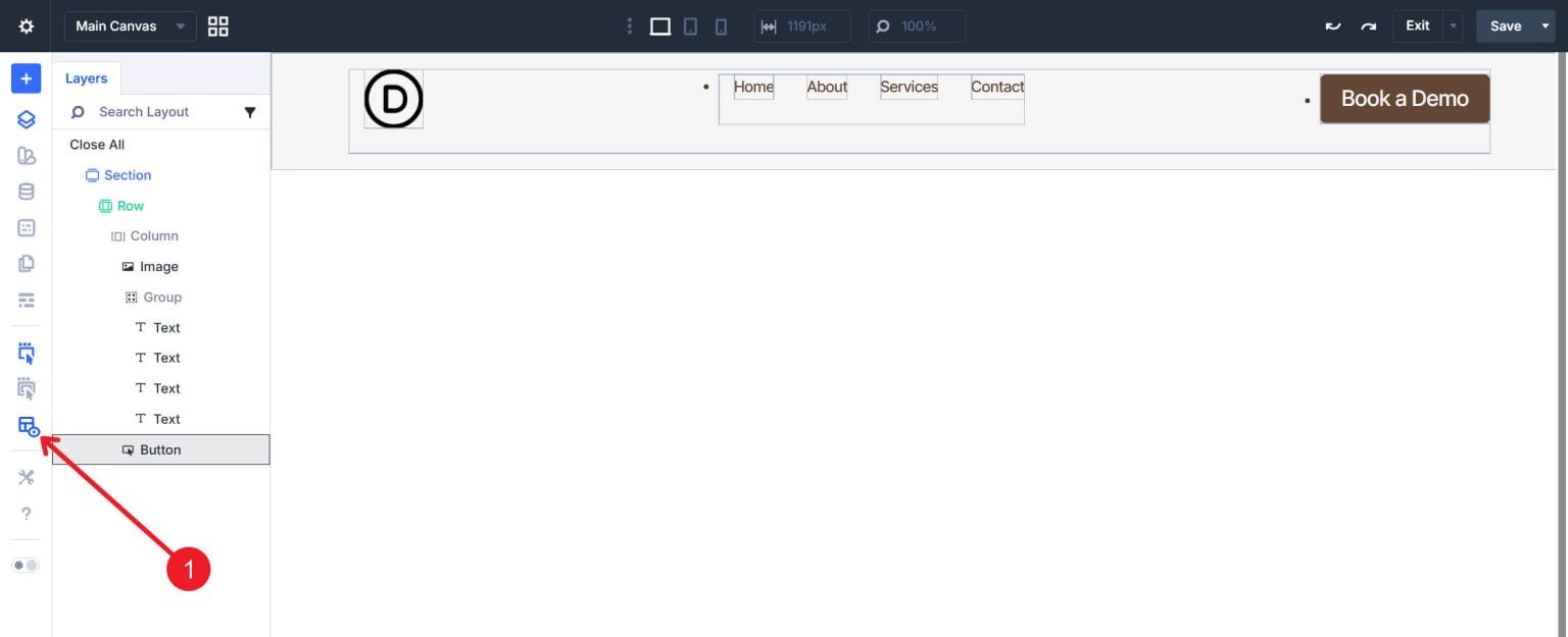
The <nav> Column should be chosen. Set Padding Bottom to 0px under Spacing in the Design tab.
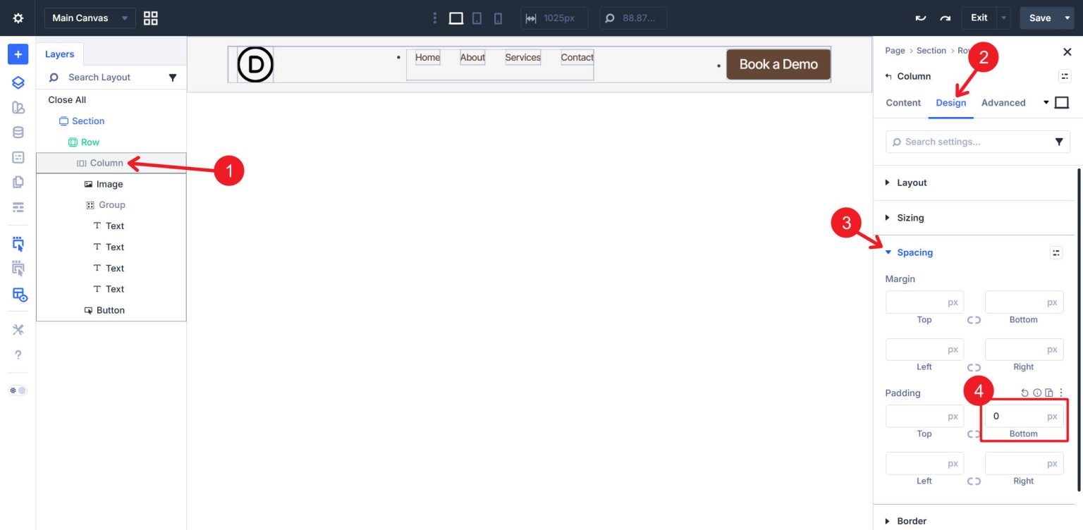
We must complete the same task, thus choose the Group Module. Padding Bottom should be set to 0px.
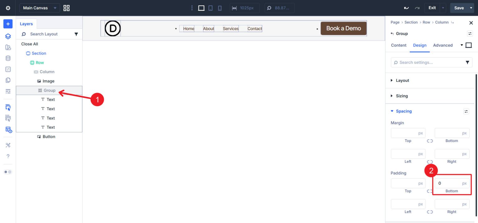
Now that the unnecessary spacing has been fixed, we can swiftly solve the list items' undesirable bullet points. Open the Advanced tab > CSS after selecting the Row. Add the following CSS to the Free-Form CSS field:
nav ul, nav ul li, nav ul li ul, nav ul li ul li { list-style: none; } .et-l--header nav ul { padding: 0; list-style: none; }
List bullets are eliminated from all list elements in the navigation in the first section of this CSS. The last <ul> spacing that is difficult to access in Divi's spacing settings is eliminated in the second section.
Now that our spacing is adjusted, you can disable X-Ray Mode.
then navigate to your website's front end to see the header. The visual outcome is consistent with a typical navigation layout, with the CTA button on the right, the nav links in the middle, and the logo on the left. But now the underlying HTML is semantically accurate.

To view the structure, examine the element in the browser's developer tools:
It is totally acceptable if you did not follow the format and module composition we used in this lesson. You may need to apply the nav, ul, li, and a tags in somewhat different ways, though. Since few of us are specialists in semantic structure, this can be difficult. I have found it useful to copy my header's HTML from my browser's DevTools and feed it to my preferred AI.
From there, ask whether the semantic structure is valid and what needs to change to make it valid. You can even give the AI the URL of this blog post so it can read up on some Divi 5 context and provide better instructions to help you reach your desired end result. Start Building In Divi 5 Today! Divi 5‘s semantic element controls unlock construction methods that previous versions of Divi couldn’t support. Building navigation from atomized modules is now possible, and with it, the assigning of semantic elements. The Element Type setting, combined with HTML Before and HTML After fields, provides the control necessary to output valid HTML5 structures from any module combination. Building a navigation is one application — the same technique applies to building custom footers, sidebars, article layouts, and any component requiring specific semantic markup. Divi users now have the tools to build accessible, semantic HTML without abandoning the Visual Builder workflow. The gap between “what Divi outputs” and “what valid HTML requires” has closed.