Controlling how objects move, wrap, and arrange themselves across several screens is frequently the crux of responsive design. Flexbox, the layout framework at the heart of Divi 5, allows you to manipulate layout alignment and flow at the container level. Block-style layouts force you to use fixed columns and floats, but Flexbox adapts to the available space, which increases the predictability of responsive behavior. To demonstrate how these features work together to provide a simple, responsive design with fewer edits, we will examine how Flexbox functions in Divi 5 and walk through a basic layout in this tutorial.
Flexbox is a contemporary arrangement technique that makes pieces automatically adjust to available space. Consider it similar to arranging things on a shelf: you choose where they should go, how much space they require, and what to do when you run out of room. Flexbox views a section or container as a flexible space and allows you to choose how its elements should respond to changes in screen size, as opposed to locking modules into fixed columns.
This adaptability is particularly helpful when creating for different screen sizes. You are no longer concerned about material overflowing on mobile devices or speculating about how components will fit together on tablets. According to the rules you provide at the container level, Flexbox takes care of those modifications for you. Flexbox is now a fundamental layout system in Divi 5. When a section, row, or container is set to Flex, the elements inside become flex items and the container itself becomes a flex container. Without using custom CSS, you may choose how things align, wrap when space runs out, sit side by side or stack vertically, and how much space separates them.
Design > Layout > Layout Style settings are where you may manage Flex properties.
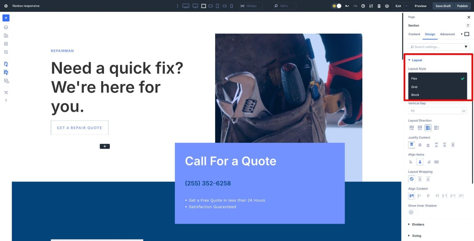
By default, any new rows and sections you create are Flex (until you select a structure particular to Grid). Divi also supports CSS Grid, which you may use in conjunction with Flex to construct sophisticated layouts, and also allows you to convert existing Block layouts to Flex.
The way you construct rows is also altered by this system. Instead of selecting a predetermined column layout up front, you may design a container and let Flexbox decide how items distribute themselves. With container settings alone, two parts may stack on mobile devices and sit side by side on desktops.
Because Flexbox operates at the container level, you can create layouts that adapt organically to screen size. This lessens the need for complicated CSS, multiple modules, and padding adjustments. Instead of being an afterthought, responsive behavior becomes a deliberate component of the layout.
To make your design simpler, Divi offers predefined Flex Row Structures.
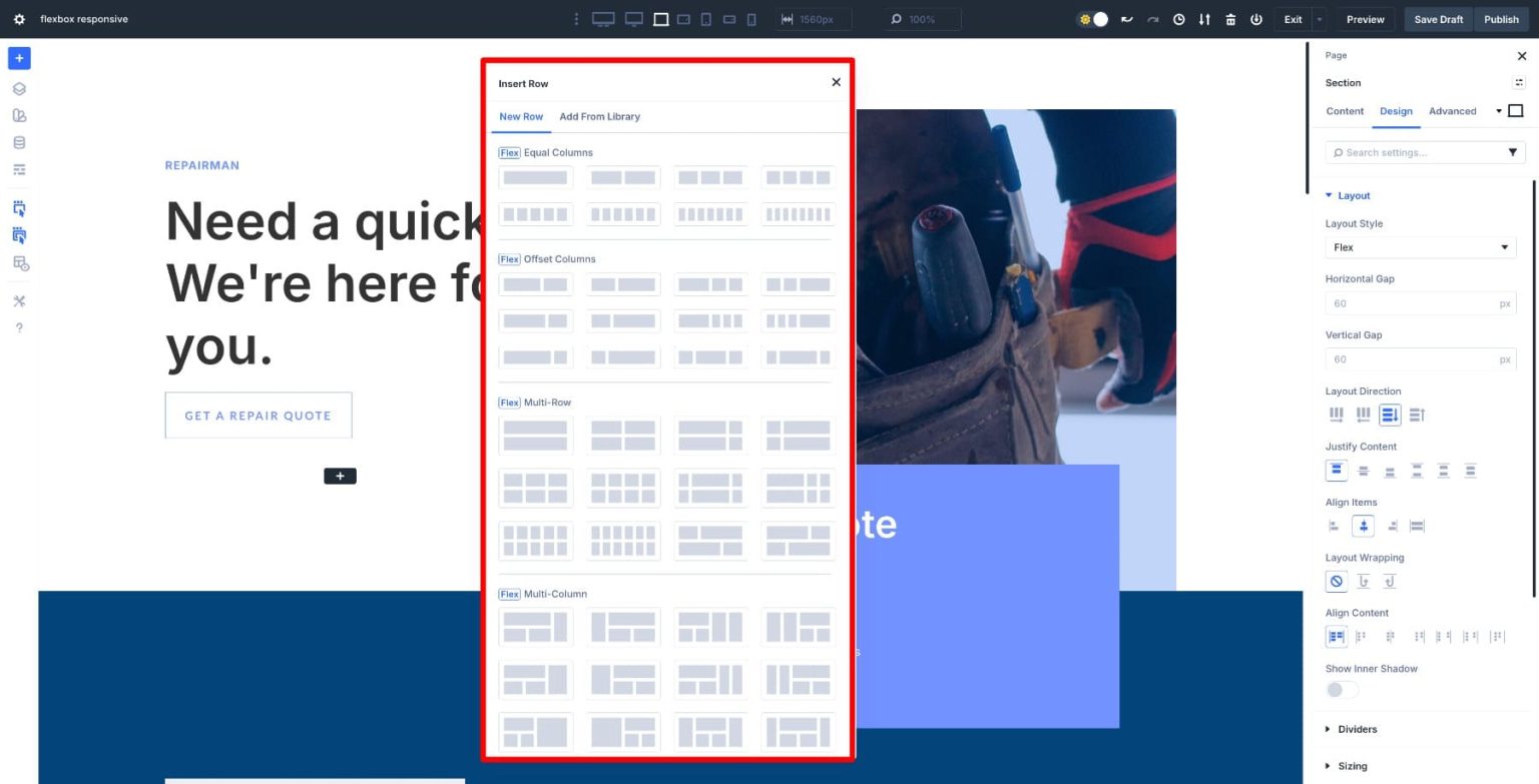
However, you are not need to begin with a predetermined framework. The fact that Flexbox eliminates the requirement for preset column layouts in Divi 5 is one of its main benefits. You can put modules inside a container and let Flexbox decide how to arrange them according to the space that is available. Things are arranged side by side on big screens. They stack automatically on smaller screens, eliminating the need to duplicate modules for mobile devices or create new rows.
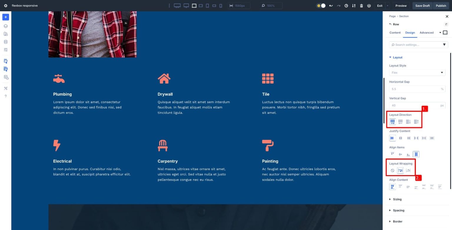
Additionally, you have control over how layouts change at certain breakpoints. On a desktop, a row can show objects horizontally; on a tablet or phone, it can switch to vertical stacking. When there is room, items can remain in a single row; when there is not, they can wrap to many lines. Instead of modifying multiple modules, you can change a single parameter because these controls are container-level.
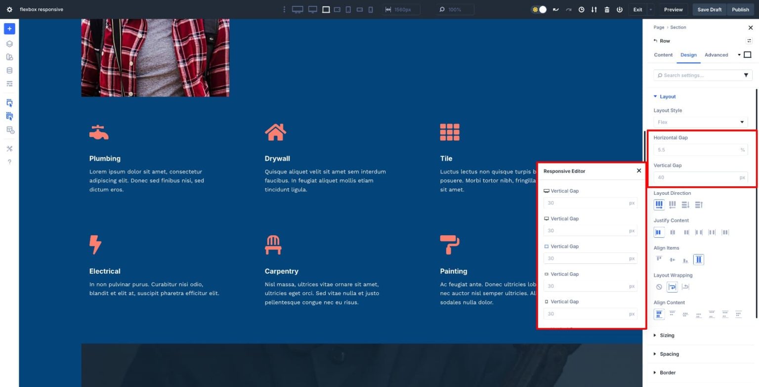
It is the same with spacing. You do not need to adjust the margin or padding on each module because Flexbox employs gap controls for both horizontal and vertical spacing. When the design changes on smaller screens, this avoids spacing problems and maintains layout consistency. Layouts appear purposeful rather than haphazardly assembled. Additionally, you may adjust for various breakpoints using the Responsive Editor and responsive Advanced Units (such as %, clamp(), and calc()).
Another degree of flexibility is added by rearranging components. On a tablet or mobile device, you can alter the modules' visual order without utilizing visibility settings or copying material. Hero sections, CTA rows, or any layout where you want text and images to move about on smaller displays will find this functionality especially helpful.
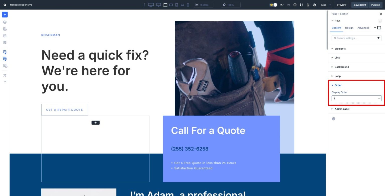
While Divi 5's Elements and structural options enable you to manually select how a row reorganizes on smaller displays, Flexbox allows layouts to dynamically shrink, wrap, and adapt.
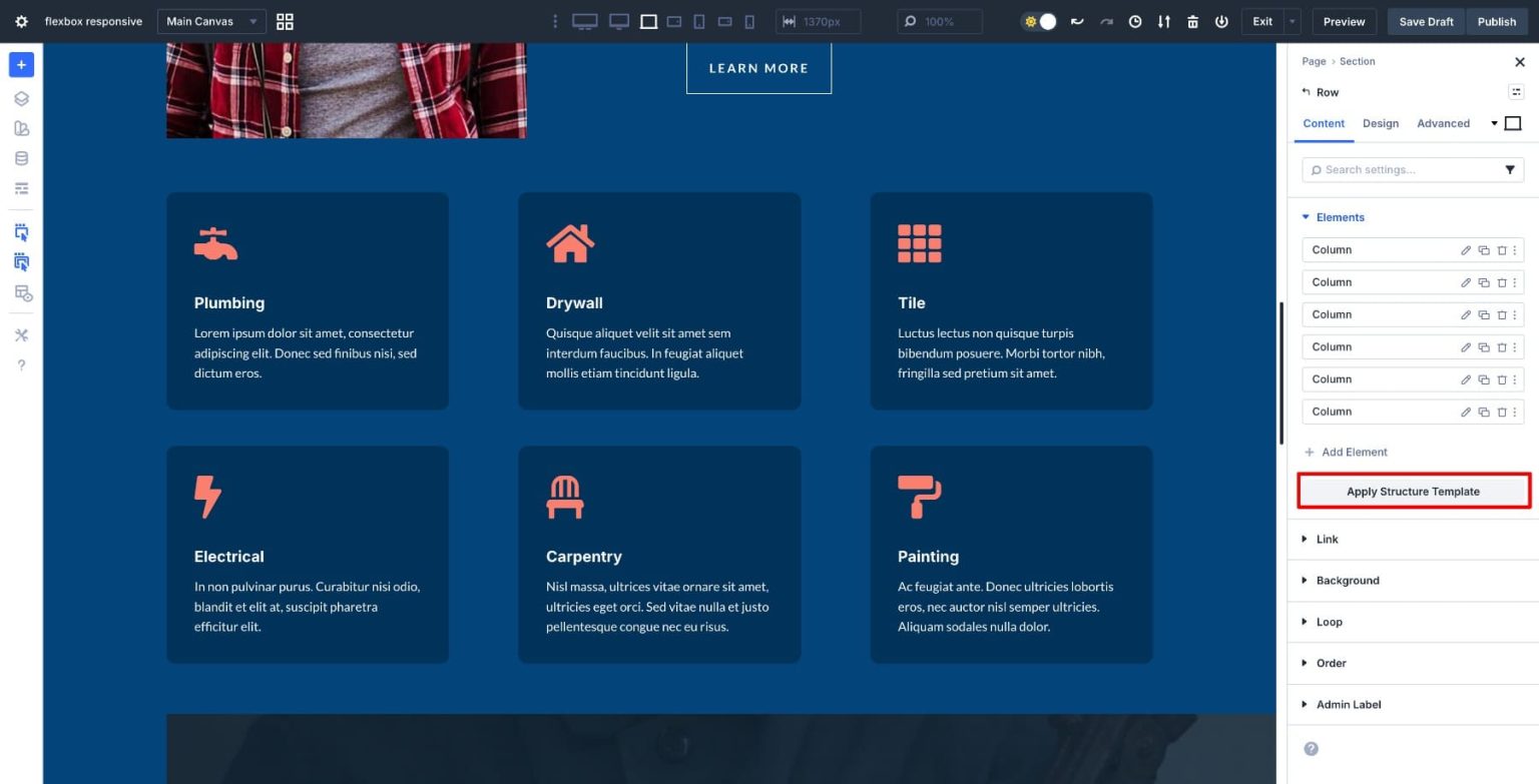
You can pick a row and a preferred structure for every breakpoint rather than depending solely on automated stacking. This enables you to choose whether elements on a tablet or mobile device should stay side by side, wrap into numerous lines, or transition into a vertical stack. On a desktop, for instance, a three-column arrangement would be effective. You can select a tablet layout that arranges items in two columns. To ensure that text flows naturally from top to bottom on mobile devices, you can change that same row to a single column. Although the layout purposefully adapts to the screen size, the information remains the same.
This method works particularly well when layouts require more control than Flexbox's built-in functionality can offer. You are specifying precisely how the row should reorganize at each breakpoint, as opposed to merely hope that items stack in a useable manner.
It is not necessary for every layout to have a different form on every screen just because row structures can be changed. The secret is to know when to make a structural decision and when to let Flexbox adjust organically.
Wrapping is frequently sufficient if a layout still reads well on smaller displays. As long as there is room, items can remain in a row before flowing organically to the following line. Icon rows, feature grids, and layouts with equal importance of elements all benefit from this.
When the hierarchy or reading order needs to be altered, switch structures. Mobile layouts are read vertically, but desktop layouts are scanned horizontally. In those situations, clarity is enhanced by using an alternative movable structure.
Distinguishing element order from row structure is also beneficial. The layout shape is determined by the structure. What shows up first is determined by order. On mobile, you may stack a row vertically and then rearrange the parts such that the most important stuff comes first.
Switching structures too quickly is a typical error. Forcing a single-column layout might make websites feel excessively long if space or wrapping addresses the issue. Changes to the structure should be used to address particular layout problems rather than as a general solution for smaller screens.
Instead of making responsive design a module-by-module task, Flexbox makes it a container-level choice. The layout changes to reflect the behavior you specify for the content. This lessens the need for trial-and-error spacing adjustments, device-specific workarounds, or custom CSS. Divi combines these capabilities with a responsive preview editor and adjustable breakpoints to allow you to create layouts that look good on both mobile phones and widescreen computers.
Using Flexbox to create a new layout in Divi 5 is simple. You may construct your layout and make adjustments at various breakpoints without requiring further setup because every section and row you add is already configured to Flex by default. We will go the other way in this scenario. To demonstrate how the switch functions and how to adjust it for responsive behavior, we will convert an outdated block-based layout to Flex.
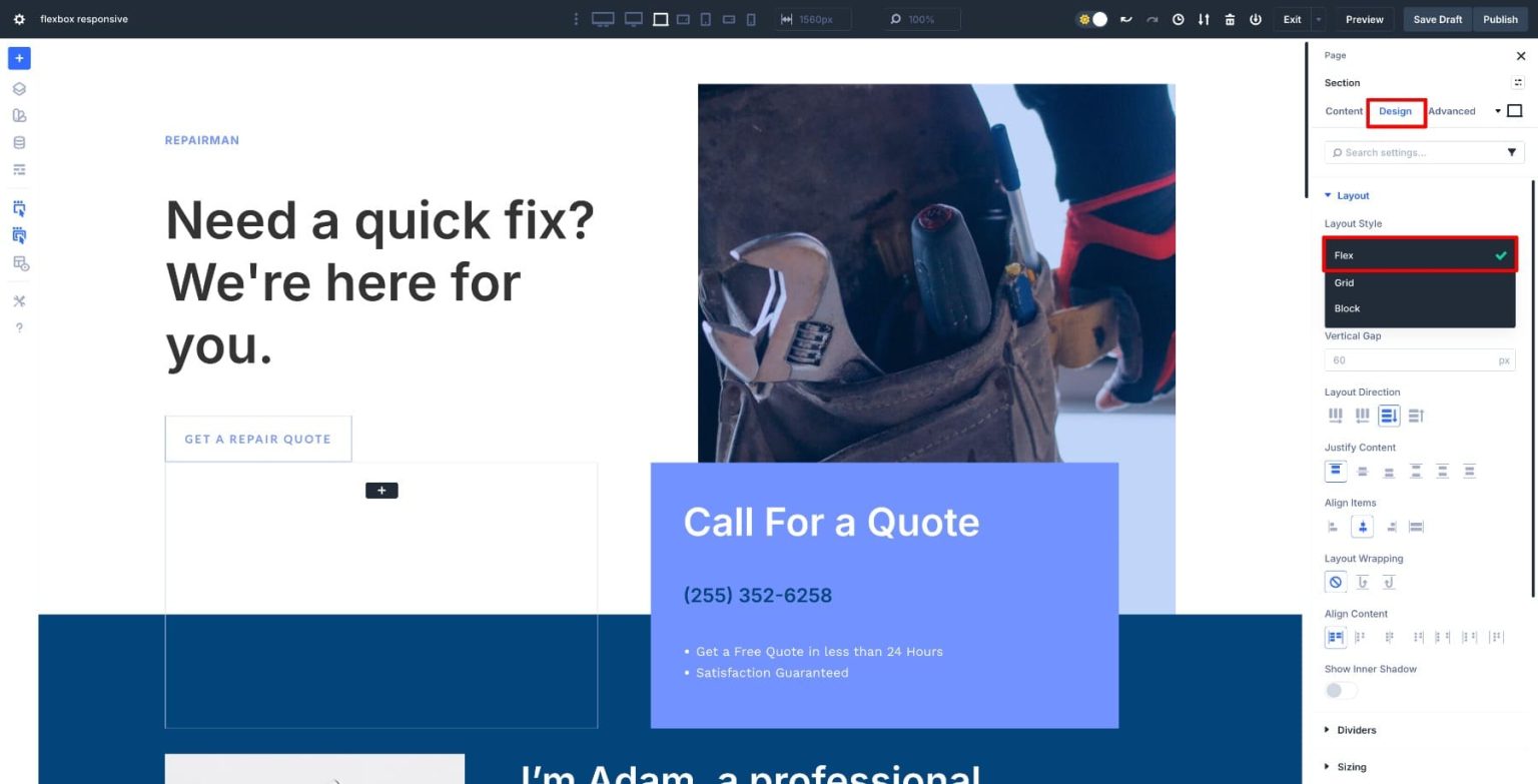
1. Change the Layout Style From Block To Flex Switch the Layout Style from Block to Flex by opening the settings of a Section, selecting Design > Layout.
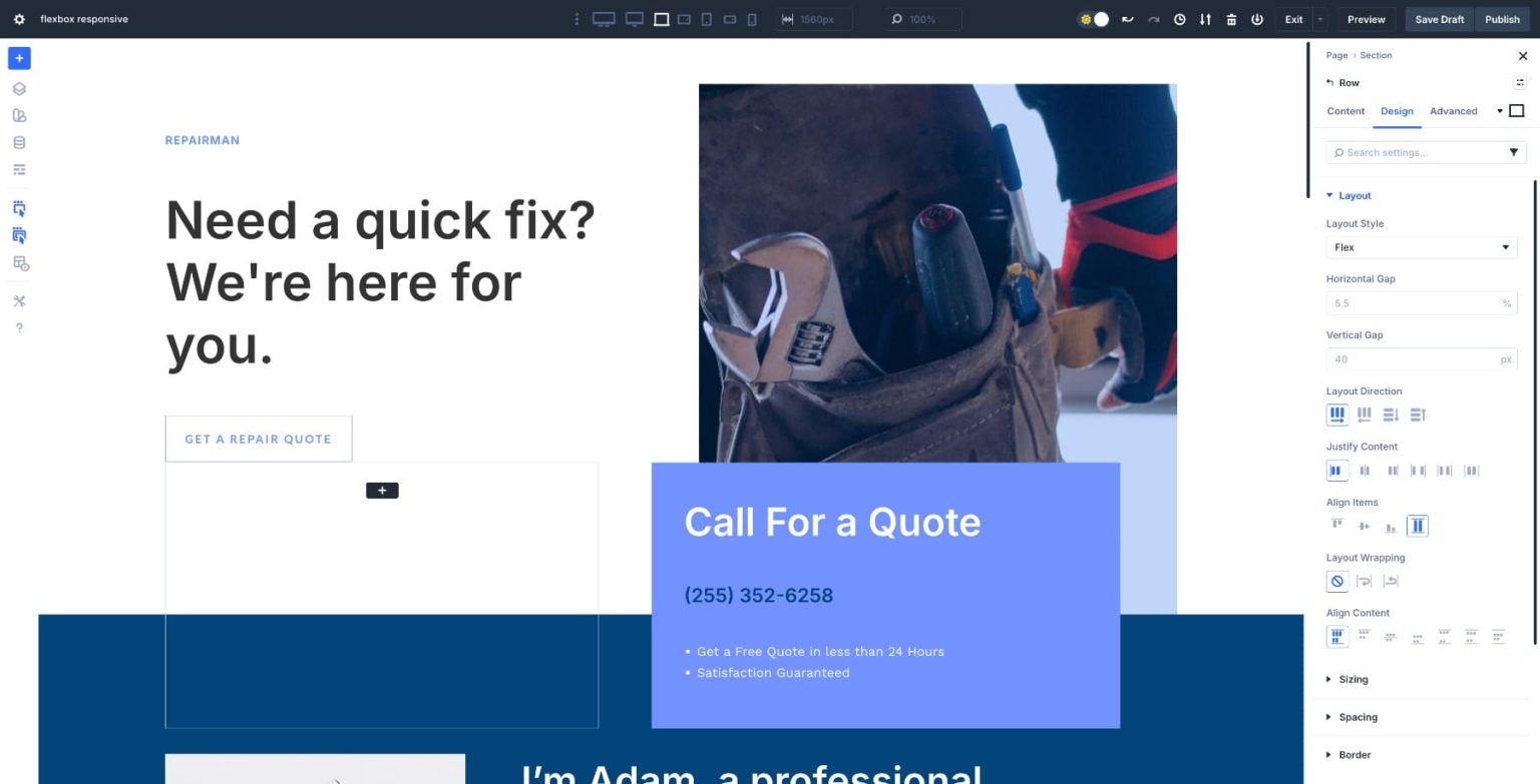
Divi transforms the container into a flex container and the modules within into flex items after you make the conversion. Controls for direction, alignment, wrap, and gap are among the new parameters that show up. Continue doing this for each additional row and segment in your plan.
Divi transforms the container into a flex container and the modules within into flex items after you make the conversion. Controls for direction, alignment, wrap, and gap are among the new parameters that show up. Continue doing this for each additional row and segment in your plan.
At this point, nothing in your layout should look off. You are not swapping modules or rebuilding the structure. By switching from a fixed-block to a flexible architecture, you will have more control over how the layout appears on various devices.
2. Modify Each Container's Flex Settings Examine the layout after making the switch. Observe how the components are positioned next to one another, how much room they occupy, and whether the row seems balanced. When you start modifying direction, alignment, and spacing, this brief audit helps you identify what needs improvement. For instance, we will widen the horizontal gap to allow for more breathing area between items because this row feels overly crowded. For more responsive spacing, change the unit to percentage and adjust until the layout seems balanced. By doing this, you can achieve uniform spacing without having to apply padding or margins to each module separately.
There is an odd space between things in the footer. To correct it, adjust the row's first column's Vertical Gap.
In mobile view, the footer appears overly packed as well. To make the layout simpler to read on smaller screens, change the Layout Direction on mobile devices from row to column so that elements stack vertically.
Instead of putting up with padding and negative margins, you may also use Justify Content to adjust the alignment of your content.With layout wrapping, you can manage how elements change according to various breakpoints and screen sizes.
Before proceeding, evaluate how the complete layout feels across breakpoints after you have finished converting and modifying each part. Make a note of any remaining issues.
3. Adjust Layouts Using a Responsive Editor and Custom Breakpoints Once the basic Flexbox framework is established, adjust the layout for different screen sizes by switching to different breakpoints. Divi 5 offers breakpoints that may be customized, so you are not just confined to desktop, tablet, and mobile devices. If your design calls for it, you can modify behavior for little phones, big tablets, or even ultrawide screens.
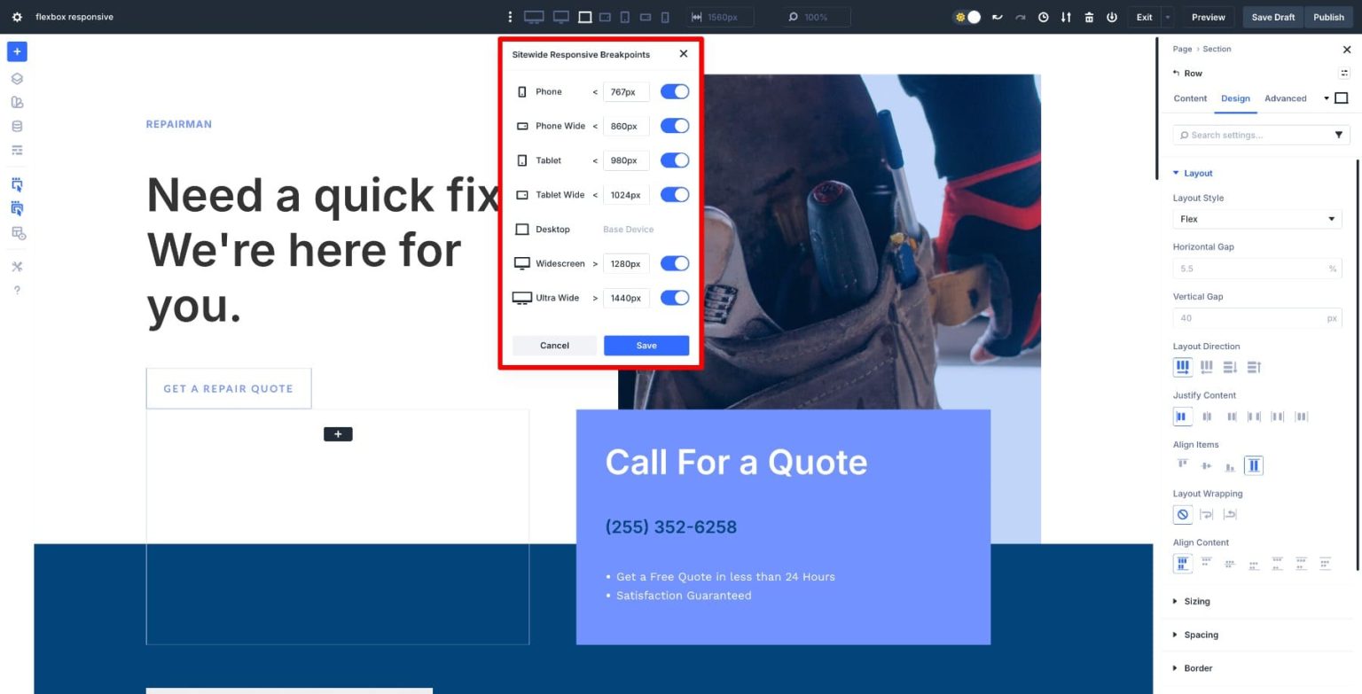
Use Flexbox settings at each breakpoint to refine direction, alignment, wrapping, and order. You might keep a horizontal layout on large tablets, but stack items earlier on smaller screens. Adjust layout behavior where it makes sense rather than forcing the same structure everywhere.
The Responsive Editor allows you to make responsive changes to other design elements while you are in breakpoint view. This covers alignment, spacing, padding, and heading size. To change values from one location without changing breakpoints, hover over any field and select the Responsive Editor icon to bring up a panel.
With this method, you may design a layout that seems deliberate on all screens without having to modify individual module settings or write unique CSS. Test your layout's behavior at intermediate sizes as well as the typical breakpoints as you move through it. Verifying such transitional times lets you identify problematic wrapping or space issues before they affect your audience because real users land on a variety of screen widths. When spacing needs to scale proportionately, utilize percentage-based units and keep gap values constant across related containers to preserve visual rhythm. Think about whether Option Group Presets or Design Variables might be more effective if you frequently make the same change in different areas. You will have a fully responsive design that adjusts on its own without the need for duplicate sections or device-specific redesigns once you have finished fine-tuning the layout across all pertinent breakpoints.
A large portion of the uncertainty associated with responsive design is eliminated using Flexbox. We refined everything across breakpoints without the need for duplicate sections or additional CSS by converting a layout to Flex in Divi 5 and adjusting spacing, direction, wrapping, and alignment straight from the container. The majority of the changes were made at the container level, and the layout changed as the screen did. With Flexbox, you can create responsive pages that perform reliably on tablets and mobile devices while requiring less manual labor and fewer maintenance workarounds. Because you have specified how your layouts should react from the beginning rather than patching them together after the fact, they scale smoothly.